Introduction to statistics
Descriptive statistics are used to summarise and describe a variable or variables for a sample of data (as opposed to drawing conclusions about any larger population from which the sample was drawn, which is covered in the Inferential statistics page). For example, sample statistics such as the mean (\(\bar{x}\)) and standard deviation (\(s\)) are often used to summarise and describe continuous variables.
Furthermore, descriptive statistics can be used to summarise just one variable at a time (univariate analysis), to analyse relationships between two variables (bivariate analysis) and, in some cases, to describe patterns across three or more variables (multivariate analysis, which is not covered here).
This page details ways of displaying and of using descriptive statistics to perform univariate and bivariate analysis, for both categorical and continuous data.
In brief, it covers the following:
- How to display data for one categorical variable
- How to use descriptive statistics to analyse data for one categorical variable
- How to display data for one continuous variable
- How to use descriptive statistics to analyse data for one continuous variable
- How to compare means of a continuous variable between different groups
- How to display data for two categorical variables
- How to use descriptive statistics to analyse data for two categorical variables
- How to display data for two continuous variables
- How to use descriptive statistics to analyse data for two continuous variables
Displaying data for one categorical variable
One way of displaying data for a single categorical variable is by using a table, or in particular a frequency distribution table. This is a table which displays the various categories for a variable, along with the corresponding frequencies (i.e. how often each category occurs in the data) and usually associated percentages (sometimes including cumulative percentages, which give the sum of all the percentages up to and including that row of the table).
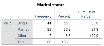
For example, the following is a frequency distribution table showing the frequency of each category of marital status in a sample of 80 people, along with the corresponding percentages:
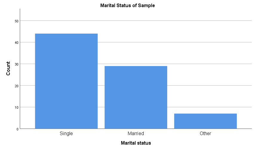
Another way to display categorical data for a single variable is using a column graph or bar chart. Column graphs and bar charts use rectangles of equal width (which do not touch) to represent each data category. The rectangles are drawn vertically for column graphs and horizontally for bar charts, and in each case the height (or length) of the rectangles allows the various quantities for each category to be compared, typically as counts or percentages. For example:
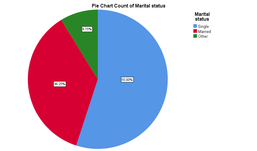
Categorical data for a single variable is also sometimes displayed in a pie chart, in order to show how the sample is divided up between the various categories. For example the data for marital status could be displayed in a pie chart as follows:
Descriptive statistics for one categorical variable
Descriptive statistics used to analyse data for a single categorical variable include frequencies, percentages, fractions and/or relative frequencies (which are simply frequencies divided by the sample size) obtained from the variable’s frequency distribution table.
For example, we can describe the sample of data for the marital status variable from the previous section by selecting some key values from its frequency distribution table, such as:
- \(91.3\%\) of the sample are either single or married
- \(7\) people in the sample identified their marital status as ‘other’
- the relative frequency of people in the sample who are married is \(0.36\)
- over \(\frac{1}{2}\) of the people in the sample are single.
If you would like to practise analysing data for a single categorical variable, have a go at the following activity.
Displaying data for one continuous variable
Continuous data for a single variable can also be displayed in a frequency distribution table, but the data first needs to be grouped into bins (also known as class intervals). These should be chosen based on the data, but they should generally be of the same size and ideally there should not be too many.
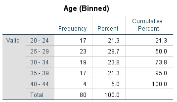
For example, the following is a frequency distribution table showing the frequency of ages of a sample of 80 people, once they have been sorted into bins:
As for graphs that display continuous data for a single variable, one of the most commonly used is a histogram. These have the following properties:
- as the variable is continuous the bars touch (unless an interval has zero frequency)
- the bars are vertical
- the vertical axis should start at zero and should have no breaks
- the area of each bar represents the frequency of the corresponding bin.
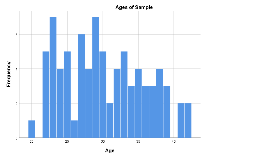
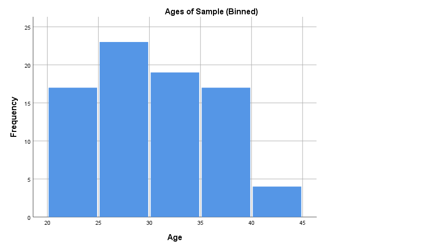
Note that different versions of a histogram can be created for the same variable, depending on the bin (class interval) width used. For example, the first histogram below uses bins of width one, while the second uses the bins as shown in the frequency distribution table above. The software you use to produce your histogram will typically decide this for you, so it is not something to be overly concerned about, but if you are wanting to create or manipulate your own histogram keep in mind it is just a matter of choosing a bin width in accordance with the level of detail you wish to show:
Another graph used to display continuous data for a single variable is a box plot (also called a box and whisker plot), which is a diagram showing the way the data for a variable is distributed. For example, a box plot for our Age variable is as follows (click on the plus signs to learn about the key features of the graph, some of which are explained in more detail in the Descriptive statistics for one continuous variable section that follows):
Descriptive statistics for one continuous variable
Continuous data for a single variable is generally analysed using two types of descriptive statistics:
- measures of central tendency, which summarise the data set by finding the average, central or typical member (for example mean, median and mode), and
- measures of dispersion, which summarise the data set by finding out how widely it is spread or dispersed (for example range, interquartile range, variance and standard deviation).
It is important not only to understand how to calculate and interpret the various measures of central tendency and dispersion, but to know when it is appropriate to use the various types. How to do both is explained in the following two sections.
Measures of central tendency
The most common measure of central tendency is the mean (otherwise known as the arithmetic average), which is calculated by adding together all of the data and then dividing through by the total number of values. The sample mean is denoted by \(\bar{x}\), and for a sample of size \(n\) the formula for calculating the mean is written as follows (note that \(\sum\) represents the sum of all the values):
\[\bar{x} = \frac{\sum x}{n}\]For example, the mean of the following sample of ten ages:
\[19, 25, 28, 28, 23, 15, 28, 22, 24, 21\]can be calculated as:
\[\begin{aligned} \bar{x} &= \frac{19+25+28+28+23+15+28+22+24+21}{10} \\\ &= 23.3 \end{aligned}\]While the mean is typically used as the measure of central tendency for continuous data, it may not be appropriate if the data set is badly skewed, contains outliers or if the variable is censored (not fully observed). In these situations the median is more suitable. This is the midpoint of the distribution, which is calculated for a sample by sorting the data from smallest to largest and then finding the middle value (or the mean of the middle two values if there are an even number of observations). For example, putting our sample of ten ages in order gives:
\[15, 19, 21, 22, 23, 24, 25, 28, 28, 28\]and the median is then the mean of the middle two:
\[\frac{(23+24)}{2} = 23.5\]Finally, the mode is the most frequently occurring value (or values) in the sample (if there are two or more values that are equally common we quote them all, rather than finding the average). Note that the mode may not necessarily be anywhere near the middle of the data set, and hence is not necessarily ‘central’, but it is useful when the most common value is of interest. For example, the mode of our sample of ten ages:
\[19, 25, 28, 28, 23, 15, 28, 22, 24, 21\]is \(28\).
Note also that the mode can be, and is most often, used for categorical data.
If you would like to test your understanding of the mean, median and mode, have a go at one or both of the following activities.
Measures of dispersion
The simplest measure of dispersion is the range, which is simply the difference between the smallest and the largest value in the sample. For example, the range of our sample of ten ages in the previous section is \(13\) (i.e. \(28 - 15\)). While the range is easy to calculate, it is usually of limited use as it takes into account just two values in the data set.
A measure of dispersion that takes into account more, if still not all, values in a data set is the calculation of percentiles. These measure position from the beginning of an ordered data set, and can be used to measure the relative standing of a particular observation. For example, stating that a child is in the \(97\)th percentile of a sample for height means that he or she is taller than \(97\%\) of others in the sample. As another example, our sample of ages contains only ten pieces of data so lends itself nicely to calculating percentiles that are multiples of \(10\). Have a look at some of these in the diagram below (click on the plus signs to find out about the different percentiles):
A specific type of percentiles which divide the sample into quarters are quartiles (as shown on the box plot in the previous section). For example, the:
- \(25\)th percentile is known as the first or lower quartile
- \(50\)th percentile is known as the median
- \(75\)th percentile is known as the third or upper quartile.
The quartiles for our sample of age data are as follows (note the different colours for each quarter of the sample, and click on the plus signs to find out about the different quartiles):
Once you have determined the quartiles you can determine another measure of dispersion, called the interquartile range. This is the difference between the first and the third quartiles, which is \(7\) for the example above. The interquartile range is quoted in conjunction with the median in situations where the latter is more appropriate than the mean.
In all other situations the mean and standard deviation are usually used to summarise a sample. The standard deviation takes into account all of the values in a sample, and is calculated by finding the deviation of each value from the mean, squaring the result, then adding them all together and dividing by one less than the sample size. This gives yet another measure of dispersion, known as the variance, and then taking the positive square root of this gives the standard deviation. The standard deviation is generally more relevant than the variance, as it is measured on the original scale of the data. The formula for the standard deviation (\(s\)) of a sample of size \(n\) is:
\[s =\sqrt{\frac{\sum(x - \bar{x})^2}{n - 1}}\]While standard deviation (along with other measures of dispersion and central tendency) can be calculated using various software, it is also good to understand how to determine it manually. For example, to calculate the standard deviation of our ten ages:
\[19, 25, 28, 28, 23, 15, 28, 22, 24, 21\]we first need to find the mean of the sample (\(\bar{x}\)), which we know to be \(23.3\).
Next, calculating the deviation of each age from this mean gives:
\[-4.3, 1.7, 4.7, 4.7, -0.3, -8.3, 4.7, -1.3, 0.7, -2.3\]and squaring these gives:
\[18.49, 2.89, 22.09, 22.09, 0.09, 68.89, 22.09, 1.69, 0.49, 5.29\]Now adding these ten values gives a total of \(164.1\), and diving through by \(9 \) (i.e. \(10 - 1\)) gives \(18.23\). Finally, taking the square root gives the sample standard deviation of \(4.27\)
If you would like to practise calculating the range, interquartile range, variance and standard deviation, and to practise deciding which measure of central tendency and measure of dispersion to interpret, have a go at the following activities.
Comparing means
Measures of central tendency and dispersion can also be used to test for differences in a continuous variable between different categories of a categorical variable. This is often done to compare means between groups.
For example, if we know that the first five people in our sample of ages are females and the second five people are males, we can compare the means of the two groups:
\[\begin{aligned} \textrm{Ages of females} &= 19, 25, 28, 28, 23 & \textrm{Mean age of females} = & 24.6 \\\ \textrm{Ages of males} &= 15, 28, 22, 24, 21 & \textrm{Mean age of males} = & 22 \end{aligned}\]So the mean of the females in our sample is \(2.6\) years greater than the mean of the males.
If you would like to practise comparing means, have a go at the following activity.
Displaying data for two categorical variables
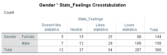
Cross-tabulations (or contingency tables) are used to investigate associations between two categorical variables for a sample. A cross-tabulation contains multiple rows and columns, with the categories of the independent variable in the rows and the categories of the dependent variable in the columns. Each cell of the table contains the frequency or number of subjects that fall into the combination of categories of the two variables, subtotals are given for each column and row, and a final total is given in the bottom right-hand corner of the table.
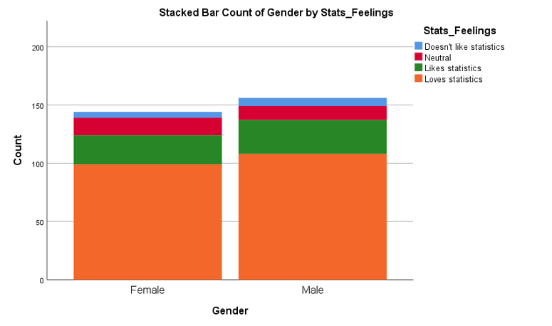
For example, the following cross-tabulation displays data for two variables (gender and feelings towards statistics), for a (fictional) sample of 300 people:
Cross-tabulations also often include row, column and/or total percentages as applicable. To find out about these, click on the plus signs in the diagram below:
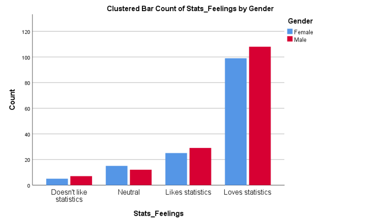
Data for two categorical variables can also be displayed in either a clustered or stacked bar chart. A clustered bar chart is great for comparing each category of one variable between the different categories of the other variable, while a stacked bar chart is better for comparing the total for each of the categories for one of the variables.
Descriptive statistics for two categorical variables
Data in cross-tabulations can be analysed using the frequencies and percentages shown previously. In addition, expected frequencies can also be used to analyse the association between the variables in the sample. These frequencies are calculated based on the assumption that there is no association between the variables in the sample, and can be compared to actual frequencies to test for association. In particular, the closer the expected and the actual frequencies are to each other, the less likely it is that there is an association between them (and therefore the less likely it is that one can be used to predict the other).
For some examples of how expected frequencies are calculated, and how they can be interpreted, click on the plus signs in the diagram below:
If you would like to practise interpreting cross-tabulations, have a go at one or both of the following activities.
Displaying data for two continuous variables
The relationship (or lack of) between two continuous variables in a sample can be visualised in a scatterplot , which plots the independent variable on the x-axis against the dependent variable on the y-axis.
For example, a scatterplot for the ages and weights of a sample of 80 people is shown below. The fact that the data points do not approximate a straight line indicates a weak to non-existent linear relationship between the variables (note that two variables may have a non-linear relationship between them, but non-linear relationships are not covered in this module).
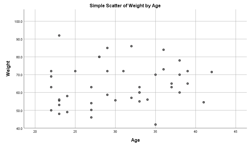
In terms of linear relationships, you can use a scatterplot to observe:
- the strength of any linear relationship between the variables, by observing how closely the data points approximate a straight line, and
- the direction of any linear relationship, by observing whether the line approximated by the points slopes up (positive relationship) or down (negative relationship).
Descriptive statistics for two continuous variables
Finally, note that the strength and direction of a linear relationship (or lack of) between two continuous variables can be quantified by Pearson’s correlation coefficient (\(r\)).
The correlation coefficient is a number between \(-1\) and \(1\), with negative values indicating a negative linear relationship and positive values indicating a positive linear relationship. Furthermore:
- \(r = 0\) indicates no linear relationship between the variables,
- \(r\) values between \(0\) and \(0.3\) (\(0\) and \(-0.3\)) indicate a weak positive (negative) linear relationship between the variables,
- \(r\) values between \(0.3\) and \(0.7\) (\(-0.3\) and \(-0.7\)) indicate a moderate positive (negative) linear relationship between the variables,
- \(r\) values between \(0.7\) and \(1\) (\(-0.7\) and -\(1\)) indicate a strong positive (negative) linear relationship between the variables, and
- \(r = 1\) (\(-1\)) indicates a perfect positive (negative) linear relationship between the variables.
For example if two variables that contain data for age and scores on a memory test have a correlation coefficient (\(r\) value) of \(-.72\), it indicates that there is a strong, negative linear relationship between them.
For practise interpreting a correlation coefficient together with a scatterplot, have a go at the following activity.