Microsoft Excel Essentials
Excel can be used to create charts from the data in your spreadsheet, and this page explores a few different ways of doing this.
In brief, it covers the following:
- How to create a column chart
- How to create a PivotChart
- How to turn a simple PivotChart into a stacked bar chart
Note that the information on this page references the resource Party_Budget_Workbook_2 [XLSX, 11kB]. Download this workbook, if you haven’t already, and use it to work through the information below. This workbook has been formatted according to the instructions on the Getting started page of this module.
Column chart
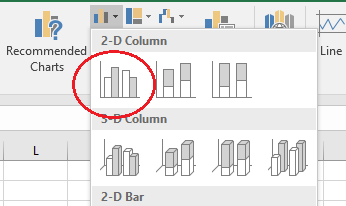
Suppose you wish to create a column chart to show the amount paid for each item. To do this first highlight cells A1 to A20 (i.e. the item names), hold down Ctrl and highlight cells D1 to D20 (i.e. the amounts paid), then go to the Insert tab and select a chart. Choose the first 2D column chart for example:
A column chart will be created in the current worksheet, and you can choose to drag it somewhere else in the worksheet or cut and paste it into another worksheet or document if required.
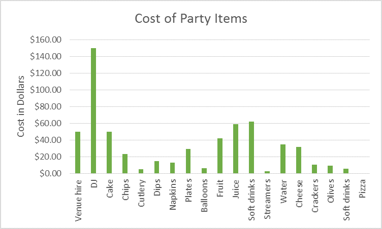
You will also probably need to format the chart. For example, you can edit the title by clicking on the current title and typing a new title (Cost of Party Items, for example), and you can add a title to the vertical axis by clicking somewhere on the chart, clicking the plus sign that appears in the top right hand corner, hovering over Axis Titles, clicking on the triangle that appears and selecting Primary Vertical. Again, rename the title by clicking on it and typing a new title (i.e. Cost in Dollars). Finally, you can play around with other changes to the graph by clicking on the Chart Elements, Chart Styles and Chart Filters icons, or by going to the Chart tools tab if desired. Your graph should look something like this:
Note you can also create charts using Quick Analysis. For example, suppose you wish to create another column chart to show the amounts paid to the different suppliers. To do this first highlight cells C2 to D20 (i.e. the suppliers and amounts paid), then click on the Quick Analysis icon in the bottom right hand corner, select the Charts tab and click on the preview of a column chart. A column chart will be created that you can format in the same way; the only problem is that due to the nature of the data in our worksheet, the different suppliers have not been grouped together. To do this, we can create a PivotChart instead.
PivotCharts
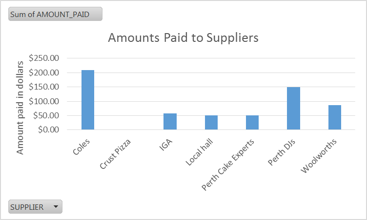
To create a PivotChart highlight all data from cells A1 to F20 as we did previously, go to the Insert tab and select PivotChart and PivotChart again. Check that the Table/Range is as required, and then select OK. Then drag the appropriate fields to the areas in the PivotChart Fields pane; in this case, drag SUPPLIER to the AXIS area and AMOUNT_PAID to the VALUES area. A graph should appear which displays the amount paid to each supplier; you can edit it as per the previous graph, and you should also reformat the values in the pivot table as Currency so that the values appear as dollar amounts on the vertical axis. Your graph should like something like this:
Stacked bar chart
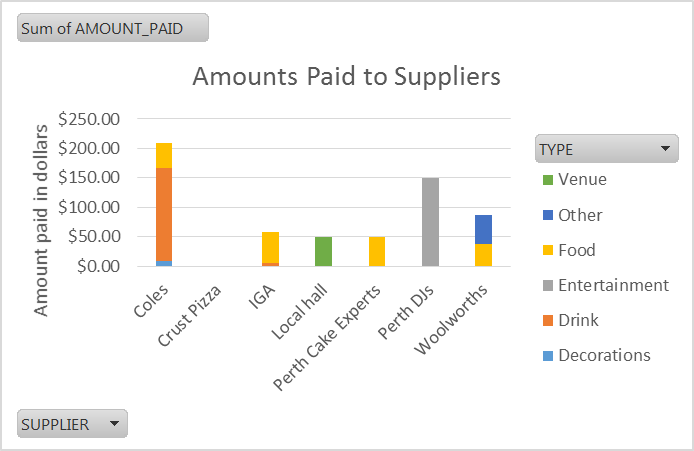
Finally, if you wish to turn this chart into a stacked bar chart instead, to show the breakdown of item types for each supplier, first click on the Design tab in PIVOTCHART TOOLS, select Change Chart Type, choose a Stacked Column Chart and select OK. Then drag the TYPE field to the LEGEND area on the PivotChart Fields pane. To display this legend on the chart click somewhere on the chart, click the plus sign that appears in the top right hand corner and select Legend. The graph should look something like this:
Note that you can create different kinds of charts, from pie charts to scatter plots and line graphs, in any of the aforementioned ways, as well as directly from an existing pivot table by going to the Analyze tab in PivotTable Tools and selecting PivotChart.