Numeracy fundamentals
This page takes you through some important concepts on the topics of statistics and probability, with activities to consolidate your knowledge along the way. For more sample questions on these concepts, in particular if you are preparing for the Literacy and Numeracy Test for Initial Teacher Education (LANTITE), you may like to visit the LANTITE page. Alternatively, if you would like to build up some more advanced skills on the topic of statistics you may like to visit the Introduction to statistics module, and if you would like to build up some more advanced skills on the top of Microsoft Excel you may like to visit the Microsoft Excel essentials module.
As you work through the content keep in mind that there are often different ways of solving the same problem. While in some cases alternative methods have been explained, for many examples just one method of working is provided. If you already know a different technique for solving the problem then that’s great (provided it is also correct, of course). Don’t feel you need to change your method - the important thing is that you use a technique that makes sense to you.
In brief, this page covers how to do the following:
- Calculate and interpret statistics for categorical data
- Calculate and interpret statistics for continuous data
- Interpret graphs
- Write and interpret Excel formulas
- Calculate probabilities and create sample spaces to solve probability problems
Statistics for categorical data
Statistics are what we use to summarise, display and describe data (observations and measurements). There are lots of different statistics, and the type of data determines the type of statistics used.
If the data is grouped into categories it is categorical data. This type of data is typically summarised using frequencies (counts) and/or percentages, and can also be displayed in a column graph or pie chart.
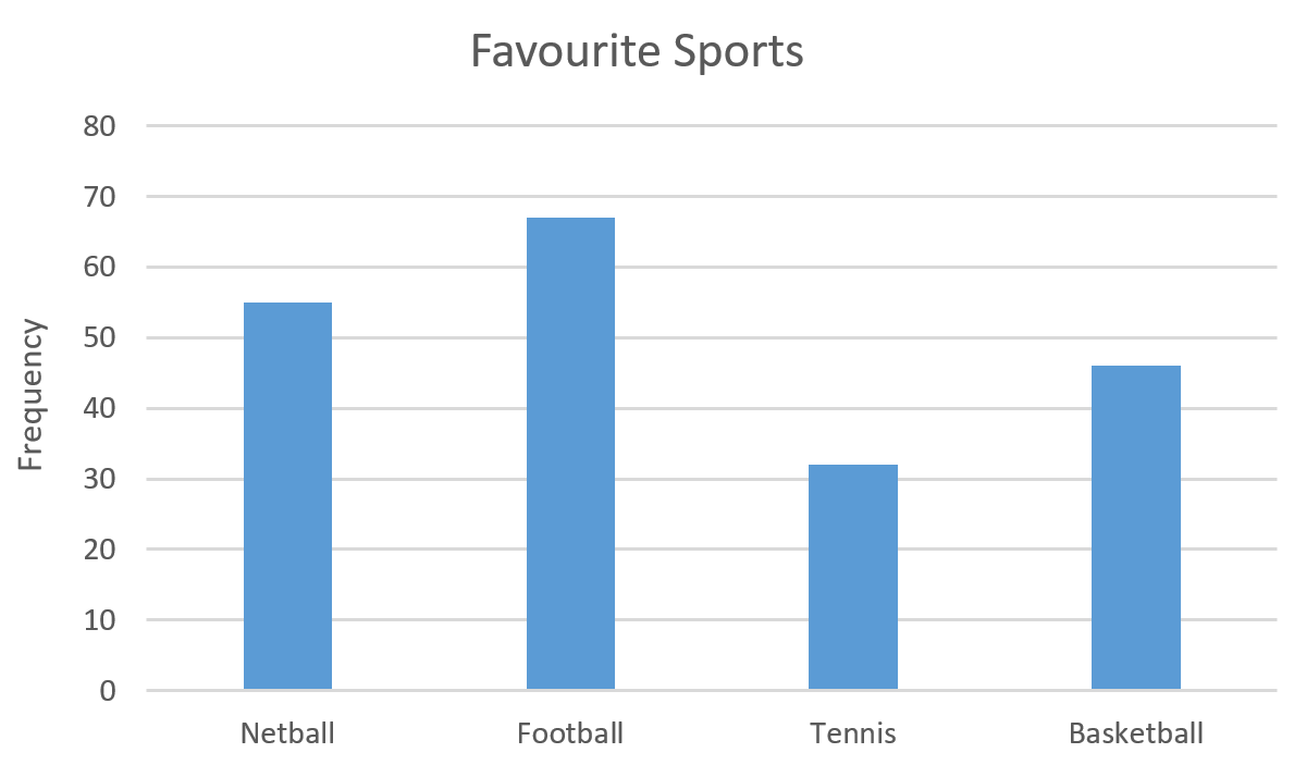
Example: Data relating to the favourite sports of students in a school can be summarised using the following frequency distribution table and column graph:
| Favourite Sports | Frequency |
|---|---|
| Netball | 55 |
| Football | 67 |
| Tennis | 32 |
| Basketball | 46 |
| TOTAL | 200 |

Use this information to determine the percentage of students who prefer tennis, as well as the most and least popular sports.
Solution: Using the data in the table we can determine that \(32 \div 200 \times 100 = 16\%\) of students prefer tennis. Using the graph or the table we can determine that football is the most and tennis is the least popular sport.
Once you have worked through the example above, have a go at analysing the categorical data in the following activity:
Statistics for continuous data
If data is measured on a continuous numerical scale it is continuous data (and in fact most numerical data is treated as continuous data, even if it is not measured on a continuous scale). This type of data is summarised using measures of central tendency and measures of dispersion, and displayed in graphs such as histograms and box plots.
Common measures of central tendency include the mean, median and mode, while common measures of dispersion include the range, interquartile range and standard deviation (although the latter two will not be covered here).
Continuous data can also be grouped into categories and displayed and analysed in the same way as categorical data. For example, data for ages can be grouped into age categories.
The mean
The mean (arithmetic average) of a set of values is calculated by summing all the values together and then dividing by the total number of values.
Example: Consider that the ages of ten education students are \(19\), \(20\), \(29\), \(28\), \(23\), \(18\), \(27\), \(22\), \(24\) and \(20\). What is the mean age of the students?
Solution: The mean age of the students can be calculated as follows:
\[\frac{19 + 20 + 29 + 28 + 23 + 18 + 27 + 22 + 24 + 20}{10} = 23\]Furthermore, sometimes the data may be presented in a frequency table, in which case you need to make use of the frequencies when calculating the mean.
Example: The following frequency distribution table shows the number of students who received different marks out of ten on a test (i.e. \(4\) students received a mark of \(6\), \(5\) students received a mark of \(7\), etc.):
| Marks (out of 10) | Frequency |
|---|---|
| 6 | 4 |
| 7 | 5 |
| 8 | 7 |
| 9 | 8 |
| 10 | 6 |
| TOTAL | 30 |
Based on the data in this table, what is the mean mark?
Solution: To calculate the mean in this case you again need to divide the total by the number of values, however in order to find the total you need to take into account the frequency of each value. You can do this by multiplying each value by its frequency before adding together, and hence the calculation should be as follows:
\[\frac{6 \times 4 + 7 \times 5 + 8 \times 7 + 9 \times 8 + 10 \times 6}{30} = \frac{247}{30} = 8.23\]Once you have worked through the examples above, have a go at calculating means in the following activity:
The median
The median is the middle value in an ordered set, or if there are an even number of values the median is the mean of the middle two. To find the median the data first needs to be put in ascending order (i.e. from smallest to largest).
Example: Consider that the ages of ten students are \(19\), \(20\), \(29\), \(28\), \(23\), \(18\), \(27\), \(22\), \(24\) and \(20\). What is the median age of the students?
Solution: The ages of the ten students in ascending order are \(18\), \(19\), \(20\), \(20\), \(22\), \(23\), \(24\), \(27\), \(28\) and \(29\). Since there are ten ages there are two middle values (the fifth and sixth ages), which are \(22\) and \(23\) respectively. Therefore the median age is \((22 + 23) \div 2 = 22.5\).
Again sometimes the data may be presented in a frequency table, in which case you need to calculate cumulative frequencies in order to determine the median.
Example: The following frequency distribution table shows the number of students who received different marks out of ten on a test (i.e. \(4\) students received a mark of \(6\), \(5\) students received a mark of \(7\), etc.):
| Marks (out of 10) | Frequency |
|---|---|
| 6 | 4 |
| 7 | 5 |
| 8 | 7 |
| 9 | 8 |
| 10 | 6 |
| TOTAL | 30 |
Based on the data in this table, what is the median mark?
Solution: Since there are \(30\) marks there are two middle values; the \(15\textrm{th}\) and \(16\textrm{th}\) marks. In order to find out what these are the cumulative frequencies (i.e. the sum of the frequencies to that point) should be calculated. It can be helpful to add another column to the table with these values, as follows:
| Marks (out of 10) | Frequency | Cumulative Frequency | |
|---|---|---|---|
| 6 | 4 | 4 | |
| 7 | 5 | 9 | |
| 8 | 7 | 16 | |
| 9 | 8 | 24 | |
| 10 | 6 | 30 | |
| TOTAL | 30 |
From these cumulative frequencies we can see that the \(10\textrm{th}\) through to the \(16\textrm{th}\) students all have a mark of \(8\), and therefore that the \(15\textrm{th}\) and \(16\textrm{th}\) students both have a mark of \(8\). Hence \(8\) is the median.
Once you have worked through the examples above, have a go at calculating medians in the following activity:
The mode
The mode in a set of scores is the one that appears most frequently. This may not necessarily be anywhere near the middle of the data set, but it is useful when we want the ‘most common’ value. If there are two or more values that are equally the most common then the set has multiple modes (they should not be averaged).
Example: Consider that the ages of ten students are \(19\), \(20\), \(29\), \(28\), \(23\), \(18\), \(27\), \(22\), \(24\) and \(20\). What is the mode of the students’ ages?
Solution: The only age that occurs more than once in the list is \(20\), which occurs twice. Hence \(20\) is the mode.
If the data is in a frequency table it is even easier to identify the mode.
Example: The following frequency distribution table shows the number of students who received different marks out of ten on a test (i.e. \(4\) students received a mark of \(6\), \(5\) students received a mark of \(7\), etc.):
| Marks (out of 10) | Frequency |
|---|---|
| 6 | 4 |
| 7 | 5 |
| 8 | 7 |
| 9 | 8 |
| 10 | 6 |
| TOTAL | 30 |
Based on the data in this table, what is the mode mark?
Solution: The mode is \(9\), as that is the mark that occurs most frequently.
Once you have worked through the examples above, have a go at the following activity:
The range
The range is simply the difference between the highest and lowest values in a data set.
Example: Consider that the ages of ten students are \(19\), \(20\), \(29\), \(28\), \(23\), \(18\), \(27\), \(22\), \(24\) and \(20\). What is the range of the students’ ages?
Solution: The oldest person is \(29\) and the youngest is \(18\), so the range is \(11\) (i.e \(29 - 18\)).
Once you have worked through the example above, have a go at the following activity:
Interpreting graphs
Being able to interpret and make comparisons using different kinds of graphs, including pie charts, column graphs, histograms, box plots and line graphs, is an important skill. When doing this, make sure you read the question carefully and, if applicable, focus in on the portion of the graph that is relevant.
Example 1: The following clustered column graphs compare the percentage of students who earned marks in four different ranges in a standardised test, for two different classes over two years:

Are the following statements true or false?
- In \(2019\) more than three-quarters of students in class \(\textrm{A}\) had a mark over \(50\%\).
- The distribution of marks was more similar for the classes in \(2019\) than in \(2020\).
- The percentage of students who scored between \(26\%\) and \(50\%\) increased by \(11\%\) between \(2019\) and \(2020\) for Class \(B\).
Solution: Working and answers are as follows:
- True. Since the question asks about \(2019\), we can focus on the first graph and ignore the second for this question. Furthermore, since it refers to Class \(\textrm{A}\) we can just look at the blue columns. The question asks whether more than three-quarters of the relevant students had a mark over \(50\%\), which equate to students in the third and fourth ranges on the graph (i.e. \(51 - 75\%\) and \(76 - 100\%\)). Adding the percentage of students in each of these columns together gives \(47\% + 29\% = 76\%\), which is just over three-quarters (since three-quarters is equivalent to \(75\%\)).
- True. The column pattern for Class \(A\) and Class \(B\) is the same for \(2019\), but not for \(2020\).
- False. This is true of Class \(A\), but the percentage of students for Class \(B\) actually decreased by \(4\%\).
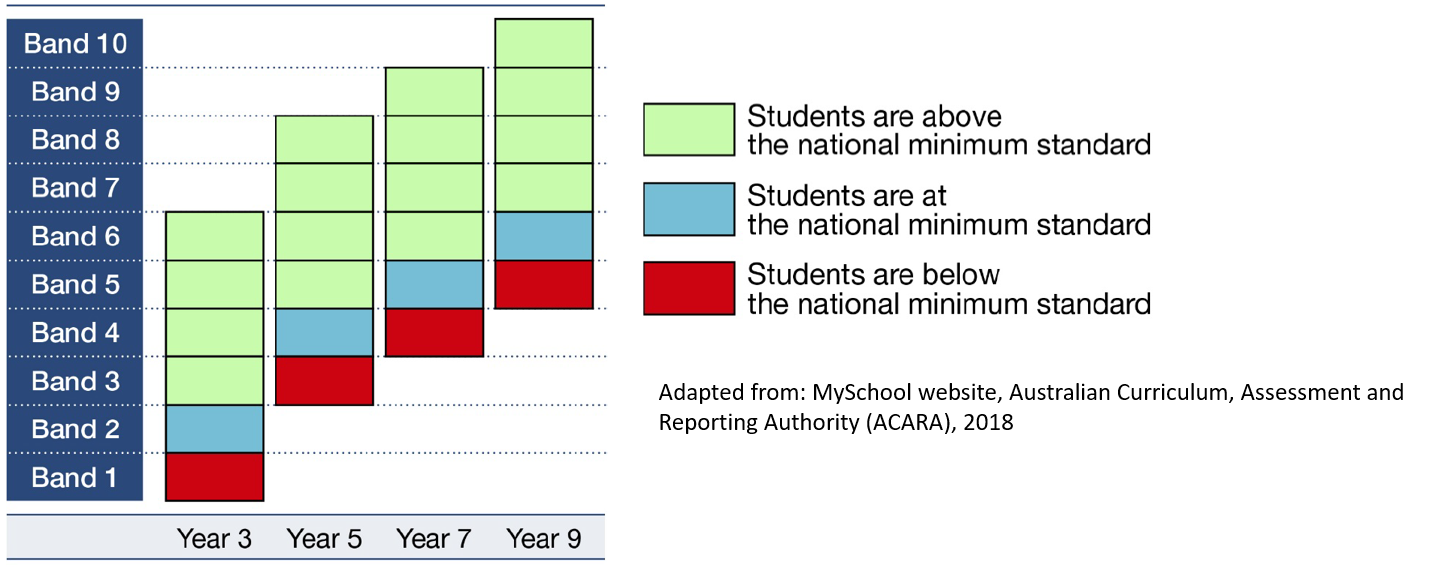
Example 2: The following graph shows NAPLAN student achievement for years \(3\), \(5\), \(7\) and \(9\):

- For how many year groups is Band \(6\) above the national minimum standard?
- A student scores in Band \(5\), and is at the national minimum standard. What year must they be in?
- How many bands are reported in common for years \(3\) and \(9\)?
Solution: Working and answers are as follows:
- Looking at Band \(6\) in the graph we can see that it is green for three of the year groups, and the key indicates that green means that students are above the minimum standard. So Band \(6\) is above the national minimum standard for three year groups (years \(3\), \(5\) and \(7\)).
- From the key we can see that a blue cell indicates that students are at the national minimum standard. Looking at Band \(5\) in the graph we can see that the only year group with a blue cell is Year \(7\), indicating that the student must be in Year \(7\).
- Looking across at the different bands, we can see that there are only two reported in common for both years \(3\) and \(9\) (bands \(5\) and \(6\)).

Example 3: The following graph shows NAPLAN \(2018\) Reading results for year \(3\) students in eight states and territories and in Australia overall:
- For which state or territory were the scores of more than \(20\%\) of students below Band \(3\)?
- For how many states or territories were the scores of at least \(80\%\) of students at Band \(4\) or above?
Solution: Working and answers are as follows:
- In order for the scores of more than \(20\%\) of students to be below Band \(3\), the entire dark orange section at the bottom of the column (which indicates the bottom \(20\%\) percentile) needs to be below Band \(3\). This is only true of the Northern Territory.
- In order for the scores of at least \(80\%\) of students to be at Band \(4\) or above, the line indicating the \(20\textrm{th}\) percentile (the line above the the dark orange section at the bottom) must be in Band \(4\) or above. This is only true for Victoria and the ACT, so the answer is \(2\).
Once you have worked through the examples above, have a go at the following activity:
Calculations in Excel
Often it can be easiest to use a spreadsheet to perform calculations (as well as to create graphs).
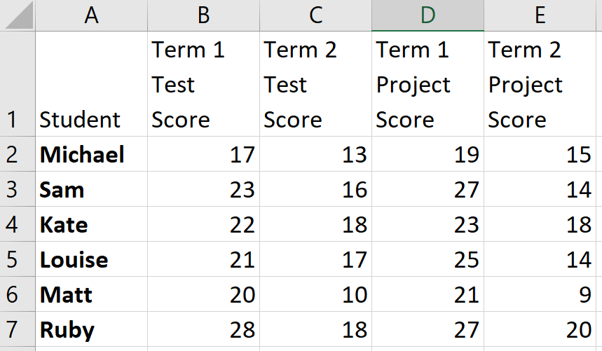
Example : The following spreadsheet shows the marks obtained by six students in a class:

In a spreadsheet such as this:
- Each cell is referred to by the column letter and row number. For example, ‘Matt’ is in cell \(\textrm{A}6\).
- ‘*’ stands for multiplication and ‘/’ stands for division
- Each formula starts with an equals sign
You can therefore use different cell references to perform different calculations. For example \(=\textrm{B}2 + \textrm{C}2\) is the formula for Michael’s total test score, while \(=(\textrm{B}4 + \textrm{D}4)/2\) gives Kate’s term \(1\) average score.
Once you have read through the example above, have a go at the following activity:
Probability
The probability of an event is the chance of it occurring. This is measured as a value between \(0\) and \(1\), where \(0\) indicates that the event can never occur, and \(1\) indicates that the event is certain. One of the simplest examples of probability is when a single coin is tossed. When this is done there are two possible outcomes; either a head is tossed or a tail is tossed. These outcomes are both equally likely, and hence the probability of tossing a head is \(\frac{1}{2}\) and the probability of tossing a tail is \(\frac{1}{2}\).
In general, to calculate the probability of an event occurring you just have to divide the number of outcomes in which the event occurs, by the total number of possible outcomes:
\[\frac{\textrm{Number of outcomes in which event occurs}}{\textrm{Total number of possible outcomes}}\]Finally, simplify the fraction if required (or state the probability as a decimal, depending on what is requested).
Example: What is the probability of rolling an even number when a die is rolled?
Solution: To calculate this consider that there are \(3\) outcomes in which an even number occurs (i.e. when a \(2\), \(4\) or \(6\) is rolled), and that there are \(6\) possible outcomes in total. So this gives a probability of \(\frac{3}{6}\), which should then be simplified to \(\frac{1}{2}\).
If the probability calculation is a bit more complex, you may need to create what is known as a sample space. This shows all the possible outcomes, and can be in the form of a list, a table or even a tree diagram (the latter is most helpful when the possible outcomes are not equally likely). Creating a sample space allows you to easily determine both the number of possible outcomes, and the number of outcomes in which the event occurs.
Example: What is the probability that when two dice are thrown the faces sum to \(7\)?
Solution: To calculate this you could create a sample space in the form of a table, as follows:
| 1 | 2 | 3 | 4 | 5 | 6 | |
|---|---|---|---|---|---|---|
| 1 | 1, 1 | 1, 2 | 1, 3 | 1, 4 | 1, 5 | 1, 6 |
| 2 | 2, 1 | 2, 2 | 2, 3 | 2, 4 | 2, 5 | 2, 6 |
| 3 | 3, 1 | 3, 2 | 3, 3 | 3, 4 | 3, 5 | 3, 6 |
| 4 | 4, 1 | 4, 2 | 4, 3 | 4, 4 | 4, 5 | 4, 6 |
| 5 | 5, 1 | 5, 2 | 5, 3 | 5, 4 | 5, 5 | 5, 6 |
| 6 | 6, 1 | 6, 2 | 6, 3 | 6, 4 | 6, 5 | 6, 6 |
From this we can see that there are \(6\) possible outcomes where the faces sum to \(7\), out of a total of \(36\) equally likely outcomes. So the probability of the faces summing to \(7\) is \(\frac{6}{36}\), which simplifies to \(\frac{1}{6}\).
Once you have worked through the examples above, have a go at the probability problems in the following activity: