Introduction to Stata
One of the first things you will likely be doing with your sample of data is analysing it using descriptive statistics. This page details some of the most common types of descriptive statistics you might need to use in Stata, organised according to the type of data (for more information on any of the descriptive statistics covered, visit the Descriptive statistics page of the Introduction to statistics module).
In brief, this page covers how to use Stata to do the following:
- Analyse data for one categorical variable
- Analyse data for one continuous variable
- Compare the mean of a continuous variable between different categories
- Establish whether there is an association between two categorical variables
- Establish whether there is a linear relationship between two continuous variables
Note that the examples covered here make use of the data described in the Getting started page of this module. If you want to work through the examples provided and haven’t already created this dataset, you can download it using the link below:
Also note that if you wish to save any of the output obtained from these examples, or any other output, you can create a log file.
Categorical data - one variable
A question you may wish to ask of the sample data is: How many respondents of each gender are there?
Categorical variables such as the ‘Gender’ variable can be analysed in this way using a frequency distribution table. To obtain one, you can make use of the tabulate command (which you can shorten to tab), as follows:
tab Gender
Note that you can also add an option to include any missing values in this table (if you think it will be useful to treat the missing data as a category rather than excluding it from the frequency and percentage calculations), by adding mi after a comma at the end of the command.
Your output should appear in the Results window, and should look like the following:
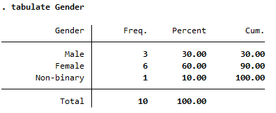
The columns to the right of the column of category names in this frequency distribution table are as follows:
- Freq.: shows how many of the sample are in each category. For example, the sample consists of 3 males.
- Percent: shows what percentage of the sample are in each category. For example, 60% of the sample are female.
- Cum.: gives the sum of all the percentages up to and including that row of the table. For example, 90% of the sample are either male or female.
Continuous data - one variable
A question you may wish to ask of the sample data is: What is the mean age of the respondents?
To obtain descriptive statistics (including the mean) for a continuous variable such as the ‘Age’ variable, you can make use of the summarize command (which you can shorten to sum), as follows:
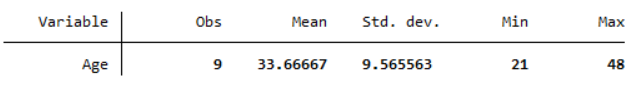
sum Age
Note that you can list multiple variables in this command, separated by a space, to obtain descriptive statistics for each as required. You can also add an option to include more statistics in the output (namely percentiles, variance, skewness and kurtosis), by adding detail after a comma at the end of the command.
Your output should appear in the Results window, and should look like the following:
While there is no single command in Stata to obtain the mode, if you would like to obtain this one option is to use the following commands:
preserve
contract Age
gsort -_freq
list Age _freq if _freq == _freq[1]
restore
Comparing means
A question you may wish to ask of the sample data is: How does the mean summer energy consumption of those with children compare to those without?
If you wish to compare the mean of a continuous variable (such as the ‘Summer_consumption’ variable) between different categories (such as for the ‘Children’ variable) you can do this using the tabstat command, as follows:
tabstat Summer_consumption, statistics(mean sd n) by(Children)
Your output should appear in the Results window, and should look like the following:
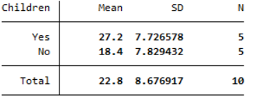
This output compares the mean, sample size and standard deviation for each category (although note you can include different statistics by adjusting the command as required). Based on this, we can see that the mean summer energy consumption of people with children in the sample is higher than the mean summer energy consumption of people without children.
If you would like to learn how to test whether differences such as this are statistically and/or practically significant in terms of the population, visit the Comparing means page of this module.
Categorical data - two variables
A question you may wish to ask of the sample data is: Is there an association between gender and desire to reduce energy consumption in the sample?
You can establish how many people of each gender there are in the sample, and how many people have different feelings about reducing energy consumption, using separate frequency distribution tables (as detailed in the Categorical data - one variable section of this page). With frequency distribution tables for the two variables separately, though, it is not possible to find out how many of each gender have different feelings about reducing consumption. To do this you need a cross-tabulation (or contingency table) instead, with categories for the independent variable (‘Gender’) in the rows, and categories for the dependent variable (‘Consumption_reduction’) in the columns (you can learn more about independent and dependent variables in the Data and variable types page of the Introduction to statistics module).
To do this for the ‘Gender’ and ‘Consumption_reduction’ variables you can use the tabulate command again (which you can shorten to tab), this time with both variables, as follows:
tab Gender Consumption_reduction
Note again that you can include any missing values in this table by adding mi after a comma at the end of the command.
Your output should appear in the Results window, and should look like the following:
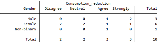
From this table you can see the number of people who are in each combination of categories; for example, there were two males and one female who strongly agreed that they wanted to reduce their energy consumption.
Usually in a report though it is not sufficient to just specify these frequencies, and percentages are used instead (or in addition). Stata can include these in the table too, by adding one or more options after a comma. In particular, you can add the row option to include percentages of the row total, the column option to include percentages of the column total, and the cell option to include percentages of the overall total. In addition, you can add the expected option to include expected frequencies
For example, the following command will include both row percentages and expected frequencies:
tab Gender Consumption_reduction, row expected
Your output should appear in the Results window, and should look like the following:
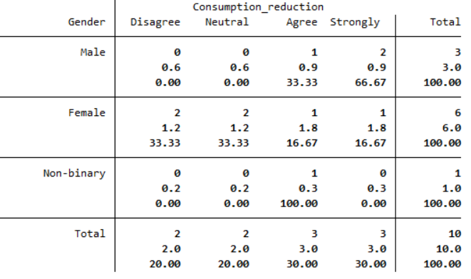
From this table you can see the percentage of people of each gender who have different levels of agreement. For example, the 2 males who strongly agree equates to 66.67% of males in the sample, while the 1 female who strongly agrees equates to 16.67% of females in the sample. Note that if you would prefer to show, for example, what percentage of those who strongly agree are male and female, you would need to include column percentages instead.
The other values that have been included in this table are the expected counts. These provide an indication of whether there is an association between the variables in the sample, and in particular the closer the expected and the actual frequencies are to each other, the less likely it is that there is an association between them (for more information on expected frequencies see the Descriptive statistics page of the Introduction to statistics module). With such a small sample size in this example this is not really relevant, but if the current discrepancies continued with a larger sample (for example, over double the number of males who strongly agreed than expected) then it would provide an indication that there is some sort of association between gender and level of agreement.
If you would like to learn how to test whether an association is statistically and/or practically significant in terms of the population, visit the Assessing relationships page of this module.
Continuous data - two variables
A question you may wish to ask of the sample data is: Is there a linear relationship between summer and winter energy consumption in the sample?
Pearson’s correlation coefficient can be used to establish the strength and direction of a linear relationship (or lack of) between two continuous variables in a sample, for example the ‘Summer_consumption’ and ‘Winter_consumption’ variables. You can do this using the correlate command, as follows:
correlate Summer_consumption Winter_consumption
Your output should appear in the Results window, and should look like the following:
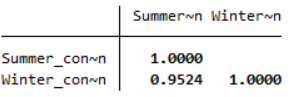
This table displays the correlation of each selected variable with every other selected variable (in this case there are only two, but note that more variables can be selected). This means that the diagonal just shows the correlation of each variable with itself, which can be ignored. The other value shows that Pearson’s correlation coefficient for the ‘Summer_consumption’ and ‘Winter_consumption’ variables is .9524, indicating that there is a strong positive linear correlation between summer and winter energy consumption (for more information on correlation see the Descriptive statistics page of the Introduction to statistics module).
If you would like to learn how to test whether linear correlation is statistically and/or practically significant in terms of the population, visit the Assessing relationships page of this module.