Presentations
The most common form of presenting is speaking about a topic and creating a set of slides to go with it, usually referred to as a PowerPoint presentation as the Microsoft Office program PowerPoint is generally used to create the slides.
There are multiple programs that you can use to make your slides. Two of these are Microsoft PowerPoint and Adobe Express, both of which are free for you to download as a Curtin student. Should you wish to utilise other tools, Canva also has a free version and can create some lovely slides.
In brief:
- Consider how to make your slides clear, simple, and accessible.
- Ensure you are using in-text citations and references, just like any other assessment.
- When creating a poster, include all the necessary elements.
- Keep your poster engaging and easy to follow without overcrowding it.
Slides
Creating effective slides can greatly impact how engaged your audience is with your presentation. Some considerations you should keep in mind when creating your slides are:
- Limit the amount of text on each slide. Don’t write your entire presentation onto your slides, just the key points. These don’t need to be full sentences, they can be in dot point form.
- Each slide should only cover one main message.
- Use a clear font. Sans serif fonts, like Arial and Calibri, are generally considered easy to read. And make sure to use a large font size; your text and any visuals must be visible from the back of the room.
- Check your spelling and grammar, then have someone else check it!
- Include white/empty space on your slides, try not to cram too much onto each slide.
- Avoid busy backgrounds and fluorescent colours as this might make your text hard to read, particularly for people with visual impairment or some neurodivergence.
- Use animations sparingly. Only include them if it adds to your presentation content or makes a point, do not use animation just to ‘make things interesting’ as they can be very distracting for the audience.
- Don’t have too many slides. You should have just enough to stick to your time limit while speaking at a steady, easy to follow pace.
- Try and use images or diagrams to illustrate your point rather than text.
- When including visuals, don’t use too many – maybe 1 to 3 per slide, depending on whether you are using text or visuals to make your point.
- Choose a theme or a ‘look’ for your slides and stick to it throughout your presentation, including using the same font and font sizes across slides.
- When choosing colours for text, ensure they are bold and easy to see, but not incredibly bright as that may distract or be overwhelming to some of your audience.
- Similarly, don’t use colour alone to represent something, because people with colour-blindness may not be able to discern your meaning. Instead of just highlighting a word in green, for example, put a green box around it - so at least everyone can see and understand the box, even if they cannot see that it is green.
Below is an example of an effective slide. It uses both white space and a relevant image effectively while getting the point across with minimal text that can be fleshed out in the presenter’s speech.
You can find more information on how to create slides through TED and their in-house expert.
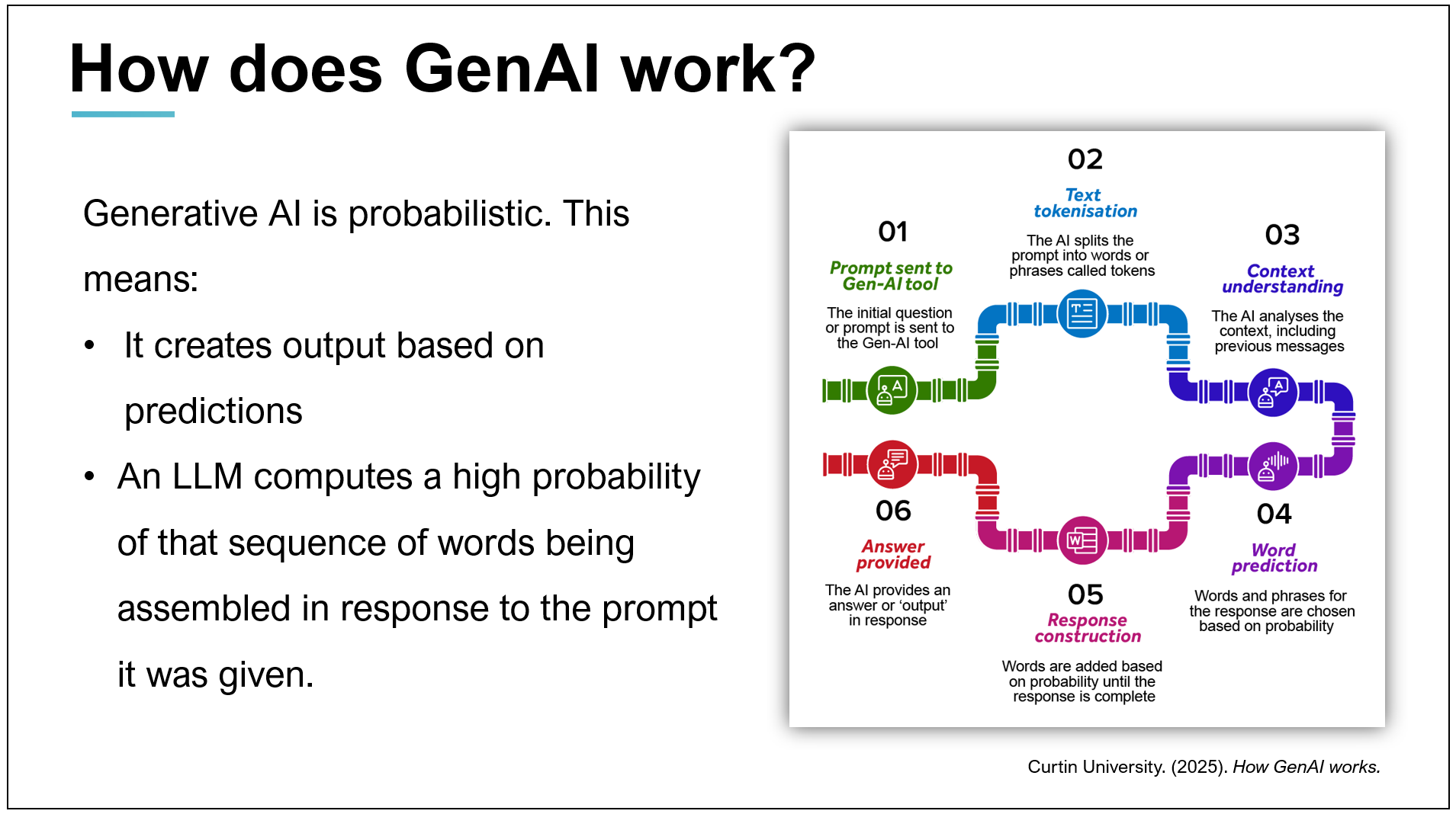
If your Unit Coordinator allows the use of GenAI, there a number of programs that can assist you to create your slides. Check the GenAI page and Curtin’s GenAI guidance for more information on how to use GenAI at Curtin appropriately. And as with all GenAI use, if you do use it to assist you make sure you consider any potential copyright issues, accuracy and bias within the output. In particular, GenAI images are problematic. They can be biased, culturally unsafe for certain groups, often contain errors, and can look bland and generic.
Finding and referencing images
As with any source in your assessments, when using images for your presentations and you will need to reference them on your slides. You will also need to acknowledge your sources using in-text citations on your slides and include a slide or section showing your reference list at the end. Copyright and plagiarism can be avoided while creating striking and engaging presentations by educating yourself around open access images and appropriate referencing. Free images that are creative commons licenced are available, you should read the Library’s Copyright guide for further information and suggestions. NapkinAI is a GenAI tool that produces professional-looking graphics (rather than realistic pictures) to represent your data/points, however as mentioned above, be sure you are allowed to use GenAI and if you choose to create GenAI pictures, double check them for accuracy, bias, copyright issues, creativity and relevance to your topic.
Other images might be found in your text books or journal articles, and must all be cited (or ‘in-text referenced’) on the slide on which they appear, and in the reference list. Use all images according to copyright permissions and/or exceptions.
Each of our referencing guides has information about how to include in-text citations and how to reference images and tables. Find your appropriate reference style guide and follow the instructions on referencing tables and figures with a good attention to detail.
Posters
A presentation with a poster means you have been asked to present on a topic and create a poster or infographic to go with your presentation. Creating a great research or conference poster is about clearly communicating your findings, not just grabbing attention. Unlike advertising posters, which aim to persuade or sell, research posters are designed to inform and explain, often to an academic audience.
Thoughtfully designing your poster will help to enhance your presentation. There are five key elements you should include in your research poster to ensure it is both professional and engaging.
Keep this short to save space, as you will be talking through this, and your audience may already know a lot about the topic, so a full background summary may not be necessary.
Focus on what’s novel or critical to your study/assessment topic. Use images to help convey the methods so that you can use less text.
Focus on only the most important findings of your study or the most important thoughts you had/information you researched around the assessment topic. Keep it short. You can discuss this further verbally.
This is where you interpret results or findings from your readings, discuss relationships and your own ideas and how they relate to what’s already in the literature. Bullet points are effective for presenting your key take-away points.
Summarise your ideas/study with their implications. A diagram illustrating your conclusions can also be effective here. When presenting, finish by inviting the audience to ask questions. Ensure you are well-read on the topic and have considered possible questions. For more guidance read through the section on managing questions.
You should also include contact details, such as an email address, people can use to get in contact with you. You may also like to include a QR code that links to further reading or more information about your research.
Designing your poster
Your poster should be visually engaging without being confusing to your audience. It is easy to get distracted by different sections on a poster, but there are ways to help your audience navigate the information you are presenting and ensure you get your point across. When creating your poster consider:
Your font and the colour should match the mood of your poster and topic. They should also be readable; remember your poster will be up on a wall or displayed on a screen. Use a sans serif typeface (Arial, Helvetica, etc.) for improved readability, and avoid extremely bright colours and background images behind the text.
Your title will be the focal point of your poster and will set the tone you wish to convey. It should quickly orient the audience without being too distracting. It should also be large and eye-catching, but without taking up too much space.
Different sections within your poster should be clear and easy to read and locate, while also having a logical order or flow to them. Whether you have them in a structured order one after the other, in a more visual mind-map or network formation, or constructed in any other way, ensure it is clear which areas are connected and how.
As with a slide deck, you should endeavour to use visual representations of your information where possible; this will enhance your audience’s understanding and retention of and interest in your talk. For posters, a suggested text-to-visuals ratio guide is about 50% text and 50% visuals.
While you want to include all your relevant information, make sure you don’t overcrowd your poster. Remember to leave some empty/white space as overcrowding can make the poster difficult to read and understand.
Getting an outsider’s perspective can be valuable with any of your work, but especially with a poster. Before you print your poster, have someone look at your design and give you feedback on the colours, the clarity, your images, and the readability, including the flow of your information. Also, have someone proof-read it all, including checking referencing, prior to printing (so that you don’t waste time and money printing it twice!)
For more information, read through TECHE’s blog on effective poster development.
There are many examples of posters and templates available online, however even bad posters get published. Now that you know what to look out for it’s up to you to determine which are good examples. Some good examples include
- Daisy Shearer’s poster of their research on Considerations for open practices in quantum technologies research presented at Inaugural University of Surrey Annual Open Research Lecture poster session (2022)
- Nicola Rivers’ presentation poster on using escape rooms in teaching and assessment presented at Monash University Learning and Teaching Conference poster session (2025).
For more information about design, have a look at these slides developed by Curtin University Library staff: Graphic design basics