Introduction to Stata
This page details how you can create and edit some simple graphs in Stata. For further information on selecting the right graphs to display data, or on how to interpret the different graphs, see the Descriptive statistics page of the Introduction to Statistics module.
In brief, this page covers how to do the following using commands in Stata:
- how to create various graphs using Stata commands
- how to name and save your graphs in Stata
- how to edit your graphs using commands or the Graph Editor
Note that the examples covered here make use of the data described in the Getting started page of this module. If you want to work through the examples provided and haven’t already created this dataset, you can download it using the link below:
Also note that if you wish to save any of the output obtained from these examples, or any other output, you can create a log file.
Creating graphs
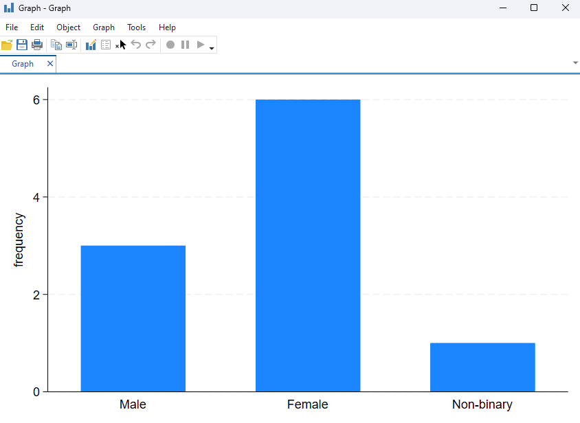
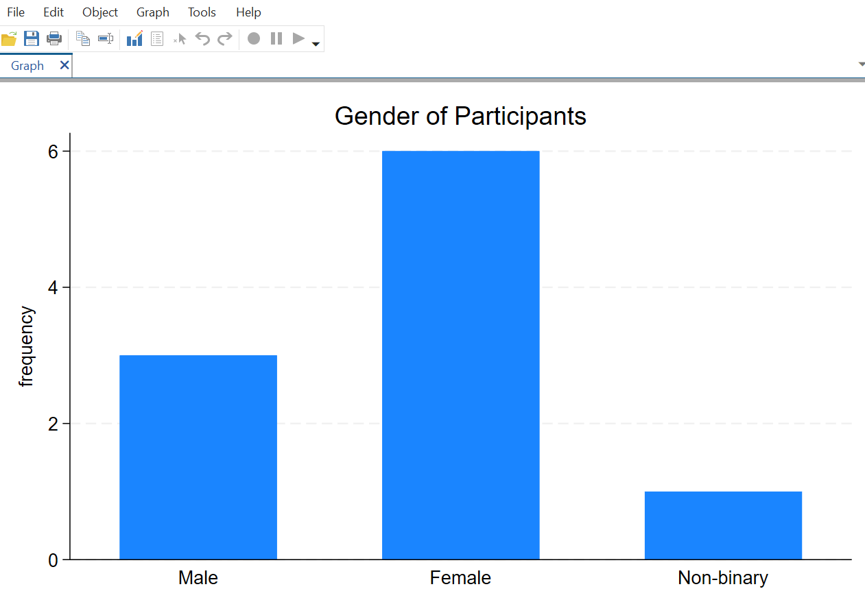
To create a bar chart, or bar graph, of one variable use the graph command as follows:
graph bar (count), over(Gender)
This will create a bar graph which will display in a separate Graph window. The chosen variable will be on the x-axis, and the frequency of each option will be on the y-axis as shown:
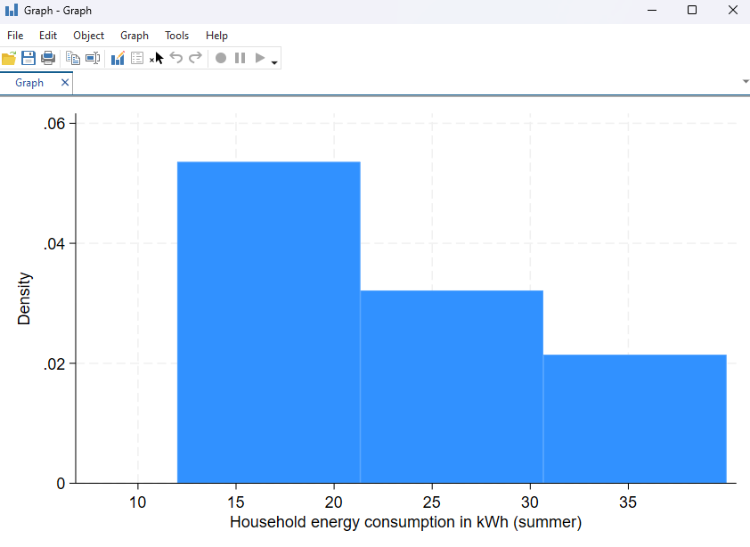
To create a histogram of a continuous variable use the histogram command:
histogram Summer_consumption
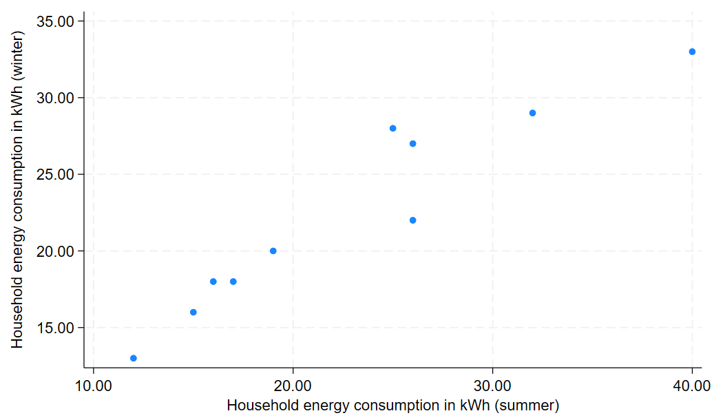
To create a scatterplot use the command scatter along with the two variables you wish to plot. Note that the variable to go on the y-axis should be written first, followed by the x-axis variable. For example, the following command produces the scatterplot shown:
scatter Winter_consumption Summer_consumption
You can also add a line of best fit to your scatterplot by using the twoway command to overlay a line of best fit. When you do this, it is recommended to remove the legend so that it doesn’t interfere with the graph width, as follows:
twoway scatter Winter_consumption Summer_consumption || lfit Winter_consumption Summer_consumption, legend(off)
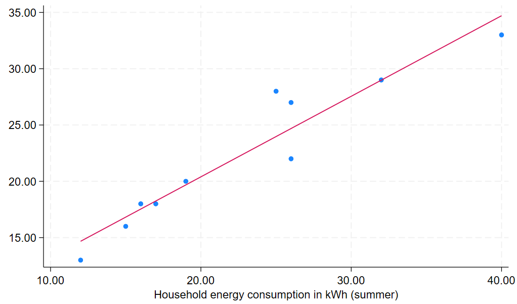
You may find that adding the line of best fit in this way means that the title no longer displays on the y-axis, as shown, but note you can fix this by adding an option to the command to edit the title.
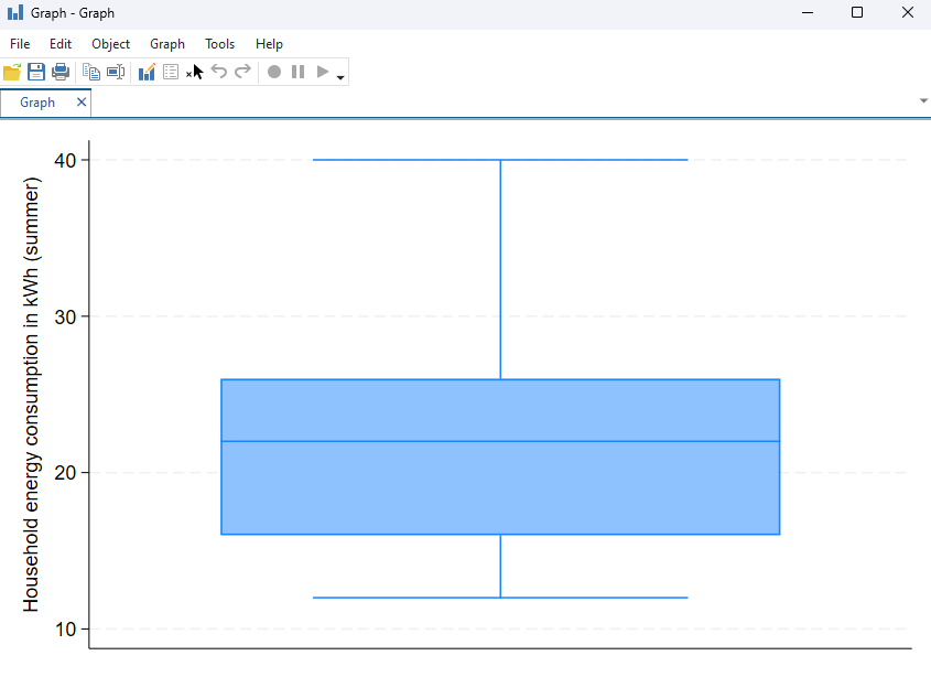
To create a box-and-whisker plot use the graph command with box:
graph box Summer_consumption
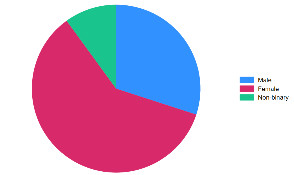
To create a pie chart use the graph command with pie:
graph pie, over(Gender)
Naming and saving graphs
When working with graphs in Stata, each new graph automatically replaces the previous one unless you name or save it. Naming a graph allows you to refer back to it later within the same session, while saving a graph creates a permanent file on your computer that you can reopen or use outside of Stata. You can do one or both of these as required.
To name the previously created bar chart, for example, you can make use of the name command. When doing this, adding replace means that any previous graph in the session with the same name will be overwritten. If you don’t want this to happen you can omit it, however note that if you run the same command again it will produce an error message:
graph bar (count), over(Gender) name(barchart_gender, replace)
Once you have named your graph you can display it at a later time using the graph display command. For example:
graph display barchart_gender
When your graph is open in the Graph window, either immediately after you create it or after using the graph display command, you can export it using the graph export command. When you use this command you’ll need to specify a name for the image file you’re creating, which generally will be the same as the name you have already assigned it in Stata (if you have done this) but doesn’t have to be. For example, the following command will export the previously created bar chart and will give it the same name as it was assigned in Stata:
graph export "barchart_gender.png"
Note that the graph exported using this command will automatically be saved in the working directory, and that if you want it to be saved in a different location you will need to specify the file path as part of the command. If you want to create a new folder within your working directory to save your graphs you can do this, you will just need to create the folder first. For example, the following commands will save the bar chart in a new folder called Graphs:
mkdir Graphs
graph export "Graphs/barchart_gender.png"
You can also save your graph using the File > Save option in the Graph window.
Editing graphs
There a number of commands that allow you to edit your graphs. It is recommended that you name and save your graphs as you go so that it is easier for you to edit the graph you want to edit without having to retype all of your previous commands.
You can add a title to your graph using the title command. For example, to give the bar graph the title Gender of Participants we would use the following command (note the title is in brackets but also in quotation marks.):
graph barchart_gender title("Gender of Participants")
When adding a title to a histogram, a comma is required after the title command. For example:
histogram Summer_consumption, title("Energy Consumption in Summer")
You can also specify the names to be displayed on the x- and y-axes of your graph, this time using the xtitle and ytitle commands. For example, the following will add different axis titles to the previously created scatterplot with line of best fit:
twoway scatter Winter_consumption Summer_consumption || lfit Winter_consumption Summer_consumption, xtitle("Energy consumption in summer") ytitle("Energy consumption in winter") legend(off)
Graph editor
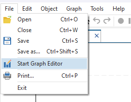
You can also use the Graph Editor to edit your graph. In the Graph window, click on File and then Start Graph Editor.
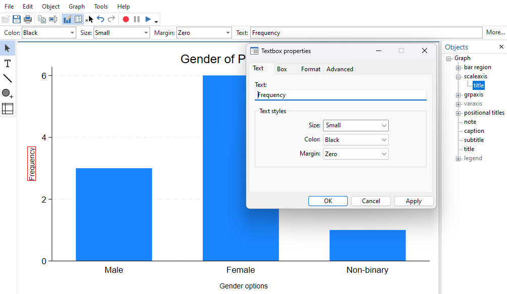
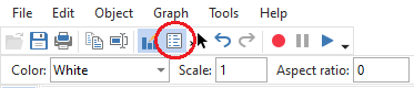
You should now see a list of objects on the right hand side. If you can’t see the list of objects, click on the small icon of a white box with blue lines.
You can use this list to change the look of your graph, including adding titles to your axes. Click on the small plus sign next to each object option to see the changes you can make. For example, using our bar chart from earlier, clicking on the plus sign next to scaleaxis (the vertical or \(y\) axis) shows the option title. To change the title of this axis, double click on title, and enter the text into the text box. You can also make any other changes you’d like to make in this pop up, including the size and colour of the text, as well as the position of the text (in the Format tab). The grpaxis or group axis refers to the horizontal or \(x\) axis.