Introduction to SPSS
One of the first things you will likely be doing with your sample of data is analysing it using descriptive statistics. This page details some of the most common types of descriptive statistics you might need to use in SPSS, organised according to the type of data (for more information on any of the descriptive statistics covered, visit the Descriptive statistics page of the Introduction to statistics module).
In brief, this page covers how to use SPSS to do the following:
- Analyse data for one categorical variable
- Analyse data for one continuous variable
- Compare the mean of a continuous variable between different categories
- Establish whether there is an association between two categorical variables
- Establish whether there is a linear relationship between two continuous variables
Note that the examples covered here make use of the data described in the Getting started page of this module. If you want to work through the examples provided and haven’t already downloaded this data, you can do so using the link below:
Before commencing the analysis, note that the default is for dialog boxes in SPSS to display any variable labels, rather than variable names. You may find this helpful, but if you would prefer to view the variable names instead then from the menu choose:
- Edit
- Options…
- Change the Variable Lists option to Display names.
Also note that if you wish to save any of the output obtained from these examples, or any other output, you will need to save it as a .spv file (in addition to the .sav data file) by selecting File and Save As… from the Output window.
Categorical data - one variable
A question you may wish to ask of the sample data is: How many respondents of each gender are there?
Categorical variables such as the ‘Gender’ variable can be analysed in this way using a frequency distribution table. To obtain one, choose the following from the SPSS menu:
- Analyze
- Descriptive Statistics
- Frequencies…
- Click on the appropriate variable required for the analysis, in this case ‘Gender’
- Click on the arrow head to move it into the right hand box
- Click on OK
Your output should appear in the SPSS Output window, and should look like the following:
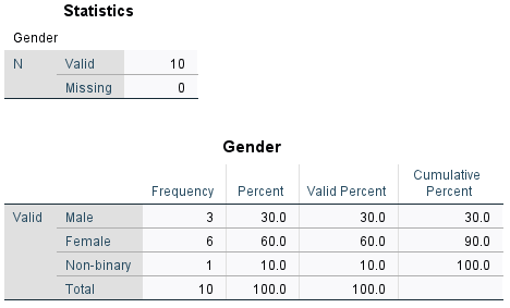
The first table of output simply shows how much data has been analysed (only 10 cases in this small sample, with no missing data for the variable), while the second table is the frequency distribution table. The columns to the right of the column of category names are as follows:
- Frequency: shows how many of the sample are in each category. For example, the sample consists of 3 males.
- Percent: shows what percentage of the sample are in each category. For example, 60% of the sample are female. Note that this column also allocates a percentage for any missing data. If you do have missing data, you can decide whether it is more useful for you to treat the missing data as its own category, and hence use this percentage, or whether you want to ignore the missing data and use the Valid Percent.
- Valid Percent: shows what percentage of the sample are in each category. For example, 10% of the sample are non-binary. Note that this column does not allocate a percentage for any missing data, and only takes into account ‘valid’ (non-missing) categories. If you do have missing data, you can decide whether it is more useful for you to ignore the missing data and hence use this percentage, or whether you want to treat the missing data as its own category and use the Percent.
- Cumulative Percent: gives the sum of all the percentages up to and including that row of the table. For example, 90% of the sample are either male or female.
Continuous data - one variable
A question you may wish to ask of the sample data is: What is the mean age of the respondents?
To obtain descriptive statistics (including the mean) for a continuous variable such as the ‘Age’ variable, choose the following from the SPSS menu (either from the Data Editor or Output window):
- Analyze
- Descriptive Statistics
- Descriptives…
- Click on the appropriate variable required for the analysis, in this case ‘Age’
- Click on the arrow head to move it into the right hand box
- Click on OK
Your output should appear in the SPSS Output window, and should look like the following:
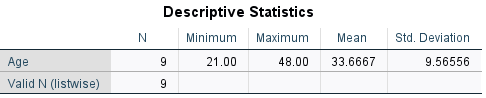
This table shows that 9 pieces of data have been analysed, as the missing data has been ignored. For these 9 people, we can see that the mean age is 33.67 (rounded to two decimal places).
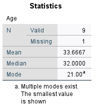
Alternatively, you can also obtain descriptive statistics for a continuous variable using the Frequencies procedure detailed in the Categorical data - one variable section of this page. Do this by clicking on the Statistics… button in the Frequencies dialog box (after selecting the variable), ticking the required boxes (for example Mean , Median and Mode) and clicking Continue. It is then also a good idea to untick the Display frequency tables box in the Frequencies dialog box before selecting OK, as generally a frequency table is not required for a continuous variable. Doing it this way will enable you to have the mean, median and mode displayed together, as follows:
Finally, you can also obtain more comprehensive descriptive statistics using the Explore… procedure instead if required. Use of this is covered in the The normal distribution page of this module.
Comparing means
A question you may wish to ask of the sample data is: How does the mean summer energy consumption of those with children compare to those without?
If you wish to compare the mean of a continuous variable (such as the ‘Summer_consumption’ variable) between different categories (such as for the ‘Children’ variable) you can do this using the Compare Means procedure. To do this, choose the following from the SPSS menu (either from the Data Editor or Output window):
- Analyze
- Compare Means (or Compare Means and Proportions)
- Means…
- Click on the continuous variable required for the analysis, in this case ‘Summer_consumption’
- Click on the arrow head to move it into the Dependent List
- Click on the categorical variable required for the analysis, in this case ‘Children’
- Click on the arrow head to move it into the Independent List
- Click on OK
Your output should appear in the SPSS Output window, and should look like the following:
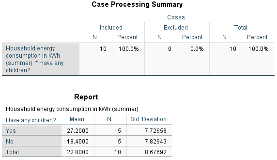
The first table of output simply shows how much data has been analysed (10 cases), while the second table compares the mean, sample size and standard deviation for each category. Based on this, we can see that the mean summer energy consumption of people with children in the sample is higher than the mean summer energy consumption of people without children.
If you would like to learn how to test whether differences such as this are statistically and/or practically significant in terms of the population, visit the Comparing means page of this module.
Categorical data - two variables
A question you may wish to ask of the sample data is: Is there an association between gender and desire to reduce energy consumption in the sample?
You can establish how many people of each gender there are in the sample, and how many people have different feelings about reducing energy consumption, using separate frequency distribution tables (as detailed in the Categorical data - one variable section of this page). With frequency distribution tables for the two variables separately, though, it is not possible to find out how many of each gender have different feelings about reducing consumption. To do this you need a cross-tabulation (or contingency table) instead, with categories for the independent variable (‘Gender’) in the rows, and categories for the dependent variable (‘Consumption_reduction’) in the columns (you can learn more about independent and dependent variables in the Data and variable types page of the Introduction to statistics module).
To do this for the ‘Gender’ and ‘Consumption_reduction’ variables, choose the following from the SPSS menu (either from the Data Editor or Output window):
- Analyze
- Descriptive statistics
- Crosstabs…
- Click on the variable to be included in the rows of the table, in this case ‘Gender’
- Click on the arrow head to move it into the Row(s) box
- Click on the variable to be included in the columns of the table, in this case ‘Consumption_reduction’
- Click on the arrow head to move it into the Column(s) box
- Click on OK
Your output should appear in the SPSS Output window, and should look like the following (note that the Case Processing Summary has been omitted):
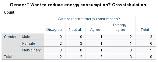
From this table you can see the number of people who are in each combination of categories; for example, there were two males and one female who strongly agreed that they wanted to reduce their energy consumption.
Usually in a report though it is not sufficient to just specify these frequencies, and percentages are used instead (or in addition). SPSS can include these in the table too, by selecting a few additional options. To do this, choose the following from the SPSS menu (either from the Data Editor or Output window):
- Analyze
- Descriptive statistics
- Crosstabs…
- The variables should still be in their respective boxes, but if not use the arrows to move them across
- Click on the Cells… button
- Select the appropriate percentages in the Cell Display dialogue box that opens; choices are Row (which will display the percentage agreement breakdown for each gender), Column (which will display the percentage gender breakdown for each level of agreement) and Total (which calculates each frequency as a percentage of the total sample)
- Click on Expected under Counts (keep Observed selected as well)
- Click on Continue
- Click on OK
Your output should appear in the SPSS output file, and should look like the following (note that only the Row percentage was selected for this example):
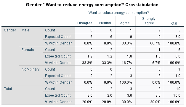
From this table you can see the percentage of people of each gender who have different levels of agreement. For example, the 2 males who strongly agree equates to 66.7% of males in the sample, while the 1 female who strongly agrees equates to 16.7% of females in the sample. Note that if you would prefer to show, for example, what percentage of those who strongly agree are male and female, you would need to include Column percentages instead.
The other values that have been included in this table are the Expected Counts. These provide an indication of whether there is an association between the variables in the sample, and in particular the closer the expected and the actual frequencies are to each other, the less likely it is that there is an association between them (for more information on expected frequencies see the Descriptive statistics page of the Introduction to statistics module). With such a small sample size in this example this is not really relevant, but if the current discrepancies continued with a larger sample (for example, over double the number of males who strongly agreed than expected) then it would provide an indication that there is some sort of association between gender and level of agreement.
If you would like to learn how to test whether an association is statistically and/or practically significant in terms of the population, visit the Looking for relationships page of this module.
Continuous data - two variables
A question you may wish to ask of the sample data is: Is there a linear relationship between summer and winter energy consumption in the sample?
Pearson’s correlation coefficient can be used to establish the strength and direction of a linear relationship (or lack of) between two continuous variables in a sample. To do this for the ‘Summer_consumption’ and ‘Winter_consumption’ variables, choose the following from the SPSS menu (either from the Data Editor or Output window):
- Analyze
- Correlate
- Bivariate…
- Select both variables (e.g. ‘Summer_consumption’ and ‘Winter consumption’) by holding down the Shift key
- Click on the arrow head to move them into the Variables box
- Click on OK
Your output should appear in the SPSS Output window, and should look like the following:
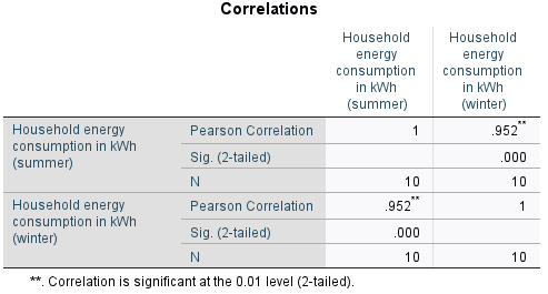
This table displays the correlation of each selected variable with every other selected variable (in this case there are only two, but note that more variables can be selected). This means that one diagonal just shows the correlation of each variable with itself, which can be ignored. The other diagonal contains duplicate data, and you only need to interpret one of the cells. Looking at the cell in the top right, for example, shows that Pearson’s correlation coefficient for the ‘Summer_consumption’ and ‘Winter_consumption’ variables is .952, indicating that there is a strong positive linear correlation between summer and winter energy consumption (for more information on correlation see the Descriptive statistics page of the Introduction to statistics module).
If you would like to learn how to test whether linear correlation is statistically and/or practically significant in terms of the population, visit the Looking for relationships page of this module.