Introduction to SPSS
This page details how you can create and edit some simple charts in SPSS. For further information on selecting the right chart to display data, or on how to interpret the different charts, see the Descriptive statistics page of the Introduction to statistics module.
In brief, this page covers how to do the following in SPSS:
- Use the Chart Builder to create charts including a bar chart and scatterplot
- Use the Chart Editor to edit a chart
- Create a chart from an existing frequency table
Alternatively, for information about creating some of the same charts using the Frequencies or Explore procedures instead, see the Descriptive statistics page of this module (follow the instructions for using the Frequencies procedure, then select Charts… from the Frequencies dialogue box and choose the appropriate chart) or the The normal distribution page of this module respectively.
Note that the examples covered here make use of the data described in the Getting started page of this module. If you want to work through the examples provided and haven’t already downloaded this data, you can do so using the link below:
Before commencing the analysis, note that the default is for dialog boxes in SPSS to display any variable labels, rather than variable names. You may find this helpful, but if you would prefer to view the variable names instead then from the menu choose:
- Edit
- Options…
- Change the Variable Lists option to Display names.
Also note that if you wish to save any of the output obtained from these examples, or any other output, you will need to save it as a .spv file (in addition to the .sav data file) by selecting File and Save As… from the Output window.
Using the Chart Builder
To produce a chart using the Chart Builder, choose the following from the SPSS menu (either from the Data Editor or Output window):
- Graphs
- Chart Builder…
- A box will appear with the warning that variables should have the correct settings; click on OK
The dialogue box that opens up shows the different types of charts that can be created. If you are not sure of what you want, you can look through all the types under Gallery and make an informed decision. The large white rectangular area (the Chart preview area) is where the graph is built. Whilst it won’t reflect your actual data, it will give an approximation of the final product.
The remainder of this section details how to create two different kinds of charts; a bar chart and a scatterplot. Other charts (e.g. pie charts for categorical variables and histograms or box plots for continuous variables) can be created in a similar way.
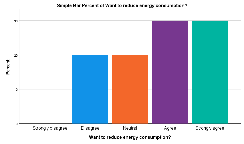
Creating a bar chart (column graph)
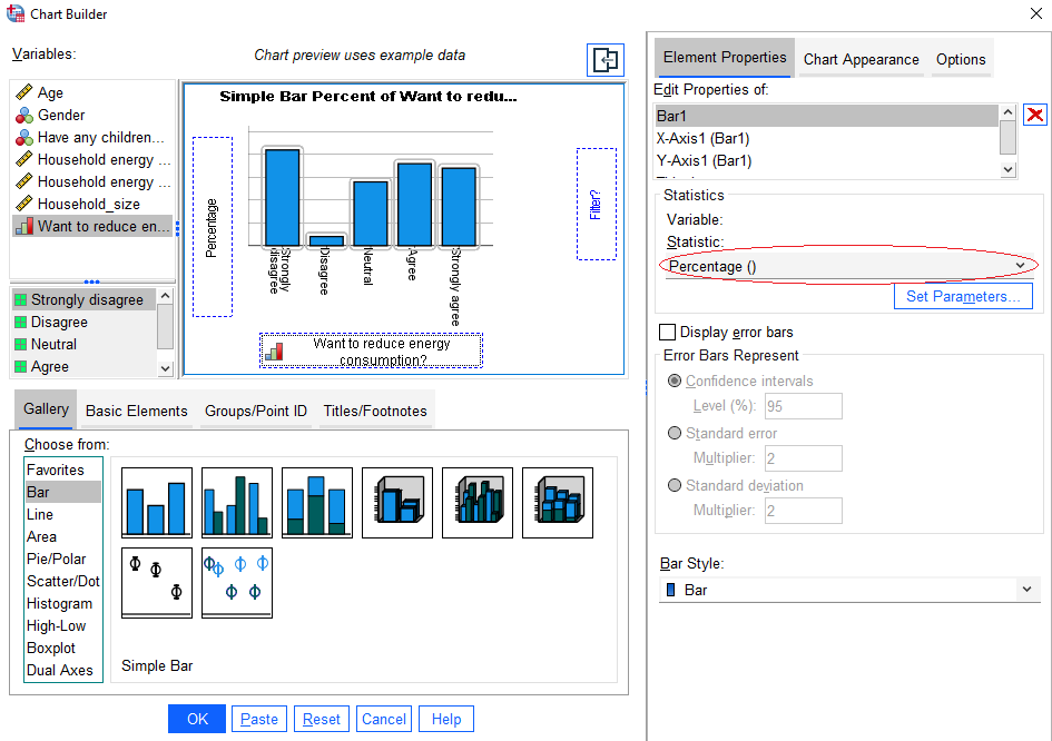
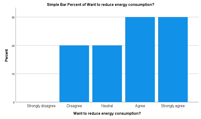
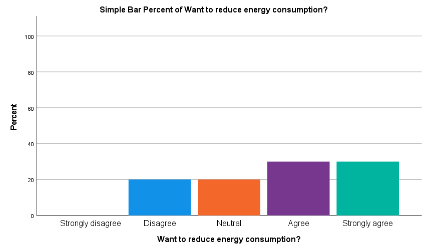
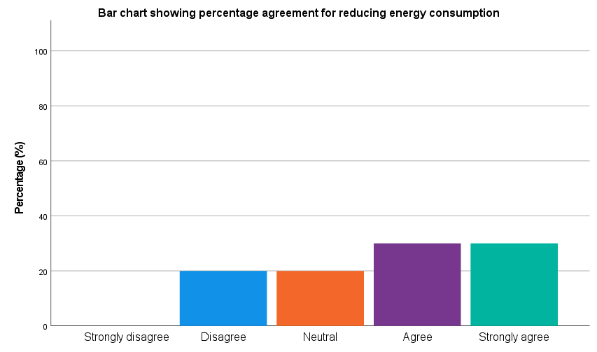
To create a simple one-dimensional bar chart (column graph) to display data for a categorical variable, for example ‘Consumption_reduction’, do the following in the Chart Builder dialogue box:
- click on the first image (Simple Bar) and drag it up to the Chart preview area
- click on the variable in the list, in this case ‘Consumption_reduction’
- drag and drop it into the X-Axis panel
The Y-Axis will then automatically update to display the count of the number of people in each category, but to change this to something else (for example percentages) do the following:
- click the drop down arrow in the Statistics area of the Element Properties box and change it to Percentage (circled in red below)
The Chart Builder dialogue box should look as follows:
Once you are happy with the settings, click on OK. Your chart should appear in the SPSS Output window, and should look like the following:
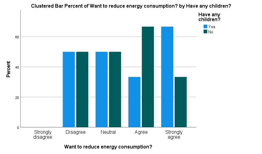
Note that if you wish to create a clustered or stacked bar chart to visualise data for two categorical variables, you should choose the Clustered Bar or Stacked Bar image from the bottom of the Chart Builder dialogue box instead, drag it up to the Chart preview area and then choose one variable to drag to the X-Axis panel (the ‘Consumption_reduction’ variable again for example), and another variable to drag to the Cluster on X: set color panel (the ‘Children’ variable for example).
You can change the Y-Axis to display percentages again if wished, but if you do this you may also like to click on the Set Parameters box (which is only clickable if you do make the change to percentages), and select Total for Each X-Axis Category (so that the chart displays the percentage breakdown for each category, rather than for the whole data set).
Doing this for a clustered bar chart will result in the following:
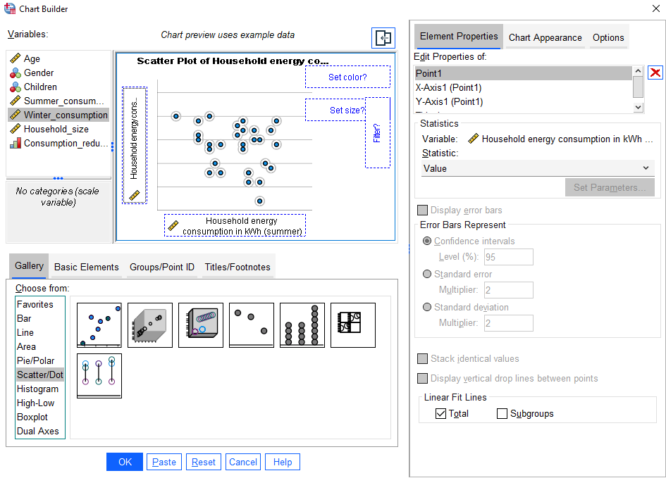
Creating a scatterplot
To create a scatterplot to visualise the relationship between two continuous variables, for example ‘Summer_consumption’ and ‘Winter_consumption’, do the following in the Chart Builder dialogue box:
- click on Scatter/Dot in the Gallery list
- click on the first image (Scatter Plot) and drag it up to the Chart preview area
- click on the independent variable (in this case it could be either, but choose ‘Summer_consumption’) and drop it into the X-Axis panel
- click on the dependent variable (in this case it could be either, but choose ‘Winter_consumption’) and drop it into the Y-Axis panel
- if you want to include the line of best fit on the scatterplot, select Total in the Element Properties box (at the bottom, underneath the Linear Fit Lines heading)
The Chart Builder dialogue box should look as follows:
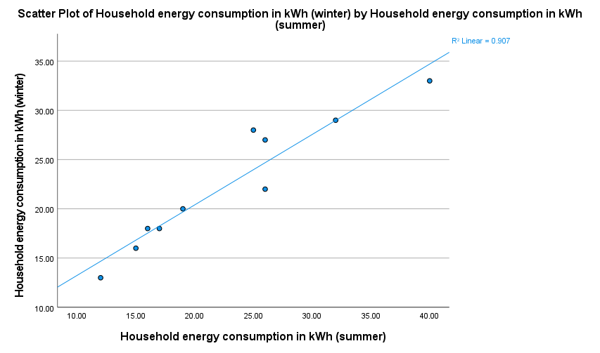
Once you are happy with the settings, click on OK. Your chart should appear in the SPSS Output window, and should look like the following:
Once you have created a chart you can always edit it in the Chart Editor before copying or exporting it, as detailed in the following section.
Using the Chart Editor
You can edit any chart that you create by double clicking on it to open the Chart Editor. For example, you may like to change the colours, scale, and titles used in the chart. How to do this is detailed below, with the ‘Consumption_reduction’ bar chart used as an example.
Changing colours
To change the colours used in a chart, for example the bar colours in the ‘Consumption reduction’ bar chart, do the following:
- double click on the relevant area in the chart (for example, one of the bars)
- click on the Fill and Border tab of the Properties dialogue box
- click on the colour you want
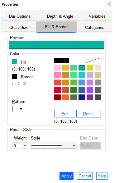
Once you are happy with your selection, click Apply and then Close the dialogue box.
Alternatively, if you want to change the colours of the bars separately, click once on one of the bars so that all bars are selected, and then click again so that only that bar is selected (alternatively, you may only need to click once on a bar for it to be selected in isolation). Then double click the bar and continue the process in the Properties dialogue box as detailed above, repeating it for other bars as required. For example, you could edit your bar chart colours as follows:
Changing the scale
To change the scale used on a graph, for example to increase the y-axis scale to 100 on the ‘Consumption reduction’ bar chart, do the following:
- double click on the relevant axis (for example, the y-axis)
- adjust the values in the Scale tab as required - for example increase the Maximum value to 100
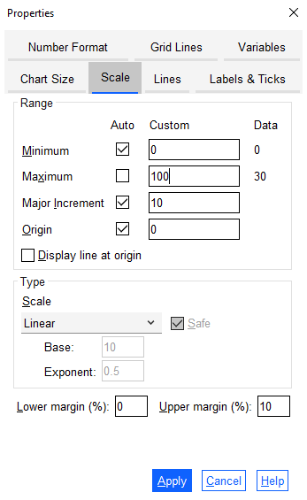
Once you are happy with your selection, click Apply and then Close the dialogue box. Your chart should look like the following:
Editing titles
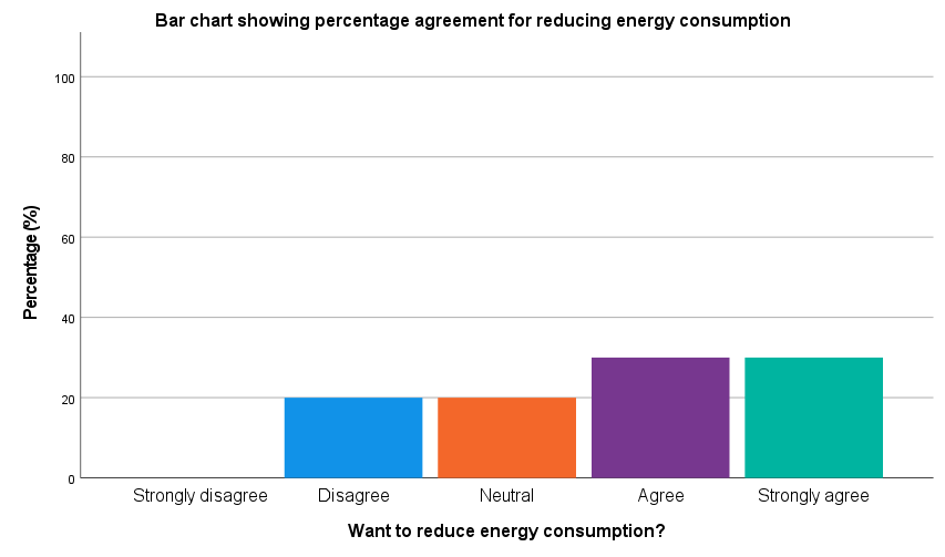
To edit an existing title on a chart, for example the y-axis title in the ‘Consumption_reduction’ bar chart, do the following:
- click once on the title to be edited, for example the ‘Percent’ title on the y-axis
- once it is selected (surrounded by a box) click it again
- edit the title as required - for example change the y-axis title to read ‘Percentage (%)’
You can also change other titles on the chart in the same way (for example, the name of the chart). Your chart should look like the following:
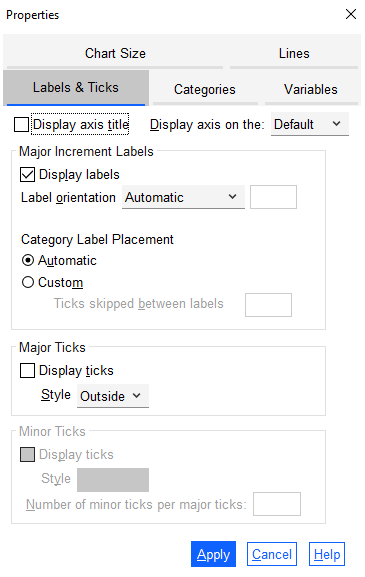
To remove an existing title on the chart, for example the x-axis title in the ‘Consumption_reduction’ bar chart, do the following:
- double click on the relevant part of the chart, for example on the x-axis
- click on the Labels and Ticks tab in the Properties dialogue box
- uncheck the Display axis title box
Once you are happy with your selection, click Apply and then Close the dialogue box. Your chart should look like the following:
Once you have finished editing a chart, if you would like to include it in a report or other document you can do so copying it and pasting it into the document, or by exporting it. You can copy the chart in the Chart Editor by going to Edit and then Copy Chart , or alternatively close the Chart Editor and right click on the chart to choose to either Copy , Copy As or Export…
Creating a chart from a table
While most of the time it is easiest to create a chart using the Chart Builder, if you have already created a frequency table then you can always create a chart directly from there if you prefer. In particular, this will save you time if you have made any changes to the data file after creating the table (as otherwise you will need to undo the changes before creating the chart).
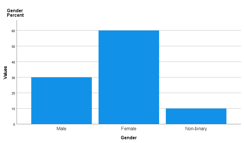
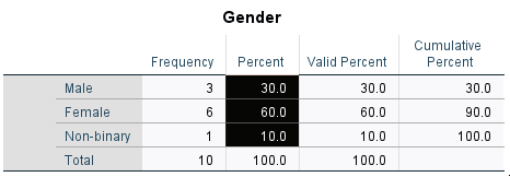
To see how to do this, first use the Frequencies procedure to produce a frequency distribution table for the ‘Gender’ variable, as detailed in the Descriptive statistics page of this module.
Now do the following to create a chart displaying the percentages included in the table (alternatively, you could make use of the frequencies or valid percentages instead):
- double click on the table (close any dialogue boxes that appear)
- click on the word Valid on the left hand side
- use Delete or Cut to remove it (otherwise the word ‘Valid’ will be included in each category label)
- click on the value in the Percent column for the first category
- holding down the Shift key, click on the Percent number for the last category (not included the total)
Your selection should look as follows:
Now right click while pointing in the selected area, and do the following:
- click on Create Graph from the menu
- choose the appropriate graph, for example Bar
Your chart should appear in the SPSS Output window, and should look like the following. It can then be edited using the techniques covered in the Using the Chart Editor section if required: