
Introduction-to-SPSS-printable-guide-UniSkills.pdf
Introduction to SPSS
Table of Contents
Introduction
Welcome to the Introduction to SPSS module. This module provides an introduction to using the statistical software SPSS, which is installed on most computers at Curtin’s Australian campuses.
If you would like access on a personal computer and are not an Australian-based Curtin staff member, you can purchase a Grad Pack version of the software or register for a free trial at the IBM website. Alternatively, if you are an Australian-based Curtin staff member you can request a free download by going to the ‘SupportU’ self-service portal in OASIS, searching ‘Request Home Use Software’, selecting the search result and entering the required information. You can also download SPSS onto a Curtin device by using ‘Install Applications’ (Windows) or ‘Self-Service’ (Mac) on your desktop.
The module looks at some of the ways you can use the software to analyse quantitative data, and uses two small data sets as examples. The idea is that you can then apply these same concepts to any data of your own, regardless of your discipline or the amount of data you have. Note that if you are not familiar with some or all of the statistical concepts mentioned in this module, you may find it useful to work through the Introduction to statistics module first.
Your feedback on this module is very welcome and can be provided at any time on the feedback page, or alternatively for any questions about the module please contact Library-UniSkills@curtin.edu.au
What you will learn
- How to open a dataset, set up variables and enter data in SPSS.
- How to use SPSS to calculate simple descriptive statistics.
- How to use SPSS to create simple charts.
- How to create new variables in SPSS by performing transformations.
- How to use SPSS to test whether continuous variables are normally distributed.
- How to obtain and interpret confidence intervals in SPSS.
- How to conduct t-tests and one-way ANOVA in SPSS.
- How to test for relationships between pairs of categorical and continuous variables using the chi-square test of independence and Pearson’s correlation (respectively) in SPSS.
- How to work with subsets of data, and with multiple response data in SPSS.
- How to use the SPSS syntax to write commands and automate processes. Getting started
When using SPSS to help with your statistical analysis, it is highly likely that you will already have your data in some other electronic format. For example, in Excel or in an online survey tool such as Qualtrics. If this is the case you do not have to enter your data manually into SPSS, and instead should just ensure that your variables are set up correctly. If you do not already have it in an electronic format though, you will need to enter the data as well as set up the variables.
In brief, this page covers the following:
- How to open a new or existing dataset in SPSS, including by importing from other software
- The key components of the Data Editor window
- How to set up variables in SPSS
- How to enter data in SPSS
- How to save a dataset in SPSS
</div>
Opening a dataset
If you will be entering data from scratch, as per the example, you should get started by opening SPSS, selecting New Dataset and pressing Open.
If you wish to open an existing SPSS dataset instead, select the Recent Files tab, select Open another file… and click Open (or double click Open another file…), then navigate to the required file and select Open again. Alternatively, if you wish to import data from another source (such as Excel, SAS or Stata) then you will need to change the Files of type field to the required type (for example to Excel Data) before navigating to the file and selecting Open. You may then need to make some selections for that particular source in the dialogue box that appears.
If you wish to import data from an online survey tool such as Qualtrics you can do the same thing, you will just need to export it from the survey tool first. Some tools will have the functionality to export to an SPSS data file (as Qualtrics does), in which case you won’t need to change the file type or make any additional selections, but if that is not possible you can export to Excel instead and then import as described.
Finally, note that you can open any relevant data file at any time once you are already in SPSS, by going to File, Open, Data and then locating, selecting and opening the file (adjusting the Files of type field as required). If you are opening a non-SPSS file, you also have the option of doing the same thing by going to File, Import Data and choosing the relevant source.
The Data Editor window
Regardless of whether you are entering your own data or using an existing dataset, the Data Editor window (which looks like a spreadsheet) should open in SPSS. This window has two parts; the Data View and the Variable View. You can move between them by using the tabs in the bottom left hand corner of the data window:
The Data View is the actual data itself, where all the information for each case (often a person) goes across a row, and each column represents a variable. Accordingly there will be as many rows as there are people/cases/questionnaires, and as many columns as there are variables. The maximum number of variables that can be set up in any data file is 35,000, while the number of cases is virtually unlimited.
The Variable View contains the specifications for the variables. For example, the variable name, variable label, category labels, etc. In the Variable View the information for each variable goes across the rows, so there will be as many rows of detail as there are variables in the data file. While SPSS does not actually require anything to be done before data is entered in the Data View, for ease of use when entering data and then when specifying the analyses to be performed, some user supplied information in the Variable View is beneficial and highly recommended. Likewise, if you already have data in the Data View (e.g. imported from Excel or Qualtrics), it is highly recommended that you check the variable settings in the Variable View and make any necessary changes before proceeding with analysis.
Setting up variables
The data to be entered into SPSS for the examples in the first few pages of this module comes from the following simple survey:
SAMPLE QUESTIONNAIRE
Please complete this questionnaire by circling your response or by writing your answer on the line provided. Thank you for your co-operation in providing the information.
-
How old are you?________
-
Which gender do you identify as?
Male Female Non-binary Prefer not to say Prefer to self-describe:________
-
Do you have any children?
Yes No
-
What is your household’s average daily energy consumption (in kWh) in summer?________
-
What is your household’s average daily energy consumption (in kWh) in winter?________
-
How many people live in your household?________
-
Would you like to reduce your household’s energy consumption?
Strongly disagree Disagree Neutral Agree Strongly agree
</div>
As each of these questions only allows for one response, there will be one variable per question and hence seven variables. Note, however, that variables which allow multiple responses will need to have one variable for each possible response. To set up these seven variables, or any others, in your SPSS data file, click on the Variable View tab at the bottom of the spreadsheet and then work through the following sections:
Naming variables
The first thing to do when setting up variables in the Variable View is to give each one a name. This should be representative of the individual item of data, and each one has to be unique. Whilst variable names can be anything you choose, and are not case sensitive, there are some rules to follow:
- The maximum number of characters in each name is 64
- Spaces are not allowed, but a full stop ( . ) or underscore ( _ ) can be used as a separator
- The last character of the name cannot be a full stop
- Dollar signs ( $ ), dashes ( - ), and slashes ( / ) are not allowed anywhere in the variable name
To enter the names of variables in the Variable View, go to the column headed Name and type in the name chosen for each variable. For this example, and for any other data you enter, this could be something that relates to the question (for example ‘Age’ for the first variable), it could be the question number (for example ‘Q1’; if you export data from Qualtrics the variable names will be the question numbers), or it could be anything else that makes sense to you. Just note that it is advisable to keep names to a sensible length, since there is only a finite space in the dialogue boxes to display them.
Once you have entered names, SPSS will automatically complete a number of other specifications for each variable by using a set of defaults. Some of the defaults may not be appropriate for the data but they can easily be altered. The Variable View for this example might now look something like:
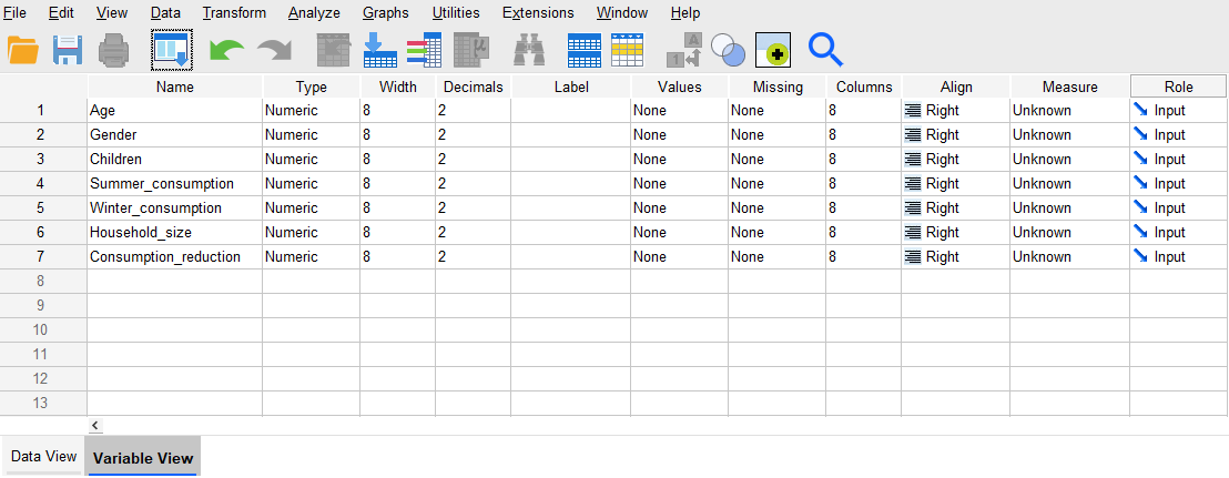
Assigning labels to variables
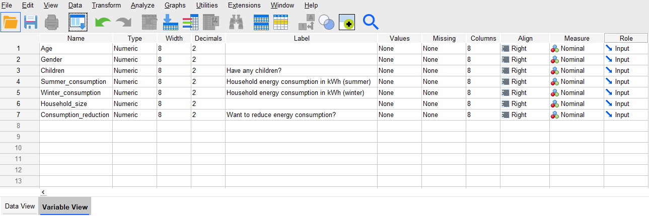
Because of the limit on the number of characters used in a variable name, the names can sometimes be rather cryptic. For example, the ‘Summer_consumption’ and ‘Winter_consumption’ variables don’t provide the complete picture about the nature of the variables in the example above. Adding some extra labelling, though, can make all the difference. To add this extra information in the Variable View, go to the column headed Label and enter labels for any variables that require them (the maximum number of characters is 256). Note that when working with data exported from Qualtrics the variable labels will automatically be the questions, but you can adjust these if wished.
Do this for the ‘Children’, ‘Summer_consumption’, ‘Winter_consumption’ and ‘Consumption_reduction’ variables for this example. The Variable View might now look something like:
Assigning labels to values for categorical variables
When entering data into SPSS, the convention is to use numbers to represent categories for categorical data (visit the Data and variable types page of the Introduction to statistics module for more information on categorical data if required). This avoids any potential typos when entering category names, and makes the statistical analysis more straightforward. These numbers can be anything that make sense to you, but it is important that you let SPSS know what category each number represents. You can do this by adding value labels for each categorical variable, by going to the column in the Variable View headed Values and clicking on the box with the ellipsis (three dots) for the relevant variable(s). This will open the Value Labels dialogue box, where you can enter values and labels as required (note again that if you are working with data exported from Qualtrics this will be done automatically).
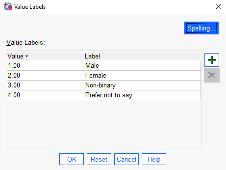
For example, for the ‘Gender’ variable in this example you could assign values 1 to 4 for each of the four categories listed, plus additional numbers for any extra categories as specified by participants, by doing the following in the Value Labels box:
- Click the plus sign
- Type the number 1 in the Value column
- Type the label ‘Male’ in the Label column
- Repeat the process for the values 2, 3 and 4, assigning labels of ‘Female’, ‘Non-binary’ and ‘Prefer not to say’ respectively (adding any extra numbers and categories as required)
- Click on OK
Alternatively, if you have an older version of the software you may need to do the following:
- Type the number 1 in the Value box
- Type the label ‘Male’ in the Label box
- Click on the Add button to move the label into the list box at the bottom
- Repeat the process for the values 2, 3 and 4, assigning labels of ‘Female’, ‘Non-binary’ and ‘Prefer not to say’ respectively (adding any extra numbers and categories as required)
- Click on OK
Do a similar thing for the other two categorical variables in this example (‘Children’ and ‘Consumption_reduction’). The completed Value Labels boxes should look something like the following (again, this may differ slightly depending on your version of the software):
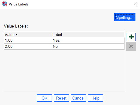
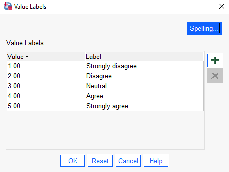
Setting the data type
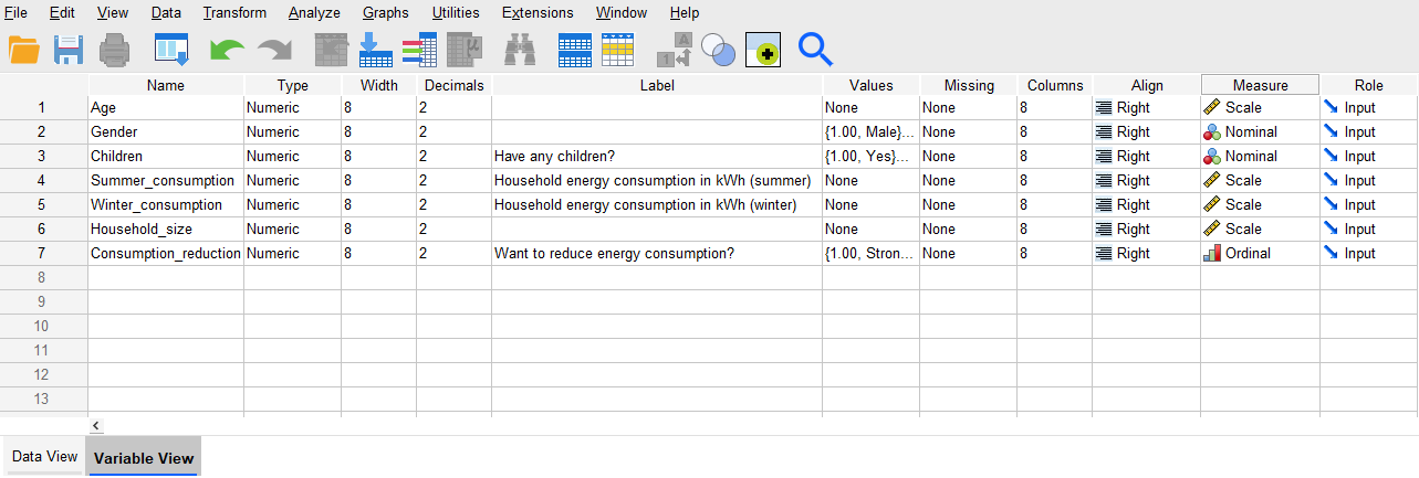
Another important change to make for each variable is to tell the software what type of data it contains. To do this in the Variable View go to the column headed Measure, where there are three options to choose from for each variable; Scale, Ordinal and Nominal. The ‘Gender’ and ‘Children’ variables in this example are nominal, as the categories don’t have any order to them, while ‘Consumption_reduction’ is ordinal. The other variables are measured on a scale (you can learn more about variable types in the Data and variable types page of the Introduction to statistics module).
To set the data type for the ‘Age’ variable, for example, do the following in the Measure column:
- Click on the cell corresponding to the ‘Age’ variable
- Click on the drop down arrow
- Choose the Scale option
Once you have done this, change the settings for the other variables to the appropriate measure in the same way. The Variable View should now look like:
Other variable attributes
While the aforementioned columns are generally the most important ones to update in the Variable View, note that the others can also be updated if needed or desired. The remaining columns and their functions are:
-
Type: the type of data that the variable contains. This is usually Numeric data, even in the case of categorical data (as detailed above), but can be changed to a different type as required. For example, if you have open-ended text responses this would be String data.
-
Width: the number of characters each cell can contain in the Data View. The default is 8, which is usually plenty, but if you have big numbers, very small numbers with lots of decimal places, or string data with more than 8 characters, you will need to increase this. Alternatively, if you have an extremely large data file and are worried about the file size becoming too large you could always decrease this value if you don’t need 8 characters, but this is usually less of a concern.
-
Decimals: the number of decimal places each numeric value has. The default is 2, but again you should increase this if needed. You can also decrease it if you do not want to include unnecessary decimal places.
-
Missing: allows for the specification of values to represent missing data. While cells can just be left blank in the Data View when there is missing data, and hence this is optional, often it can be beneficial to assign values to represent missing data so that it is clear that it hasn’t simply been skipped over. For example, rather than leaving a cell blank you may choose to assign a value such as 999 or -1 to represent missing data, and then you would enter this value instead. Multiple missing values can be assigned for different purposes if required, such as to represent missing data for a question that wasn’t relevant to the participant, versus missing data for a question that they should have answered.
-
Columns: the width of the column in the Data View, which can also be adjusted manually in the Data View by simply dragging the column.
-
Align: whether the data is left, centre or right aligned in the Data View.
-
Role: roles can be assigned to variables such as ‘Input’ or ‘Target’, although generally this is not required.
Entering data
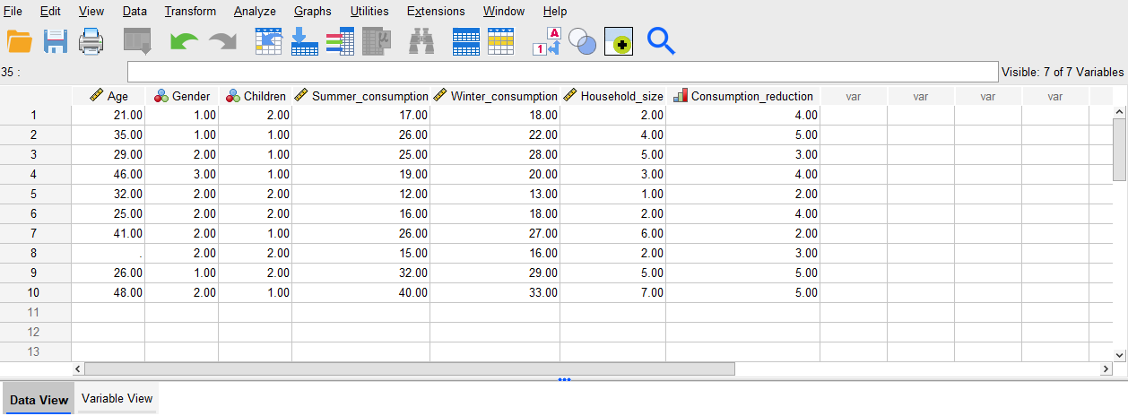
Having entered variable names in the Variable View, note that the columns in the Data View now automatically have those names as the headings (along with symbols to represent the measure). All that remains now is to key in the data, if required, so for this example enter the following in the Data View (either row by row, or column by column as preferred). Alternatively, you can download the data file attached below rather than entering the data.
Download this sample data file rather than entering the data above, if preferred:
In both cases, note the blank cell for the missing ‘Age’ data for case 8. If missing values had been set up, the missing value could be entered there instead (for example, 999 could be entered if that was assigned as a value to represent missing data).
Also note that you can see the value labels assigned to categorical variables if preferred, rather than the category numbers, by selecting the Value Labels icon available on the menu in the Data View:

Saving a dataset
Once a data file has been created, it can be saved in the usual way by going to File, Save As… and choosing a location and name. This will save as a .sav file type. When working in SPSS it is likely that you will also need to save other file types as well, such as output and syntax, but these will be covered in subsequent pages of this module. Descriptive statistics
One of the first things you will likely be doing with your sample of data is analysing it using descriptive statistics. This page details some of the most common types of descriptive statistics you might need to use in SPSS, organised according to the type of data (for more information on any of the descriptive statistics covered, visit the Descriptive statistics page of the Introduction to statistics module).
In brief, this page covers how to use SPSS to do the following:
- Analyse data for one categorical variable
- Analyse data for one continuous variable
- Compare the mean of a continuous variable between different categories
- Establish whether there is an association between two categorical variables
- Establish whether there is a linear relationship between two continuous variables
</div>
Note that the examples covered here make use of the data described in the Getting started page of this module. If you want to work through the examples provided and haven’t already downloaded this data, you can do so using the link below:
Before commencing the analysis, note that the default is for dialog boxes in SPSS to display any variable labels, rather than variable names. You may find this helpful, but if you would prefer to view the variable names instead then from the menu choose:
- Edit
- Options…
- Change the Variable Lists option to Display names.
Also note that if you wish to save any of the output obtained from these examples, or any other output, you will need to save it as a .spv file (in addition to the .sav data file) by selecting File and Save As… from the Output window.
Categorical data - one variable
A question you may wish to ask of the sample data is: How many respondents of each gender are there?
Categorical variables such as the ‘Gender’ variable can be analysed in this way using a frequency distribution table. To obtain one, choose the following from the SPSS menu:
- Analyze
- Descriptive Statistics
- Frequencies…
- Click on the appropriate variable required for the analysis, in this case ‘Gender’
- Click on the arrow head to move it into the right hand box
- Click on OK
Your output should appear in the SPSS Output window, and should look like the following:
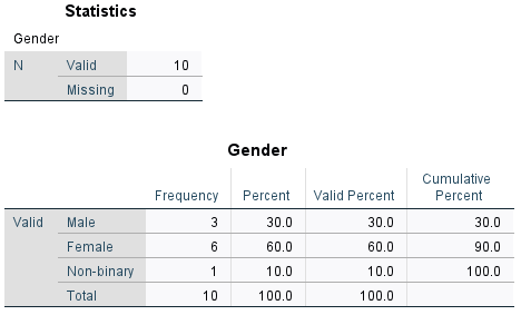
The first table of output simply shows how much data has been analysed (only 10 cases in this small sample, with no missing data for the variable), while the second table is the frequency distribution table. The columns to the right of the column of category names are as follows:
- Frequency: shows how many of the sample are in each category. For example, the sample consists of 3 males.
- Percent: shows what percentage of the sample are in each category. For example, 60% of the sample are female. Note that this column also allocates a percentage for any missing data. If you do have missing data, you can decide whether it is more useful for you to treat the missing data as its own category, and hence use this percentage, or whether you want to ignore the missing data and use the Valid Percent.
- Valid Percent: shows what percentage of the sample are in each category. For example, 10% of the sample are non-binary. Note that this column does not allocate a percentage for any missing data, and only takes into account ‘valid’ (non-missing) categories. If you do have missing data, you can decide whether it is more useful for you to ignore the missing data and hence use this percentage, or whether you want to treat the missing data as its own category and use the Percent.
- Cumulative Percent: gives the sum of all the percentages up to and including that row of the table. For example, 90% of the sample are either male or female.
Continuous data - one variable
A question you may wish to ask of the sample data is: What is the mean age of the respondents?
To obtain descriptive statistics (including the mean) for a continuous variable such as the ‘Age’ variable, choose the following from the SPSS menu (either from the Data Editor or Output window):
- Analyze
- Descriptive Statistics
- Descriptives…
- Click on the appropriate variable required for the analysis, in this case ‘Age’
- Click on the arrow head to move it into the right hand box
- Click on OK
Your output should appear in the SPSS Output window, and should look like the following:
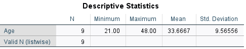
This table shows that 9 pieces of data have been analysed, as the missing data has been ignored. For these 9 people, we can see that the mean age is 33.67 (rounded to two decimal places).
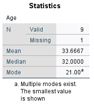
Alternatively, you can also obtain descriptive statistics for a continuous variable using the Frequencies procedure detailed in the Categorical data - one variable section of this page. Do this by clicking on the Statistics… button in the Frequencies dialog box (after selecting the variable), ticking the required boxes (for example Mean , Median and Mode) and clicking Continue. It is then also a good idea to untick the Display frequency tables box in the Frequencies dialog box before selecting OK, as generally a frequency table is not required for a continuous variable. Doing it this way will enable you to have the mean, median and mode displayed together, as follows:
Finally, you can also obtain more comprehensive descriptive statistics using the Explore… procedure instead if required. Use of this is covered in the The normal distribution page of this module.
Comparing means
A question you may wish to ask of the sample data is: How does the mean summer energy consumption of those with children compare to those without?
If you wish to compare the mean of a continuous variable (such as the ‘Summer_consumption’ variable) between different categories (such as for the ‘Children’ variable) you can do this using the Compare Means procedure. To do this, choose the following from the SPSS menu (either from the Data Editor or Output window):
- Analyze
- Compare Means (or Compare Means and Proportions)
- Means…
- Click on the continuous variable required for the analysis, in this case ‘Summer_consumption’
- Click on the arrow head to move it into the Dependent List
- Click on the categorical variable required for the analysis, in this case ‘Children’
- Click on the arrow head to move it into the Independent List
- Click on OK
Your output should appear in the SPSS Output window, and should look like the following:
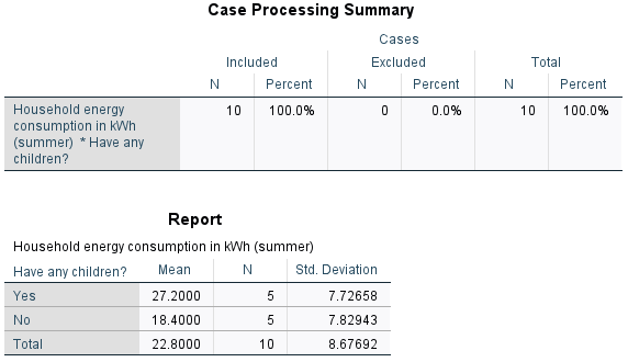
The first table of output simply shows how much data has been analysed (10 cases), while the second table compares the mean, sample size and standard deviation for each category. Based on this, we can see that the mean summer energy consumption of people with children in the sample is higher than the mean summer energy consumption of people without children.
If you would like to learn how to test whether differences such as this are statistically and/or practically significant in terms of the population, visit the Comparing means page of this module.
Categorical data - two variables
A question you may wish to ask of the sample data is: Is there an association between gender and desire to reduce energy consumption in the sample?
You can establish how many people of each gender there are in the sample, and how many people have different feelings about reducing energy consumption, using separate frequency distribution tables (as detailed in the Categorical data - one variable section of this page). With frequency distribution tables for the two variables separately, though, it is not possible to find out how many of each gender have different feelings about reducing consumption. To do this you need a cross-tabulation (or contingency table) instead, with categories for the independent variable (‘Gender’) in the rows, and categories for the dependent variable (‘Consumption_reduction’) in the columns (you can learn more about independent and dependent variables in the Data and variable types page of the Introduction to statistics module).
To do this for the ‘Gender’ and ‘Consumption_reduction’ variables, choose the following from the SPSS menu (either from the Data Editor or Output window):
- Analyze
- Descriptive statistics
- Crosstabs…
- Click on the variable to be included in the rows of the table, in this case ‘Gender’
- Click on the arrow head to move it into the Row(s) box
- Click on the variable to be included in the columns of the table, in this case ‘Consumption_reduction’
- Click on the arrow head to move it into the Column(s) box
- Click on OK
Your output should appear in the SPSS Output window, and should look like the following (note that the Case Processing Summary has been omitted):
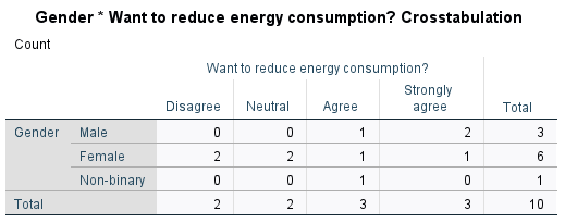
From this table you can see the number of people who are in each combination of categories; for example, there were two males and one female who strongly agreed that they wanted to reduce their energy consumption.
Usually in a report though it is not sufficient to just specify these frequencies, and percentages are used instead (or in addition). SPSS can include these in the table too, by selecting a few additional options. To do this, choose the following from the SPSS menu (either from the Data Editor or Output window):
- Analyze
- Descriptive statistics
- Crosstabs…
- The variables should still be in their respective boxes, but if not use the arrows to move them across
- Click on the Cells… button
- Select the appropriate percentages in the Cell Display dialogue box that opens; choices are Row (which will display the percentage agreement breakdown for each gender), Column (which will display the percentage gender breakdown for each level of agreement) and Total (which calculates each frequency as a percentage of the total sample)
- Click on Expected under Counts (keep Observed selected as well)
- Click on Continue
- Click on OK
Your output should appear in the SPSS output file, and should look like the following (note that only the Row percentage was selected for this example):
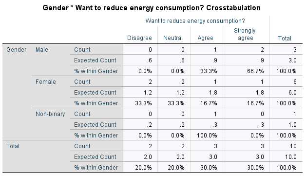
From this table you can see the percentage of people of each gender who have different levels of agreement. For example, the 2 males who strongly agree equates to 66.7% of males in the sample, while the 1 female who strongly agrees equates to 16.7% of females in the sample. Note that if you would prefer to show, for example, what percentage of those who strongly agree are male and female, you would need to include Column percentages instead.
The other values that have been included in this table are the Expected Counts. These provide an indication of whether there is an association between the variables in the sample, and in particular the closer the expected and the actual frequencies are to each other, the less likely it is that there is an association between them (for more information on expected frequencies see the Descriptive statistics page of the Introduction to statistics module). With such a small sample size in this example this is not really relevant, but if the current discrepancies continued with a larger sample (for example, over double the number of males who strongly agreed than expected) then it would provide an indication that there is some sort of association between gender and level of agreement.
If you would like to learn how to test whether an association is statistically and/or practically significant in terms of the population, visit the Looking for relationships page of this module.
Continuous data - two variables
A question you may wish to ask of the sample data is: Is there a linear relationship between summer and winter energy consumption in the sample?
Pearson’s correlation coefficient can be used to establish the strength and direction of a linear relationship (or lack of) between two continuous variables in a sample. To do this for the ‘Summer_consumption’ and ‘Winter_consumption’ variables, choose the following from the SPSS menu (either from the Data Editor or Output window):
- Analyze
- Correlate
- Bivariate…
- Select both variables (e.g. ‘Summer_consumption’ and ‘Winter consumption’) by holding down the Shift key
- Click on the arrow head to move them into the Variables box
- Click on OK
Your output should appear in the SPSS Output window, and should look like the following:
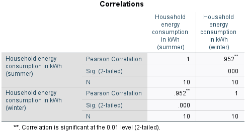
This table displays the correlation of each selected variable with every other selected variable (in this case there are only two, but note that more variables can be selected). This means that one diagonal just shows the correlation of each variable with itself, which can be ignored. The other diagonal contains duplicate data, and you only need to interpret one of the cells. Looking at the cell in the top right, for example, shows that Pearson’s correlation coefficient for the ‘Summer_consumption’ and ‘Winter_consumption’ variables is .952, indicating that there is a strong positive linear correlation between summer and winter energy consumption (for more information on correlation see the Descriptive statistics page of the Introduction to statistics module).
If you would like to learn how to test whether linear correlation is statistically and/or practically significant in terms of the population, visit the Looking for relationships page of this module. Charts
This page details how you can create and edit some simple charts in SPSS. For further information on selecting the right chart to display data, or on how to interpret the different charts, see the Descriptive statistics page of the Introduction to statistics module.
In brief, this page covers how to do the following in SPSS:
- Use the Chart Builder to create charts including a bar chart and scatterplot
- Use the Chart Editor to edit a chart
- Create a chart from an existing frequency table
</div>
Alternatively, for information about creating some of the same charts using the Frequencies or Explore procedures instead, see the Descriptive statistics page of this module (follow the instructions for using the Frequencies procedure, then select Charts… from the Frequencies dialogue box and choose the appropriate chart) or the The normal distribution page of this module respectively.
Note that the examples covered here make use of the data described in the Getting started page of this module. If you want to work through the examples provided and haven’t already downloaded this data, you can do so using the link below:
Before commencing the analysis, note that the default is for dialog boxes in SPSS to display any variable labels, rather than variable names. You may find this helpful, but if you would prefer to view the variable names instead then from the menu choose:
- Edit
- Options…
- Change the Variable Lists option to Display names.
Also note that if you wish to save any of the output obtained from these examples, or any other output, you will need to save it as a .spv file (in addition to the .sav data file) by selecting File and Save As… from the Output window.
Using the Chart Builder
To produce a chart using the Chart Builder, choose the following from the SPSS menu (either from the Data Editor or Output window):
- Graphs
- Chart Builder…
- A box will appear with the warning that variables should have the correct settings; click on OK
The dialogue box that opens up shows the different types of charts that can be created. If you are not sure of what you want, you can look through all the types under Gallery and make an informed decision. The large white rectangular area (the Chart preview area) is where the graph is built. Whilst it won’t reflect your actual data, it will give an approximation of the final product.
The remainder of this section details how to create two different kinds of charts; a bar chart and a scatterplot. Other charts (e.g. pie charts for categorical variables and histograms or box plots for continuous variables) can be created in a similar way.
Creating a bar chart (column graph)
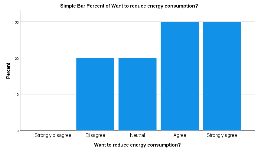
To create a simple one-dimensional bar chart (column graph) to display data for a categorical variable, for example ‘Consumption_reduction’, do the following in the Chart Builder dialogue box:
- click on the first image (Simple Bar) and drag it up to the Chart preview area
- click on the variable in the list, in this case ‘Consumption_reduction’
- drag and drop it into the X-Axis panel
The Y-Axis will then automatically update to display the count of the number of people in each category, but to change this to something else (for example percentages) do the following:
- click the drop down arrow in the Statistics area of the Element Properties box and change it to Percentage (circled in red below)
The Chart Builder dialogue box should look as follows:
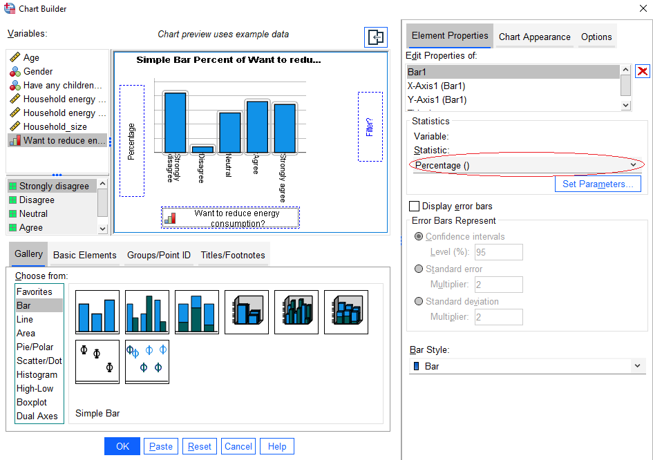
Once you are happy with the settings, click on OK. Your chart should appear in the SPSS Output window, and should look like the following:
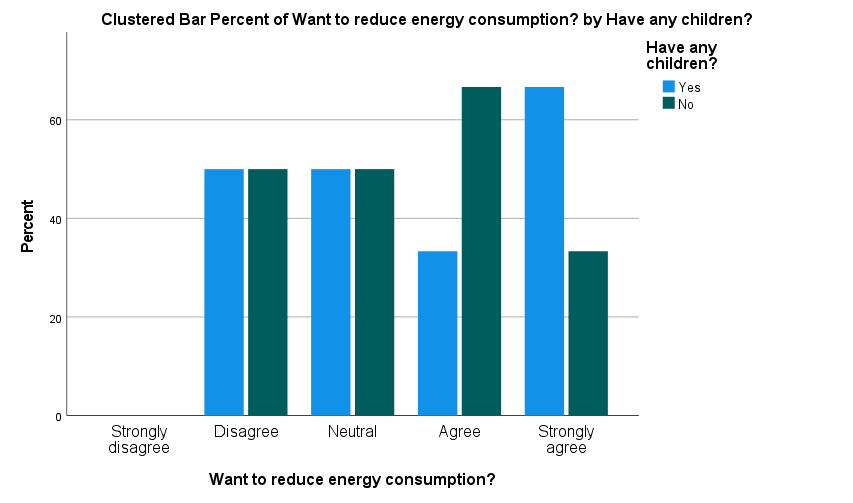
Note that if you wish to create a clustered or stacked bar chart to visualise data for two categorical variables, you should choose the Clustered Bar or Stacked Bar image from the bottom of the Chart Builder dialogue box instead, drag it up to the Chart preview area and then choose one variable to drag to the X-Axis panel (the ‘Consumption_reduction’ variable again for example), and another variable to drag to the Cluster on X: set color panel (the ‘Children’ variable for example).
You can change the Y-Axis to display percentages again if wished, but if you do this you may also like to click on the Set Parameters box (which is only clickable if you do make the change to percentages), and select Total for Each X-Axis Category (so that the chart displays the percentage breakdown for each category, rather than for the whole data set).
Doing this for a clustered bar chart will result in the following:
Creating a scatterplot
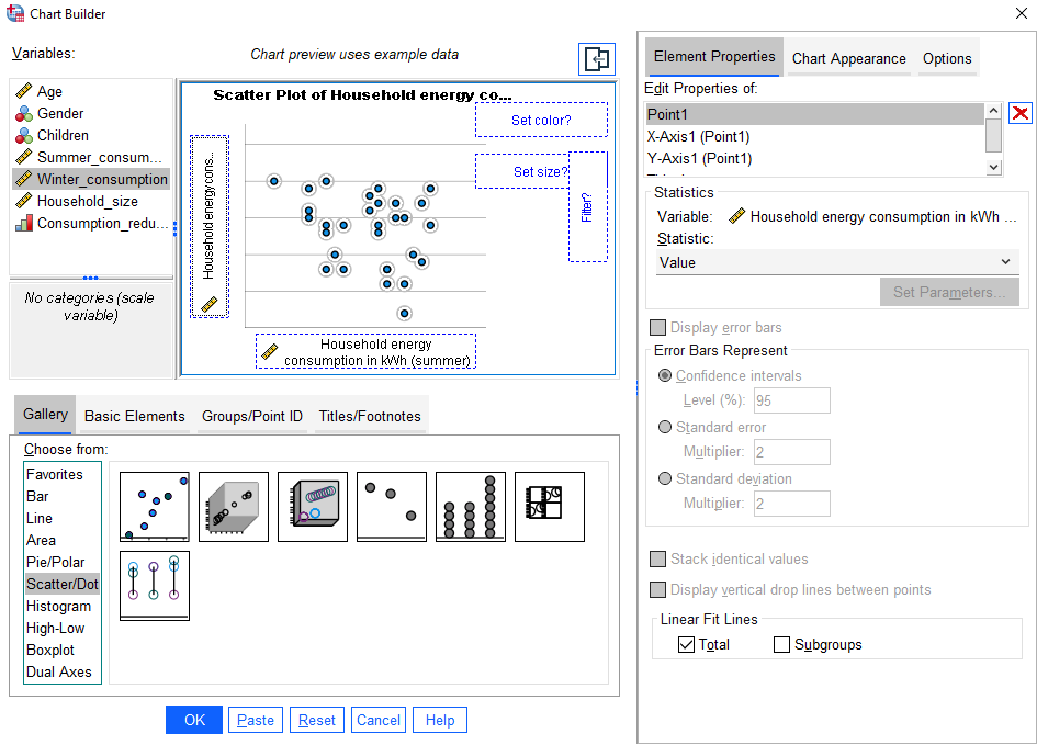
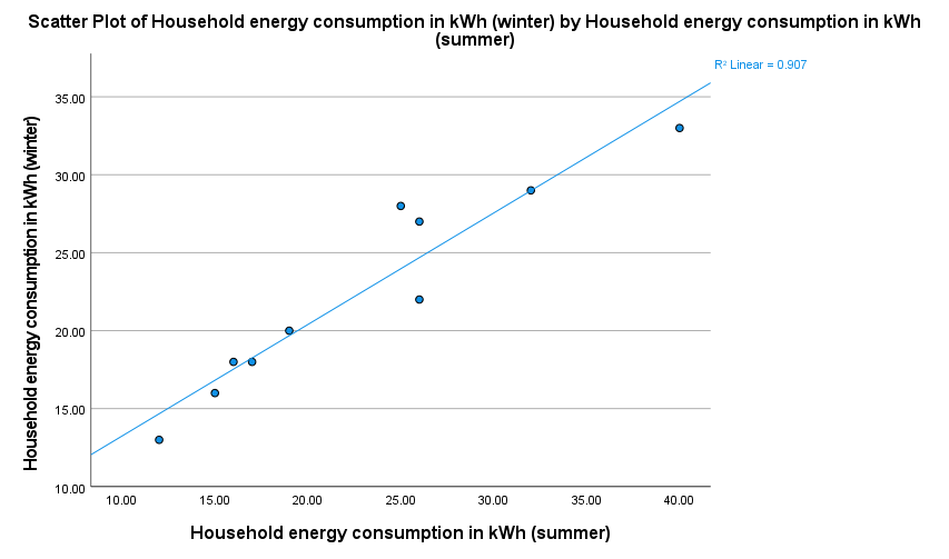
To create a scatterplot to visualise the relationship between two continuous variables, for example ‘Summer_consumption’ and ‘Winter_consumption’, do the following in the Chart Builder dialogue box:
- click on Scatter/Dot in the Gallery list
- click on the first image (Scatter Plot) and drag it up to the Chart preview area
- click on the independent variable (in this case it could be either, but choose ‘Summer_consumption’) and drop it into the X-Axis panel
- click on the dependent variable (in this case it could be either, but choose ‘Winter_consumption’) and drop it into the Y-Axis panel
- if you want to include the line of best fit on the scatterplot, select Total in the Element Properties box (at the bottom, underneath the Linear Fit Lines heading)
The Chart Builder dialogue box should look as follows:
Once you are happy with the settings, click on OK. Your chart should appear in the SPSS Output window, and should look like the following:
Once you have created a chart you can always edit it in the Chart Editor before copying or exporting it, as detailed in the following section.
Using the Chart Editor
You can edit any chart that you create by double clicking on it to open the Chart Editor. For example, you may like to change the colours, scale, and titles used in the chart. How to do this is detailed below, with the ‘Consumption_reduction’ bar chart used as an example.
Changing colours
To change the colours used in a chart, for example the bar colours in the ‘Consumption reduction’ bar chart, do the following:
- double click on the relevant area in the chart (for example, one of the bars)
- click on the Fill and Border tab of the Properties dialogue box
- click on the colour you want
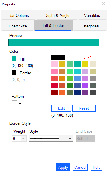
Once you are happy with your selection, click Apply and then Close the dialogue box.
Alternatively, if you want to change the colours of the bars separately, click once on one of the bars so that all bars are selected, and then click again so that only that bar is selected (alternatively, you may only need to click once on a bar for it to be selected in isolation). Then double click the bar and continue the process in the Properties dialogue box as detailed above, repeating it for other bars as required. For example, you could edit your bar chart colours as follows:
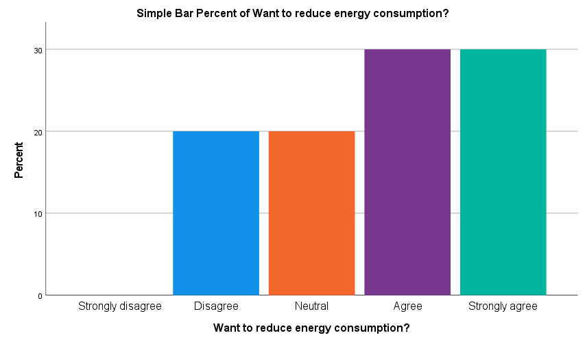
Changing the scale
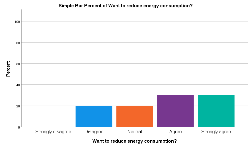
To change the scale used on a graph, for example to increase the y-axis scale to 100 on the ‘Consumption reduction’ bar chart, do the following:
- double click on the relevant axis (for example, the y-axis)
- adjust the values in the Scale tab as required - for example increase the Maximum value to 100
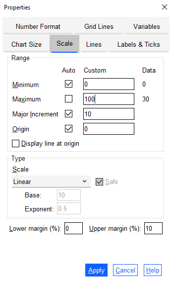
Once you are happy with your selection, click Apply and then Close the dialogue box. Your chart should look like the following:
Editing titles
To edit an existing title on a chart, for example the y-axis title in the ‘Consumption_reduction’ bar chart, do the following:
- click once on the title to be edited, for example the ‘Percent’ title on the y-axis
- once it is selected (surrounded by a box) click it again
- edit the title as required - for example change the y-axis title to read ‘Percentage (%)’
You can also change other titles on the chart in the same way (for example, the name of the chart). Your chart should look like the following:
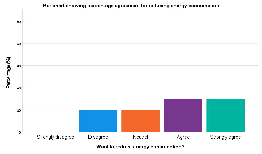
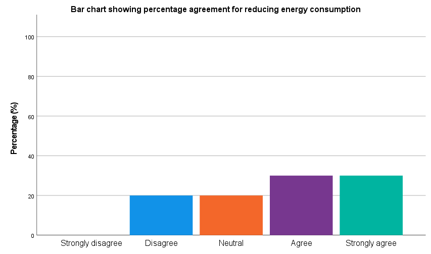
To remove an existing title on the chart, for example the x-axis title in the ‘Consumption_reduction’ bar chart, do the following:
- double click on the relevant part of the chart, for example on the x-axis
- click on the Labels and Ticks tab in the Properties dialogue box
- uncheck the Display axis title box
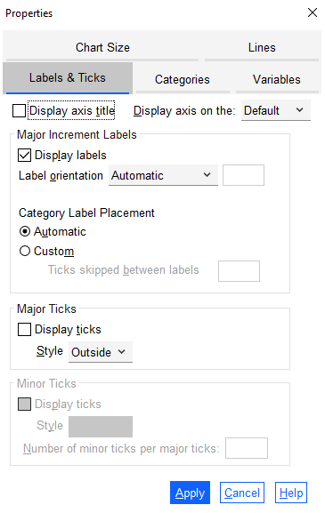
Once you are happy with your selection, click Apply and then Close the dialogue box. Your chart should look like the following:
Once you have finished editing a chart, if you would like to include it in a report or other document you can do so copying it and pasting it into the document, or by exporting it. You can copy the chart in the Chart Editor by going to Edit and then Copy Chart , or alternatively close the Chart Editor and right click on the chart to choose to either Copy , Copy As or Export…
Creating a chart from a table
While most of the time it is easiest to create a chart using the Chart Builder, if you have already created a frequency table then you can always create a chart directly from there if you prefer. In particular, this will save you time if you have made any changes to the data file after creating the table (as otherwise you will need to undo the changes before creating the chart).
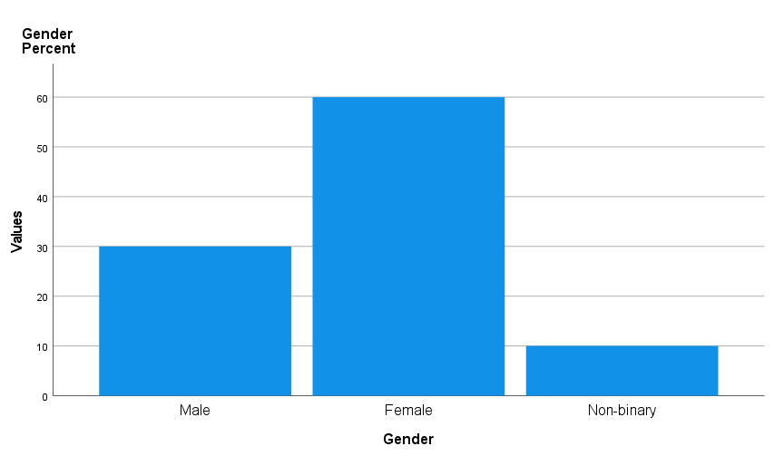
To see how to do this, first use the Frequencies procedure to produce a frequency distribution table for the ‘Gender’ variable, as detailed in the Descriptive statistics page of this module.
Now do the following to create a chart displaying the percentages included in the table (alternatively, you could make use of the frequencies or valid percentages instead):
- double click on the table (close any dialogue boxes that appear)
- click on the word Valid on the left hand side
- use Delete or Cut to remove it (otherwise the word ‘Valid’ will be included in each category label)
- click on the value in the Percent column for the first category
- holding down the Shift key, click on the Percent number for the last category (not included the total)
Your selection should look as follows:
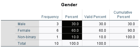
Now right click while pointing in the selected area, and do the following:
- click on Create Graph from the menu
- choose the appropriate graph, for example Bar
Your chart should appear in the SPSS Output window, and should look like the following. It can then be edited using the techniques covered in the Using the Chart Editor section if required:
Transformations
Often when you are doing your analysis you will find that it is helpful to create new variables, or to make changes to existing variables. This page details some of the transformation facilities provided by SPSS which enable you to do this, all of which are found under the Transform menu.
In brief, this page covers the following:
- How to compute a new variable using data from existing variables
- How to recode a variable in order to create new categories for it
- How to convert a string variable to a numeric variable
- How to change a continuous variable into a categorical one using visual binning
</div>
Note that the examples covered here make use of the Household energy consumption data.sav file, which contains fictitious data for 80 people based on a short ‘Household energy consumption’ questionnaire. If you want to work through the examples provided you can download the data file using the following link:
If you would like to read the sample questionnaire for which the data relates, you can do so using this link:
Before commencing the analysis, note that the default is for dialog boxes in SPSS to display any variable labels, rather than variable names. You may find this helpful, but if you would prefer to view the variable names instead then from the menu choose:
- Edit
- Options…
- Change the Variable Lists option to Display names
Computing a new variable
Sometimes you may wish to create a new variable or variables to add to your data file, either from scratch or using the data from an existing variable or variables. For example, in the sample data file you may wish to create a new variable which gives the difference between summer and winter household energy consumption for each survey participant. You can do this by choosing the following from the SPSS menu (either from the Data Editor or Output window):
- Transform
- Compute Variable…
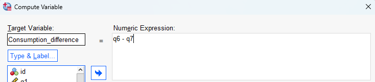
- specify the new variable name in the Target Variable box, for example ‘Consumption_difference’
- enter the required formula in the Numeric Expression box, for example by moving the ‘q6’ variable into the box, using the keypad provided or your keyboard to type the - (minus) sign, and then moving the ‘q7’ variable into the box (spaces between each item are optional)
Next:
- click OK
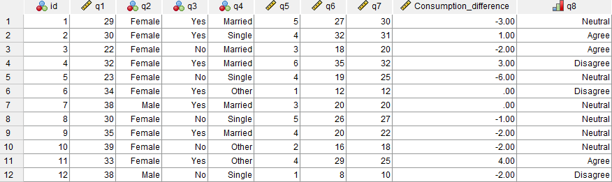
If you then navigate to the Data View of the Data Editor window, you will see that a new ‘Consumption_difference’ variable has been added to the end of the data file, with the difference for each of the 80 cases determined using the numeric expression entered. You can then analyse this variable as you would any of the original variables.
Note that you can also move the new variable if wished, either in the Data View or in the Variable View, by dragging and dropping. For example, you could move the new variable to sit after the ‘q7’ variable by selecting the variable name in the Data View, then holding down the left mouse key and dragging until it is in the required spot.
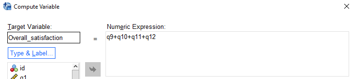
As another example of when you might want to compute a new variable, consider questions q9 through q12, which all relate to satisfaction with different aspects of the participants’ electricity provider. As these questions all use the same rating system (measured on a scale of 1 to 5, with 1 indicating ‘Very unsatisfied’ and 5 indicating ‘Very satisfied’), the four variables representing these questions can be combined to come up with an overall satisfaction score.
One way of doing this is by adding all the variables together to create a score out of 20. To do this, you could enter the new variable name Overall_satisfaction and the numeric expression q9+q10+q11+q12:
If you run the Frequencies procedure on this new variable (as described in the Descriptive statistics page of this module) you will see that there are only 78 satisfaction scores, whereas there are 80 cases in the data file. Looking at the actual data reveals why; the data in row 30 is missing for all four of the variables ‘q9’ to ‘q12’, and the data in row 31 is missing for variables ‘q10’ and ‘q12’. Since the numeric expression shown above only calculates new values for those cases that have complete data, the new variable has not been computed for rows 30 and 31.
Sometimes this will be what you want, but other times you will require data for the new variable regardless of whether some of the data is missing or not (note that if there is missing data for all the variables, there will automatically be missing data for the new variable). To do this simply requires that a different numeric expression is used within the Compute variable procedure, which makes use of the sum function.
For example, you could alter the numeric expression for the variable you have just created to sum(q9 to q12) (note that the word ‘to’ can be used between the variables in this case as they occur one after the other in the data file; if this isn’t the case, you would need to list the variable names separated by commas instead):
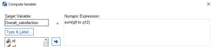
With this new numeric expression, there is now a value for the ‘Overall_satisfaction’ variable in row 31.
You may also like to experiment with other formulas. For example, if you wanted to calculate an average overall satisfaction score instead you could also try using two different, similar numeric expressions:
- The numeric expression (q9 + q10+ q11 + q12)/4 will again have missing data for both rows 30 and 31.
- The numeric expression mean(q9 to q12) (or mean(q9, q10, q11, q12) if the variables are not in order) will have missing data only for row 30. For row 31, the average will be calculated by dividing by 2 instead of 4, since there are only two variables with data.
Regardless of which formula you choose to use, the new variable can then be analysed in the usual way.
Recoding an existing variable
Sometimes you may wish to recode an existing categorical variable, most likely to reduce the number of categories by combining existing ones together. For example, in the sample data file you may wish to recode the ‘q8’ variable to reduce the number of categories from five to three. You can do this by choosing the following from the SPSS menu (either from the Data Editor or Output window):
- Transform
- Recode into Different Variables… (this will keep the existing variable and create a new one, which provides maximum flexibility; if you would prefer to over-write the existing variable though you can select Recode into Same Variables…)
- move the required variable into the Numeric Variable - > Output Variable box, for example ‘q8’
- specify a name for the new variable in the Name field of the Output Variable box, for example ‘q8_recoded’
- enter a label for the new variable in the Label field of the Output Variable box if desired
- click Change
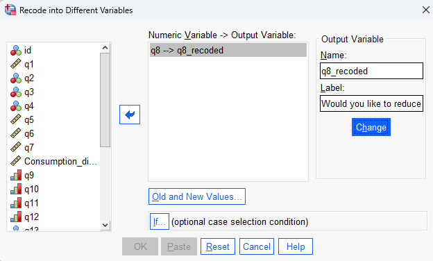
The second part of the process is to decide how the categories of the existing variable are going to map to categories of the new variable. Sometimes this can require quite a bit of thought and planning, but with so few categories in this example it is more straightforward. In particular, the existing categories lend themselves to being recoded into three new categories (‘Agree’, ‘Neutral’ and ‘Disagree’), as follows:
| Existing category | New category |
|---|---|
| 1 (Strongly disagree) | 1 (Disagree) |
| 2 (Disagree) | 1 (Disagree) |
| 3 (Neutral) | 2 (Neutral) |
| 4 (Agree) | 3 (Agree) |
| 5 (Strongly agree) | 3 (Agree) |
To specify this in SPSS, do the following in the Recode into Different Variables: Old and New Values dialogue box:
- select Old and New Values…
- specify the existing category number(s) in the Old Value side of the dialogue box, and the new category number in the New Value side of the dialogue box, then press Add. You can map each category individually, or multiple categories can be mapped at once using the options available. For example, you could specify the required mappings as follows:
- select Range, LOWEST through value: and specify 2 on the Old Value side of the dialogue box, and specify 1 on the New Value side of the dialogue box, then press Add
- select Value: and specify 3 on the Old Value side of the dialogue box, and specify 2 on the New Value side of the dialogue box, then press Add
- select All other values and specify 3 on the New Value side of the dialogue box, then press Add
- click Continue
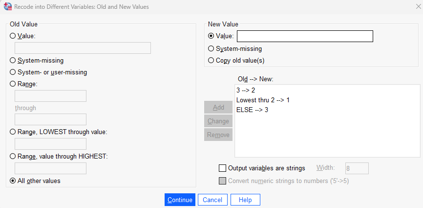
Next:
- click OK
If you then navigate to the Data View of the Data Editor window, you will see that a new ‘q8_recoded’ variable has been added to the end of the data file (note that you can move it if wished, either in the Data View or in the Variable View, by dragging and dropping). The category values do not currently have any labels (e.g. ‘Disagree’, ‘Neutral’ and ‘Agree’), and you may need to change the variable Measure (from Nominal to Ordinal), but you can do both of these things as described in the Getting started page of this module.
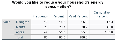
Once you have finished setting up the variable, you can analyse it in the usual way. For example, you could run the Frequencies procedure (as described in the Descriptive statistics page of this module) on the new variable, which should result in the following table:
Converting a string variable
Although SPSS does allow alphabetic/string information to be entered as part of the data file, the more in-depth statistical analysis procedures require numeric data only (even if those numbers are simply codes or values representing categories).
At the questionnaire design stage it may be very difficult to anticipate the responses that will be given though, so creating a tick-box type question can be too complicated or restrictive. Hence allowing open-ended responses may be preferable instead, and the choice then is to either numerically code the data before keying it in, or to recode the responses once they have been entered into SPSS. This section details how to do the latter using the Automatic Recode and Recode into Different/Same Variable procedures, and uses the ‘q13’ variable in the sample data file as an example. This variable stores participant responses to the question:
What kind of hot water system do you use at your property?
The variable is defined as String under Variable View, and is a nominal variable. A frequency table of the responses is as follows:
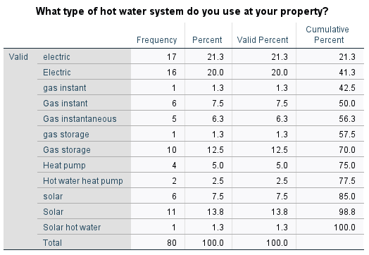
This output shows only five different types of hot water systems, but because of different spelling and terminology and different use of upper and lower case characters, twelve different responses are listed. To reduce this twelve down to the real five, the different categories need to be combined (i.e. recoded).
To complete the first part of this two-step process, from the menus choose:
- Transform
- Automatic Recode…
Now in the dialogue box that opens:
- move the variable (‘q13’) into the Variables box
- enter a name for the new variable in the New Name box (for example ‘q13_autorecode’)
- click on Add New Name
- select Treat blank string variables as user-missing (so that no category is created for these)
- select OK
The resultant output should be as follows:
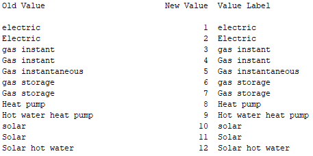
Note that the original responses have been sorted into alphabetical order and assigned a value from 1 to 12. The original data has been used to create the Value Labels for those values and all this has been put into a new variable at the end of the data file called ‘q13_autorecode’.
The second step of the process is then to reduce these 12 categories to the 5 required ones, using the standard Recode into Different Variables command described previously (or you could use the Recode into Same Variables command in this instance if preferred). In this case, the existing and new categories could be as follows:
| Existing category | New category |
|---|---|
| 1 (electric) | 1 (Electric) |
| 2 (electric) | 1 (Electric) |
| 3 (gas instant) | 2 (Instantaneous gas) |
| 4 (Gas instant) | 2 (Instantaneous gas) |
| 5 (Gas instantaneous) | 2 (Instantaneous gas) |
| 6 (gas storage) | 3 (Gas storage) |
| 7 (Gas storage) | 3 (Gas storage) |
| 8 (Heat pump) | 4 (Heat pump) |
| 9 (Hot water heat pump) | 4 (Heat pump) |
| 10 (solar) | 5 (Solar) |
| 11 (Solar) | 5 (Solar) |
| 12 (Solar hot water) | 5 (Solar) |
Visual binning
Sometimes it is helpful to transform a continuous variable into a categorical variable, as this provides additional analysis options. For example, in the sample data file you may wish to transform the continuous ‘q1’ variable into categories, perhaps in order to make some comparisons for different age groups.
While you can in fact do this using either of the procedures outlined above, the purpose-built procedure for this in SPSS is Visual Binning. You can make use of this by choosing the following from the SPSS menu (either from the Data Editor or Output window):
- Transform
- Visual Binning…
- select the required variable, for example the ‘q1’ variable, and move it across to the Variables to Bin box
- select Continue
- specify a name for the new variable in the Binned Variable box, for example ‘q1_grouped’
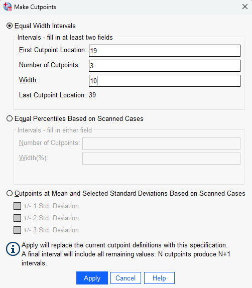
- click on the Make Cutpoints… button, to specify how you are going to ‘cut’ the data in order to make categories (sometimes you might use the histogram of the data to help you decide how to do this, while other times you might have set categories already in mind)
- specify a value for the First Cutpoint Location, for example if you want the first age category to include those up to and including the age of 19, you would enter 19
- specify the Number of Cutpoints , which will be one less than the number of categories you want to have, for example if you want to have four age categories you would enter 3
- adjust the Width of each cutpoint, for example from 7.667 to 10
Next:
- click Apply
- click Make Labels to automatically create labels for each new category
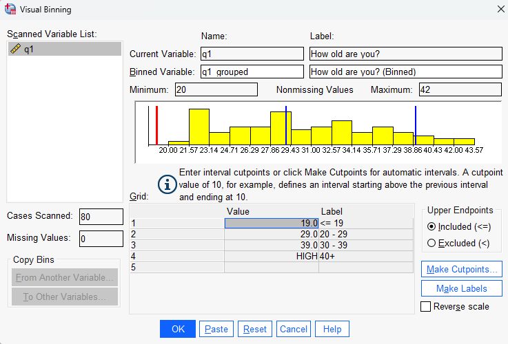
Next:
- click OK
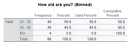
If you then navigate to the Data View of the Data Editor window, you will see that a new ‘q1_grouped’ variable has been added to the end of the data file (note that you can move it if wished, either in the Data View or in the Variable View , by dragging and dropping). You can analyse it in the usual way, for example you could run the Frequencies procedure (as described in the Descriptive statistics page of this module) on the new variable, which should result in the following table:
The normal distribution
Many of the statistics detailed in the Inferential statistics page of this module rely on the assumption that continuous data approximates a normal distribution, or that the sample size is large enough that the sampling distribution of the mean approximates a normal distribution. This page details how to use SPSS to test whether a continuous variable is normally distributed, while the Introduction to statistics module provides more information about what the normal distribution is and when testing for it is required.
In brief, this page covers how to do the following in SPSS:
- Test whether the distribution of a continuous variable approximates a normal distribution
- Transform a variable in order to try and make it better approximate a normal distribution
- Test for normality of a continuous variable for two or more categories of a categorical variable
</div>
Note that the examples covered here make use of the Household energy consumption data.sav file, which contains fictitious data for 80 people based on a short ‘Household energy consumption’ questionnaire. If you want to work through the examples provided you can download the data file using the following link:
If you would like to read the sample questionnaire for which the data relates, you can do so using this link:
Before commencing the analysis, note that the default is for dialog boxes in SPSS to display any variable labels, rather than variable names. You may find this helpful, but if you would prefer to view the variable names instead then from the menu choose:
- Edit
- Options…
- Change the Variable Lists option to Display names
Testing for normality
As explained in the Introduction to statistics module, it is helpful to consult a number of different measures in order to make a decision about normality. The Explore procedure in SPSS allows you to do this.
For example, to test whether the ‘q6’ variable (which measures average daily summer energy consumption in kWh in the sample data file) is normally distributed, choose the following from the SPSS menu (either from the Data Editor or Output window):
- Analyze
- Descriptive Statistics
- Explore…
- move the variable that you are checking for normality (in this case ‘q6’) into the Dependent List
- click on the Plots… button
- tick the Histogram box (keep the Stem-and-leaf box ticked as well)
- tick the Normality plots with tests option
- click on Continue
- click on OK
The output should be as follows:
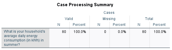
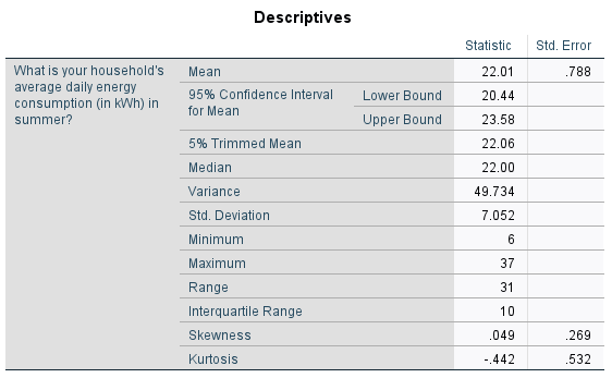
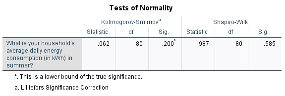
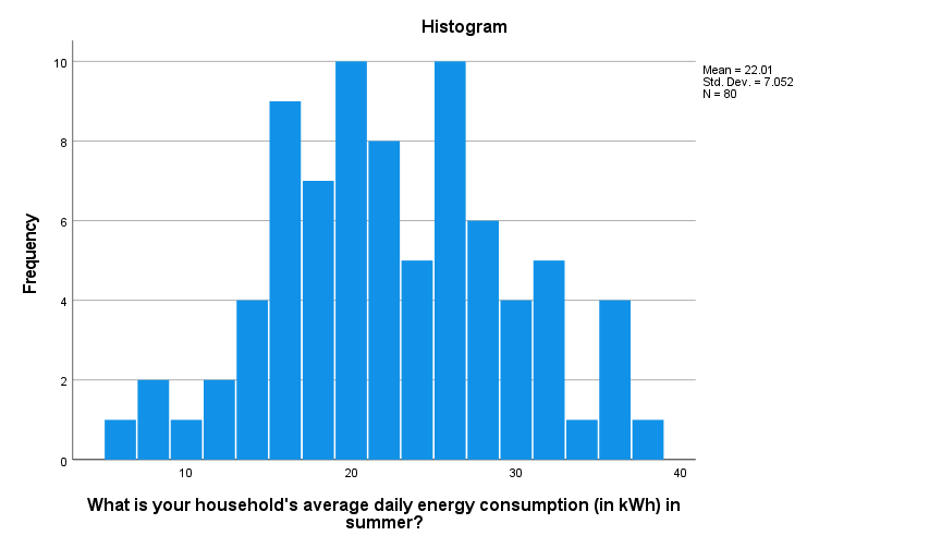
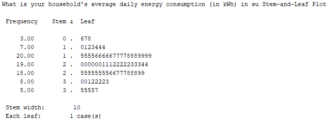
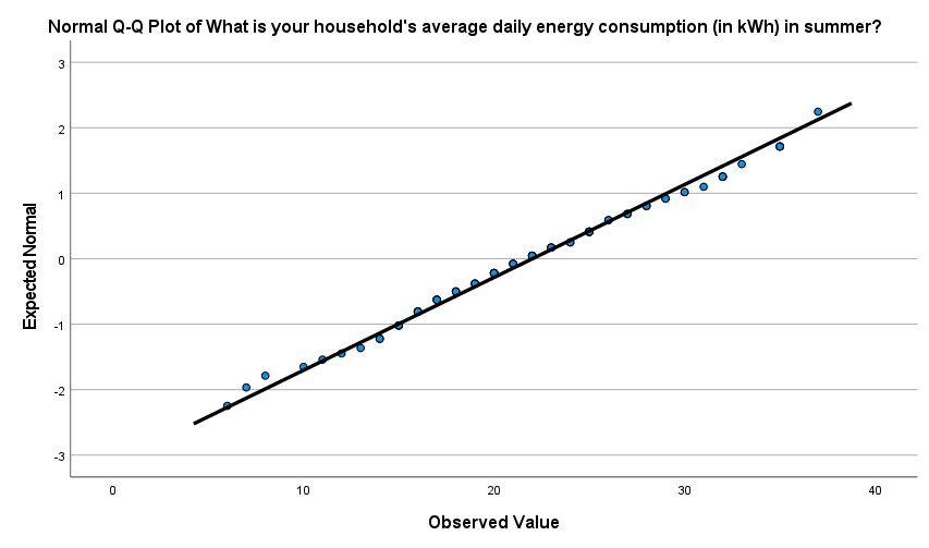
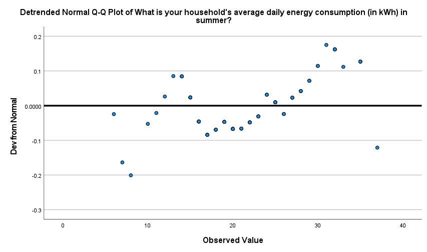
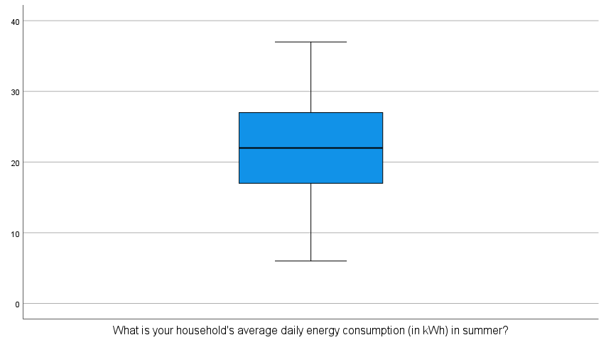
This output can then be evaluated as explained in the Introduction to statistics module. In particular, you should observe the following:
-
The mean and median (as shown in the ‘Descriptives’ table) are extremely similar. Note that if you would also like to compare the mode, you can obtain this through the Frequencies procedure as described in the Descriptives statistics page of this module. While this is a bit higher, at \(25\), this is less of a concern.
-
The skewness is \(0.049\) (as shown in the ‘Descriptives’ table), which is well within the acceptable range of \(-1\) to \(1\)
If you want you can also calculate the z-score by dividing this by the skewness standard error of \(0.269\) (also shown in the ‘Descriptives’ table), to give \(0.182\)
This is well within the acceptable range of \(-1.96\) to \(1.96\) -
The kurtosis is \(-0.442\) (as shown in the ‘Descriptives’ table), which is within the acceptable range of \(-1\) to \(1\)
If you want you can also calculate the z-score by dividing this by the kurtosis standard error of \(0.532\) (also shown in the ‘Descriptives’ table), to give \(0.831\)
This is within the acceptable range of \(-1.96\) to \(1.96\) -
The \(p\) value for the Shapiro-Wilk test is \(.585\) (as listed under ‘Sig.’ in the ‘Tests of Normality’ table), which is greater than \(.05\) as required.
-
The histogram is roughly symmetrical. Note that you can double click on the graph in SPSS to open the Chart Editor , then select the Elements drop down menu and choose Show Distribution Curve , to add in the normal curve in order to assess symmetry if desired.
-
The stem and leaf plot is roughly symmetrical.
-
The points do not deviate much from the line in the Normal Q-Q plot, and there are roughly equal number of points above and below the line in the detrended Q-Q plot.
-
The median is approximately in the middle of the box plot, the whiskers are of similar length and there are no outliers.
Hence it can be concluded that the ‘q6’ variable is approximately normally distributed.
Transforming variables
If you find that a variable is not normally distributed when you require it to be, you can try transforming the variable to see if this makes it better approximate a normal distribution. Some examples of transformations to try are provided in the Introduction to statistics module.
You can apply any of these transformations to the variable using the Compute variable procedure, as described in the Transformations page of this module. Once you have done this, you will need to test again for normality in the usual way.
Testing for normality in two or more groups
Sometimes rather than just testing that a continuous variable is normally distributed, you need to check that it is normally distributed for each category of a categorical variable. Again, you can do this using the Explore procedure.
For example, to test whether the ‘q6’ variable (which measures average daily summer energy consumption in kWh in the sample data file) is normally distributed for both groups of the ‘q3’ variable (which shows whether or not the participant has any children in the sample data file), choose the following from the SPSS menu (either from the Data Editor or Output window):
- Analyze
- Descriptive Statistics
- Explore…
- move the variable that you are checking for normality (in this case ‘q6’) into the Dependent List
- move the grouping variable (in this case ‘q3’) into the Factor List
- click on the Plots… button
- tick the Histogram box (keep the Stem-and-leaf box ticked as well)
- tick the Normality plots with tests option
- click on Continue
- click on OK
The output will be very similar to the output obtained when no factor is added, but this time there will be a set of statistics and graphs for each group. These should be analysed separately, and you may sometimes find that the data is normally distributed for all groups, for some groups only, or for none of the groups. In this case, the output indicates that the ‘q6’ variable is normally distributed for both the group that has children, and the group that doesn’t.
Inferential statistics
There are two key types of inferential statistics, estimation and hypothesis testing, and SPSS can be used to assist with both. This page looks at confidence intervals and at the fundamentals of hypothesis testing with regards to SPSS, while subsequent pages of the module focus on how to conduct some common inferential statistical tests in SPSS. Alternatively, for more information on inferential statistics you may like to visit the Introduction to statistics module.
In brief, this page covers the following:
- How to calculate a confidence interval in SPSS
- The steps involved in hypothesis testing, and where SPSS can assist
</div>
Note that the examples covered here make use of the Household energy consumption data.sav file, which contains fictitious data for 80 people based on a short ‘Household energy consumption’ questionnaire. If you want to work through the examples provided you can download the data file using the following link:
If you would like to read the sample questionnaire for which the data relates, you can do so using this link:
Before commencing the analysis, note that the default is for dialog boxes in SPSS to display any variable labels, rather than variable names. You may find this helpful, but if you would prefer to view the variable names instead then from the menu choose:
- Edit
- Options…
- Change the Variable Lists option to Display names
Determining a confidence interval
A confidence interval is a range of probable values for an unknown population parameter, based on the sample statistic (for example the mean). The percentage associated with the confidence interval is termed the confidence coefficient, and this is the level of confidence you have that the range actually includes the true value. SPSS automatically calculates confidence intervals for a range of statistics, with the default being a \(95\%\) confidence interval. For example, the following details how to obtain and interpret a \(95\%\) confidence interval for the mean of a continuous variable. If you would like more information on confidence intervals you may first like to visit the Introduction to statistics module.
A question you may wish to ask of the data is: Based on the data observed in the sample, what is the \(95\%\) confidence interval for the population mean summer energy consumption?
Before calculating this confidence interval in SPSS, it is important to note that some assumptions need to be met when using a confidence interval to estimate the mean of a population. These assumptions are as follows:
-
Assumption 1: The sample is a random sample that is representative of the population.
-
Assumption 2: The observations are independent, meaning that measurements for one subject have no bearing on any other subject’s measurements.
-
Assumption 3: The variable is normally distributed, or the sample size is large enough that the sampling distribution of the mean approximates a normal distribution.
While these first two assumptions should be met during the design and data collection phases, the third assumption should be checked at this stage. For instructions on testing for normality in SPSS, see the The normal distribution page of this module.
If all assumptions are met (as is the case for this example), you can obtain a \(95\%\) confidence interval for the mean in SPSS by choosing the following from the menu (either from the Data Editor or Output window; note that you may already have this output if you have previously tested this variable for normality):
- Analyze
- Descriptive statistics
- Explore…
- move the variable (for example the ‘q6’ variable) into the Dependent List (remove other variables if required)
- select Statistics in the Display section underneath
- click on OK
The output should then include the following:
This tells us that based on what has been observed in the sample, we can be \(95\%\) confident that the mean summer energy consumption of the wider population is somewhere between \(20.44\) kWh (lower bound) and \(23.58\) kWh (upper bound).
Note that to calculate a confidence interval for the mean with a confidence coefficient other than \(95\%\), follow the same instructions but also click on the Statistics button and change the Confidence Interval for Mean as required.
Hypothesis testing
Hypothesis testing involves testing statements (hypotheses) about the population using data collected in the sample. The particular test to use depends on the nature of the hypothesis, and there are often versions of each test that are parametric (assume normal distribution and require at least one continuous variable) and non-parametric (don’t assume normal distribution and can be used for ordinal variables). If you would like more information on hypothesis testing, you may like to visit the Introduction to statistics module.
Some common examples of hypothesis tests are one sample, paired samples and independent samples \(t\) tests, one-way ANOVA, the chi-square test of independence and Pearson’s correlation (all of which are covered in later pages of this module). Whichever test you are using, it is important to note that conducting the test in SPSS is just part of the process. In particular, the recommended steps to follow in order to successfully conduct a hypothesis test are listed below.
- Determine the hypothesis to be tested.
- Establish the appropriate test for the hypothesis.
- Check that all assumptions for the test are valid (SPSS can help with some of these).
- Use SPSS to conduct the relevant test and determine the \(p\) value and confidence interval (if applicable).
- Interpret the result.
Examples of how to do this for each of the tests in the table are covered in the following pages.Comparing means
One of the reasons you may wish to do a hypothesis test is to determine whether there is a statistically significant difference between means, either for a single sample (in which case you would compare to a constant value) or for multiple independent or related samples (in which case you would compare between these different samples). Depending on the exact nature of the analysis different tests are required, and this page details the process for performing some of the most common ones using SPSS.
In brief, it covers how to do the following in SPSS:
- Conduct and interpret the output for a one sample \(t\) test
- Conduct and interpret the output for a paired samples \(t\) test
- Conduct and interpret the output for an independent samples \(t\) test
- Conduct and interpret the output for a one-way ANOVA
</div>
Note that the examples covered here make use of the Household energy consumption data.sav file, which contains fictitious data for 80 people based on a short ‘Household energy consumption’ questionnaire. If you want to work through the examples provided you can download the data file using the following link:
If you would like to read the sample questionnaire for which the data relates, you can do so using this link:
Before commencing the analysis, note that the default is for dialog boxes in SPSS to display any variable labels, rather than variable names. You may find this helpful, but if you would prefer to view the variable names instead then from the menu choose:
- Edit
- Options…
- Change the Variable Lists option to Display names
Conducting a one sample \(t\) test
A question you may wish to ask of the wider population is: Does this sample come from a population where the mean summer daily energy consumption is \(19\)kWh?
This question can be answered by following the recommended steps, as follows:
-
The appropriate hypotheses for this question are:
\(\textrm{H}_\textrm{0}\): The sample comes from a population with a mean summer daily energy consumption of \(19\)kWh
\(\textrm{H}_\textrm{A}\): The sample does not come from a population with a mean summer daily energy consumption of \(19\)kWh -
The appropriate test to use is the one sample \(t\) test, as we are testing whether the sample comes from a population with a specific mean (\(19\)kWh in this case).
- The assumptions for a one sample \(t\) test are as follows:
- Assumption 1: The sample is a random sample that is representative of the population.
- Assumption 2: The observations are independent, meaning that measurements for one subject have no bearing on any other subject’s measurements.
- Assumption 3: The variable is continuous.
- Assumption 4: The variable is normally distributed, or the sample size is large enough to ensure normality of the sampling distribution.
While the first three assumptions should be met during the design and data collection phases, the fourth assumption should be checked at this stage (for instructions on doing this in SPSS, see the The normal distribution page of this module). If the normality assumption is not met you can try transforming the data or conducting the One sample Wilcoxon signed-rank test instead (you can also use this test if you have an ordinal rather than continuous variable).
- If all the assumptions are met, you can conduct the one sample \(t\) test in SPSS by choosing the following from the SPSS menu (either from the Data Editor or Output window):
- Analyze
- Compare Means
- One-Sample T Test
- move the variable (‘q6’) into the Test Variable(s) box
- enter the Test Value of 19
- click on OK
The output should look like this:
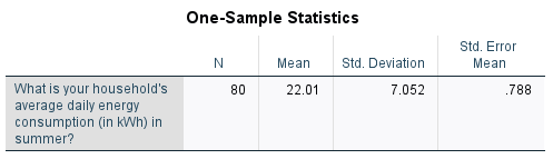
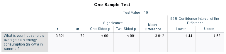
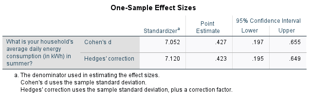
-
From the first table we can see that the mean summer daily energy consumption in our sample is \(22.01\)kWh, which is \(3.012\)kWh more than our hypothesised value. To test whether this is a statistically significant difference, we need to refer to the second table and to the \(p\) value and confidence interval.
While there are actually two \(p\) values listed in the second table (the ‘One-sided \(p\)’ and ‘Two-sided \(p\)’), the standard one to use is the ‘Two-Sided \(p\)’ value as this is used to test for a difference in either direction (that is, to test whether the mean is significantly greater than or less than \(19\), as per our alternative hypothesis). Since \(p < .05\) (in fact \(p < .001\)) and since the \(95\%\) confidence interval for the difference between the population mean summer daily energy consumption and the hypothesised value does not include zero (\(95\% \textrm{CI}\) [\(1.44\)kWh, \(4.58\)kWh]), we can reject the null hypothesis and conclude that the sample actually comes from a population with mean summer daily energy consumption significantly more than \(19\)kWh.
Finally, the third table provides the effect sizes, which can be used to test for practical significance. The ‘Point Estimate’ for ‘Cohen’s \(d\)’ of \(0.427\) indicates a medium effect.
For more information on how to interpret these results see the Introduction to statistics module.
Conducting a paired samples \(t\) test
A question you may wish to ask of the wider population is: Is there a statistically significant difference between mean summer daily energy consumption and mean winter daily energy consumption?
This question can be answered by following the recommended steps, as follows:
-
The appropriate hypotheses for this question are:
\(\textrm{H}_\textrm{0}\): There is no significant difference between mean summer and winter daily energy consumption
\(\textrm{H}_\textrm{A}\): There is a significant difference between mean summer and winter daily energy consumption -
The appropriate test to use is the paired samples \(t\) test, as we are comparing the means of two related groups (summer and winter consumption for the sample people).
- The assumptions for a paired samples \(t\) test are as follows:
- Assumption 1: The sample is a random sample that is representative of the population.
- Assumption 2: The observations are independent, meaning that measurements for one subject have no bearing on any other subject’s measurements.
- Assumption 3: The variables are both continuous.
- Assumption 4: Both variables as well as the difference variable (the differences between each data pair) are normally distributed, or the sample size is large enough to ensure normality of the sampling distributions.
While the first three assumptions should be met during the design and data collection phases, the fourth assumption should be checked at this stage (for instructions on doing this in SPSS, see the The normal distribution and Transformations pages of this module). If the normality assumption is not met you can try transforming the data or conducting the Wilcoxon signed rank test instead. You can also use this test if you have ordinal rather than continuous variables.
- If all the assumptions are met, you can conduct the paired samples \(t\) test in SPSS by choosing the following from the SPSS menu (either from the Data Editor or Output window):
- Analyze
- Compare Means
- Paired-Samples T Test
- move the variables (‘q6’ and ‘q7’) into the Paired Variables box as Pair 1
- click on OK
The output should look like this:
-
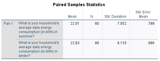
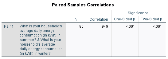
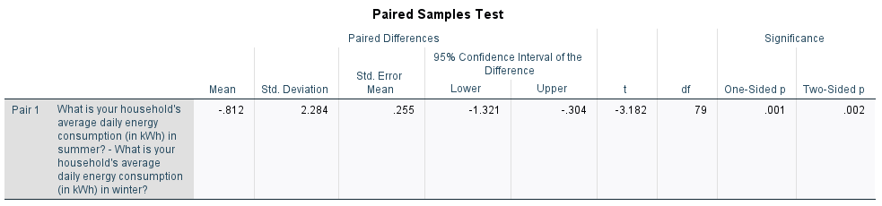
From the first table we can see that the mean summer daily energy consumption in our sample is \(22.01\)kWh, while the mean winter daily energy consumption is \(22.83\)kWh; a difference of \(0.812\)kWh. To test whether this is a statistically significant difference, we need to refer to the third table and to the \(p\) value and confidence interval. (Note that the second table provides information about the correlation between the variables, and does not need to be interpreted here.)
While there are actually two \(p\) values listed in the third table (the ‘One-sided \(p\)’ and ‘Two-sided \(p\)’), the standard one to use is the ‘Two-Sided \(p\)’ value as this is used to test for a difference in either direction (that is, to test whether one mean is significantly greater than or less than the other, as per our alternative hypothesis). Since \(p < .05\) (in fact \(p= .002\)) and since the \(95\%\) confidence interval for the difference between the population mean summer and winter daily energy consumptions does not include zero (\(95\% \textrm{CI}\) [\(-1.321\)kWh, \(-0.304\)kWh]), we can reject the null hypothesis and conclude that the mean summer daily energy consumption is significantly less than the mean winter daily energy consumption.
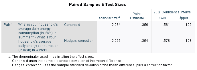
Finally, the third table provides the effect sizes, which can be used to test for practical significance. The ‘Point Estimate’ for ‘Cohen’s \(d\)’ of \(-0.356\) indicates a small to medium effect.
For more information on how to interpret these results see the Introduction to statistics module.
Conducting an independent samples \(t\) test
A question you may wish to ask of the wider population is: Is there a statistically significant difference in mean summer daily energy consumption for those with and without children?
This question can be answered by following the recommended steps, as follows:
-
The appropriate hypotheses for this question are:
\(\textrm{H}_\textrm{0}\): There is no significant difference in mean summer daily energy consumption for those with and without children
\(\textrm{H}_\textrm{A}\): There is a significant difference in mean summer daily energy consumption for those with and without children -
The appropriate test to use an independent samples \(t\) test, as we are comparing the means of two unrelated groups (summer consumption of those with and without children).
- The assumptions for an independent samples \(t\) test are as follows:
- Assumption 1: The sample is a random sample that is representative of the population.
- Assumption 2: The observations are independent, meaning that measurements for one subject have no bearing on any other subject’s measurements.
- Assumption 3: The dependent variable is continuous.
- Assumption 4: The variable is normally distributed for both groups, or the sample size is large enough to ensure normality of the sampling distribution.
While the first three assumptions should be met during the design and data collection phases, the fourth assumption should be checked at this stage (for instructions on doing this in SPSS, see the The normal distribution page of this module). If the normality assumption is not met you can try transforming the data or conducting the Mann-Whitney U test instead. You can also use this test if you have an ordinal rather than continuous dependent variable.
- If all the assumptions are met, you can conduct the independent samples \(t\) test in SPSS by choosing the following from the SPSS menu (either from the Data Editor or Output window):
- Analyze
- Compare Means
- Independent-Samples T Test
- move the continuous variable (‘q6’) into the Test Variable(s) box
- move the categorical variable (‘q3’) into the Grouping Variable box
- click on Define Groups…
- keep Group 1 as category 1 and Group 2 as category 2 and select Continue
- click on OK
The output should look like this:
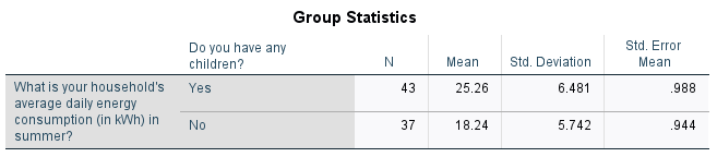

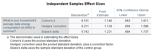
-
From the first table we can see that the mean summer daily energy consumption in our sample for those with children is \(25.26\)kWh, while for those without children it is \(18.24\)kWh; a difference of \(7.013\)kWh. To test whether this is a statistically significant difference, we need to refer to the second table and to the \(p\) value and confidence interval.
The second table actually contains five \(p\) values, of which we need to assess two. The first is for Levene’s Test for Equality of Variances (listed as ‘Sig.’), and since this \(p > .05\) (in fact \(p = .354\)), we can assume equal variances. This means we should interpret the top row of the remainder of the table. While there are actually two \(p\) values listed in the remainder of the top row (the ‘One-sided \(p\)’ and ‘Two-sided \(p\)’), the standard one to use is the ‘Two-Sided \(p\)’ value as this is used to test for a difference in either direction (that is, to test whether one mean is significantly greater than or less than the other, as per our alternative hypothesis). Since \(p < .05\) (in fact \(p < .001\)) and since the \(95\%\) confidence interval for the difference between the population mean summer daily energy consumptions of those with and without children does not include zero (\(95\% \textrm{CI}\) [\(4.267\)kWh, \(9.758\)kWh]), we can reject the null hypothesis and conclude that the mean summer daily energy consumption is significantly more for those with children compared to those without.
Finally, the third table provides the effect sizes, which can be used to test for practical significance. The ‘Point Estimate’ for ‘Cohen’s \(d\)’ of \(1.14\) indicates a large effect.
For more information on how to interpret these results see the Introduction to statistics module.
Conducting a one-way ANOVA
A question you may wish to ask of the wider population is: Is there a statistically significant difference in mean summer daily energy consumption for any of the different marital statuses?
This question can be answered by following the recommended steps, as follows:
-
The appropriate hypotheses for this question are:
\(\textrm{H}_\textrm{0}\): There is no significant difference in mean summer daily energy consumption for any of the different marital statuses
\(\textrm{H}_\textrm{A}\): The mean summer daily energy consumption of at least one of the marital status groups is significantly different from the others -
The appropriate test to use a one-way ANOVA, as we are comparing the means of three unrelated groups (summer consumption of those with a marital status of single, married and other).
- The assumptions for a one-way ANOVA are as follows:
- Assumption 1: The sample is a random sample that is representative of the population.
- Assumption 2: The observations are independent, meaning that measurements for one subject have no bearing on any other subject’s measurements.
- Assumption 3: The dependent variable is continuous.
- Assumption 4: The variable is normally distributed for each of the groups, or the sample size is large enough to ensure normality of the sampling distribution.
- Assumption 5: The populations being compared have equal variances.
While the first three assumptions should be met during the design and data collection phases, the fourth and fifth assumptions should be checked at this stage (for instructions on checking the normality assumption in SPSS, see the The normal distribution page of this module). Instructions on checking the equal variances assumption are included in the analysis stage.
If the normality assumption is not met you can try transforming the data or conducting the Kruskall-Wallis one-way ANOVA instead. You can also use this test if you have an ordinal rather than continuous dependent variable. If the equal variances assumption is violated you will need to use a Welch or Brown-Forsythe statistic instead.
- If the first four assumptions are met, you can conduct the one-way ANOVA in SPSS by choosing the following from the SPSS menu (either from the Data Editor or Output window):
- Analyze
- Compare Means
- One-Way ANOVA
- move the continuous variable (‘q6’) into the Dependent List box
- move the categorical variable (‘q4’) into the Factor box
- select Options… from the right hand menu
- select Descriptive and Homogeneity of variance test in the dialogue box
- click on Continue
- click on OK
The output should look like this:
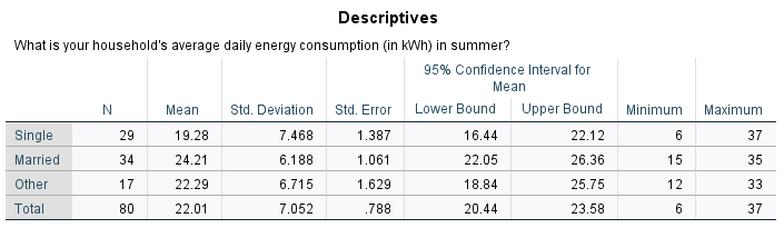
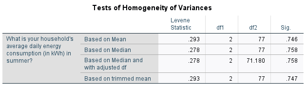
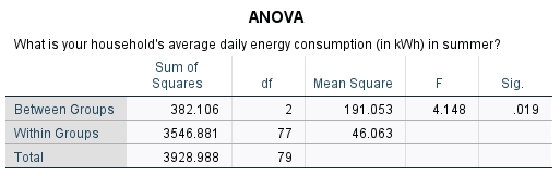
-
From the first table we can see that the mean summer daily energy consumption in our sample for those who are single is \(19.28\)kWh, for those who are married it is \(24.21\)kWh and for those who classified their marital status as ‘Other’ it is \(22.29\)kWh. To test whether there are any statistically significant differences between these values, we need to refer to the third table and to the \(p\) value.
Before this though, we need to use the second table to evaluate the fifth assumption using Levene’s test of homogeneity of variance. The \(p\) value to evaluate is the one in the ‘Based on Mean’ row, which is listed as ‘Sig.’. Since this \(p > .05\) (in fact \(p = .746\)), we can assume equal variances and therefore the fifth assumption for the test is met. If the fifth assumption is not met, you can go back through the menu and keep the previous selections, but this time also select either the Brown-Forsythe test or the Welch test in the Options dialogue box.
The third table contains the \(p\) value to evaluate for the one-way ANOVA, and since \(p < .05\) (in fact \(p = .019\)) we can reject the null hypothesis and conclude that the mean summer daily energy consumption is significantly different for at least one of the marital status groups.
To find out where the significant difference(s) lie you can conduct a post hoc test. While there are many different options to choose from, a common test to try is Tukey’s HSD test (alternatively, if the homogeneity of variance assumption is violated you can use the Games Howell test). To do this, go back through and keep the previous selections but also do the following:
* select Post Hoc… from the right hand menu * select Tukey in the dialogue box * click on Continue * click on OKThe output should be the same as previously, but with the addition of the tables below. Both of these tables indicate that the only significant difference in mean summer daily energy consumption is between the single and married groups. This is shown by the fact that the \(p < .05\) (in fact \(p = .014\)) for this pair in the first table, and by the fact that mean values for the single and married groups do not appear in the same column of the second table.
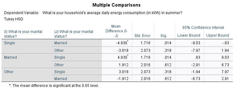
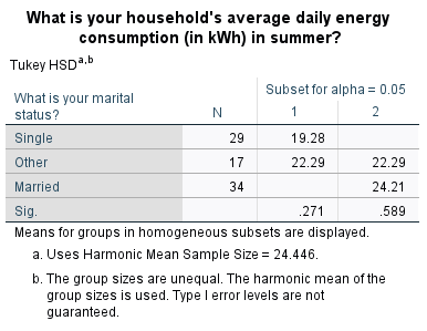
Assessing relationships
One of the reasons you may wish to do a hypothesis test is to determine whether there is a statistically significant relationship between two or more variables, and different tests are required for this based on the type of variables.
In brief, this page covers how to do the following in SPSS:
- Conduct and interpret the output for a chi-square test of independence
- Conduct and interpret the output for a test of linear correlation
</div>
Note that the examples covered here make use of the Household energy consumption data.sav file, which contains fictitious data for 80 people based on a short ‘Household energy consumption’ questionnaire. If you want to work through the examples provided you can download the data file using the following link:
If you would like to read the sample questionnaire for which the data relates, you can do so using this link:
Before commencing the analysis, note that the default is for dialog boxes in SPSS to display any variable labels, rather than variable names. You may find this helpful, but if you would prefer to view the variable names instead then from the menu choose:
- Edit
- Options…
- Change the Variable Lists option to Display names
Testing for association
A question you may wish to ask of the wider population is: Is there a statistically significant association between having children and owning a dishwasher?
This question can be answered by following the recommended steps, as follows:
-
The appropriate hypotheses for this question are:
\(\textrm{H}_\textrm{0}\): There is no significant association between having children and owning a dishwasher
\(\textrm{H}_\textrm{A}\): There is significant association between having children and owning a dishwasher -
The appropriate test to use is a chi-square test of independence, as we are testing for association between two categorical variables (having children and owning a dishwasher).
- The assumptions for the chi-square test of independence are as follows:
- Assumption 1: The sample is a random sample that is representative of the population.
- Assumption 2: The observations are independent, meaning that measurements for one subject have no bearing on any other subject’s measurements.
- Assumption 3: The categories used for the variables are mutually exclusive.
- Assumption 4: The categories used for the variables are exhaustive.
- Assumption 5: No more than \(20\%\) of the expected frequencies are less than \(5\) (if this is violated Fisher’s exact test can be used instead).
While the first four assumptions should be met during the design and data collection phases, the fifth assumption can be checked during the analysis stage. If this assumption is violated and your variables each have only two categories, you can use the results displayed in SPSS for Fisher’s exact test instead. If your variables have more categories, you may be able to exclude or combine some of them. For instructions on combining categories by recoding, see the Transformations page of this module.
- If the first four assumptions are met, you can conduct the chi-square test of independence in SPSS by choosing the following from the SPSS menu (either from the Data Editor or Output window):
- Analyze
- Descriptive statistics
- Crosstabs…
- transfer the independent variable (‘q3’) to the Row(s) box
- transfer the dependent variable (‘q16.3’) to the Column(s) box
- select Statistics… from the right hand menu
- select Chi-square and Phi and Cramer’s V in the dialogue box
- click on Continue
- select Cells… from the right hand menu
- select Observed and Expected in the dialogue box
- click on Continue
- click on OK
The output should look like this:
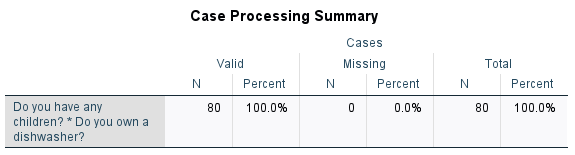
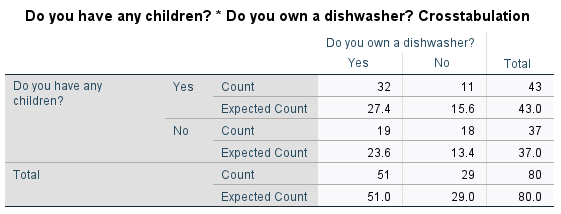
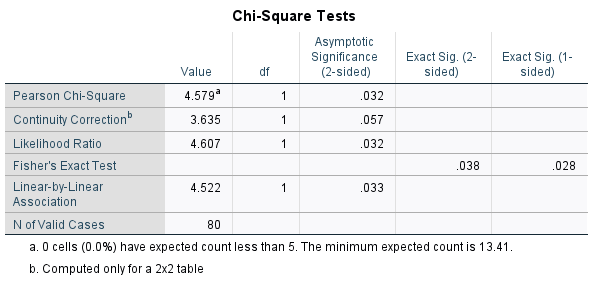
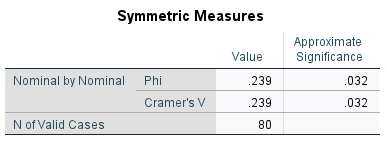
-
The first table simply shows that \(80\) cases have been processed. The second table shows how the actual sample data compares with what would be expected if there was no association between having children and dishwasher ownership. The fact that there is a bit of a difference between the observed and expected values provides evidence of association in the sample, with the nature of the association being that people with children are more likely to own a dishwasher.
To find out whether the association is significant, we need to refer to the third table and to the ‘Asymptotic Significance (2-sided)’ value in the ‘Pearson Chi-Square’ row. Since \(p < .05\) (\(p = .032\)) we can reject the null hypothesis and conclude that there is a statistically significant association between having children and owning a dishwasher.
Finally, the fourth table provides the effect sizes, which can be used to test for practical significance. The ‘Phi’ of \(.239\) indicates a small to medium effect.
For more information on how to interpret these results see the Introduction to statistics module.
Testing for linear correlation
A question you may wish to ask of the wider population is: Is there a statistically significant linear correlation between summer daily energy consumption and winter daily energy consumption?
This question can be answered by following the recommended steps, as follows:
-
The appropriate hypotheses for this question are:
\(\textrm{H}_\textrm{0}\): There is no significant linear correlation between summer and winter daily energy consumption
\(\textrm{H}_\textrm{A}\): There is significant linear correlation between summer and winter daily energy consumption -
The appropriate test to use is Pearson’s correlation coefficient, as we are testing for linear correlation between two variables (summer daily energy consumption and winter daily energy consumption).
- The assumptions for Pearson’s correlation coefficient are as follows:
- Assumption 1: The sample is a random sample that is representative of the population.
- Assumption 2: The observations are independent, meaning that measurements for one subject have no bearing on any other subject’s measurements.
- Assumption 3: The variables are both continuous.
- Assumption 4: Both variables are normally distributed, or the sample size is large enough to ensure normality of the sampling distribution.
- Assumption 5: There is a linear relationship between the variables, as observed in the scatter plot (this is not strictly an assumption as Pearson’s correlation coefficient is still valid without it, but if you already know the relationship is not linear further interpretation is not necessary).
- Assumption 6: There is a homoscedastic relationship between the variables (i.e. variability in one variable is similar across all values of the other variable), as observed in the scatter plot (dots should be similar distance from line of best fit all the way along).
While the first three assumptions should be met during the design and data collection phases, the fourth, fifth and sixth assumptions should be checked at this stage (for instructions on checking the normality assumption in SPSS, see the The normal distribution page of this module).
If the normality assumption is not met you can try transforming the data or using Spearman’s Rho or Kendall’s Tau-B instead. You can also use one of these tests if you have ordinal rather than continuous variables, or if there is non-linear correlation.
To check for linearity and homoscedasticity, you can create a scatter plot with the independent variable on the \(x\)-axis and the dependent variable on the \(y\)-axis (for this example these are interchangeable; we will put summer consumption on the \(x\)-axis). For instructions on creating a scatterplot in SPSS, see the Charts page of this module.
The scatterplot, with the line of best fit included, should look as follows. This shows that the relationship is approximately linear as the points lie close to the line of best fit. It also shows that the relationship is homoscedastic, as the points are a similar distance from the line of best fit all the way along (they don’t create a ‘funnel’ shape in either direction). Hence the fifth and sixth assumptions have been met.
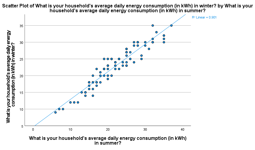
- If the assumptions are met, you can assess Pearson’s correlation coefficient in SPSS by choosing the following from the SPSS menu (either from the Data Editor or Output window):
- Analyze
- Correlate
- Bivariate
- select the variables (‘q6’ and ‘q7’) and move them into the Variables box
- click on OK
The output should look like this:
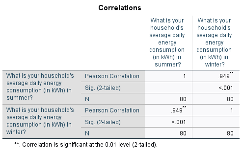
-
This table shows that Pearson’s correlation coefficient is \(.949\), indicating a strong positive linear correlation between summer and winter energy consumption (for more information on how to interpret this see the Descriptive statistics page of this module
To test whether this linear correlation is statistically significant requires the \(p\) value (listed as ‘Sig. (2-tailed)’). Since \(p < .05\) (in fact \(p < .001\)) we can reject the null hypothesis and conclude that there is a statistically significant linear correlation between summer energy consumption and winter energy consumption.
Pearson’s correlation coefficient and its square (the coefficient of variation) are also measures of effect size, which can be used to test for practical significance. The correlation coefficient of \(.949\) indicates a large effect, and the coefficient of variation of \(90.06\%\) indicates that \(90.06\%\) of variation in winter energy consumption can be explained by variation in summer energy consumption.
For more information on how to interpret these results see the Introduction to statistics module. Extras
This page of the module covers a few extra tips and tricks that you may find helpful when analysing data in SPSS.
In brief, it covers the following:
- Selecting and deselecting subsets of the data
- Analysing multiple response data
- Using SPSS syntax to write and run commands instead of the menus and dialogue boxes
</div>
Note that the examples covered here make use of the Household energy consumption data.sav file, which contains fictitious data for 80 people based on a short ‘Household energy consumption’ questionnaire. If you want to work through the examples provided you can download the data file using the following link:
If you would like to read the sample questionnaire for which the data relates, you can do so using this link:
Before commencing the analysis, note that the default is for dialog boxes in SPSS to display any variable labels, rather than variable names. You may find this helpful, but if you would prefer to view the variable names instead then from the menu choose:
- Edit
- Options…
- Change the Variable Lists option to Display names
Using subsets of the data
While the default in SPSS is for all of the cases in the data file to be processed every time, this doesn’t mean you need to have separate data files for each little subset of cases in order to process them separately. Instead, you can use a filter to select and process particular subsets of your data file as required.
As an example, suppose that for reporting purposes there is a need to analyse just the female responses - temporarily ignoring the other data. To select this subset of data, choose the following from the SPSS menu (either from the Data Editor or Output window):
- Data
- Select cases…
Then to select cases according to certain criteria (e.g. if they are female):
- Select If condition is satisfied
- Click If…
The expression that defines the required condition in this case is that the ‘q2’ variable (the gender variable) is equal to the value 2 (the code representing female). To define this:
- move the ‘q2’ variable into the box and add in the = 2
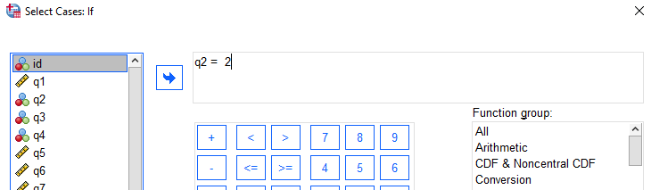
Next:
- Click on Continue
- Click on OK
In the Data View of the Data Editor window the cases that do not satisfy the selection criteria (i.e. those of other genders) will now not be visible, as they have been temporarily filtered out (or the row numbers will have a line through them, depending on the version of the software). Any analyses now will only report on the selected cases – the females.
For example, to find out how many females are in each of the different categories for the ‘q8’ variable (which relates to consumption reduction), run the Frequencies procedure (as described in the Descriptive statistics page of this module) on the available data. Note that the number of cases reported in the output should be 69, the number of females, and not the 80 that constitutes the full data file.
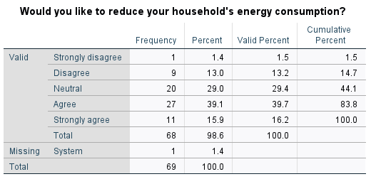
When all of the analysis of the female only data has been completed, another subset can be isolated by going through the Select Cases process again if required. Alternatively, to revert back to the whole data file don’t forget to turn the selection/filter off! To do this, choose the following from the SPSS menu (either from the Data Editor or Output window):
- Data
- Select cases…
- select All cases
- click on OK
All 80 cases are available for processing again once the selection has been turned off.
Multiple response data
The sample questionnaire provided contains two questions with multiple parts: question 15, which asks whether the participant owns any heating or cooling products and prompts them to list up to three if so; and question 16, which asks the participant whether or not they own five different items.
While the data for each part of these questions is required to be stored in a separate variable (for example ‘q15’, ‘q15.1’, ‘q15.2’ and ‘q15.3’; and ‘q16.1’, ‘q16.2’, ‘q16.3’, ‘q16.4’ and ‘q16.5’), often the data needs to be analysed together in sets. These are known as multiple response sets in SPSS, and this section explains how to create, analyse and display them.
Creating and using multiple response sets
There are two ways of creating multiple response sets in SPSS. One of the ways (the Multiple Response option in the Analyze menu) does not retain the sets between SPSS sessions. The other does as long as the data file is saved again once they have been created; it is this latter way that is used in this example. There are two ways to access this method using the menu options in SPSS, the first of which is by selecting:
- Data
- Define Multiple Response Sets…
The second way is by selecting:
- Analyze
- Tables
- Multiple Response Sets…
Either way, you can then create sets in the Define Multiple Response Sets window. For example, to create a set containing the ‘q15.1’, ‘q15.2’ and ‘q15.3’ variables (in order to analyse all of the specified heating and cooling methods together) do the following:
- move the three variables containing the heating and cooling methods (‘q15.1’, ‘q15.2’, and ‘q15.3’) into the Variables in Set panel
- click on Categories (because the responses were coded into different categories)
- give the set a Name (for example ‘q15methods’)
- give the set a Label (for example ‘Heating and cooling methods’)
- click on Add
The set for question 16 can be created at the same time, but this time the variables are dichotomous and the answers of interest are the ‘Yes’ ones (coded 1). You can create this set as follows:
- move the five variables relating to question 16 into the Variables in Set panel
- click on Dichotomies
- enter the counted value as 1
- give the set a Name (for example ‘q16’)
- give the set a Label (for example ‘Items owned’)
- click on Add
Both sets will now be listed in the Multiple Response Sets panel, so now:
- Click on OK
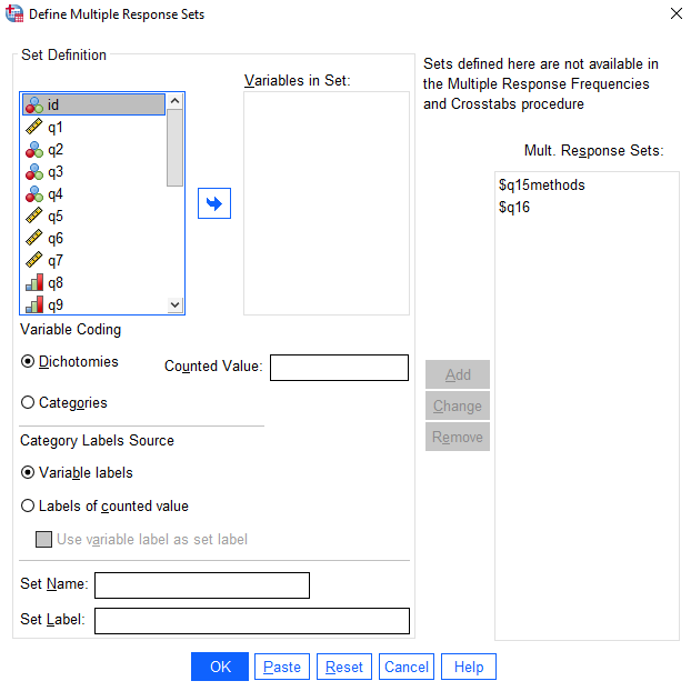
Once you have created the multiple response sets some output will appear in the results window (not shown here) detailing the variables used. The two sets will not be visible in the data file, except as the separate variables making up the sets, but they are set up for use in any of the Tables procedures. The sets will be retained for this use if the data file is saved before ending the SPSS session.
To use these sets in Custom Tables, from the menus choose:
- Analyze
- Tables
- Custom Tables
- click on OK
The Custom Tables dialogue box is arranged differently to most other procedures in that it has a ‘Canvas’ area where specifications are dragged and dropped to build the required table. The concept is similar to using the Chart Builder for producing graphs.
The multiple response sets that have been defined will be listed after the variables in the panel on the left hand side. The icon with four squares depicts a set with categorical variables while the one with two squares is for a dichotomous set.
To create a frequencies table for the ‘q15methods’ set:
- click on ‘q15methods’
- drag and drop it into the Rows panel
A mock up of the table will appear in the canvas, which should look like the following (note there are no percentages or totals provided automatically, but you can add these as detailed below):
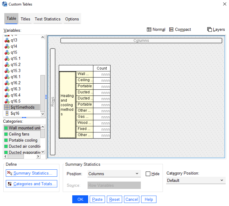
To include percentages on the table:
- click on Summary Statistics…
- click on the plus sign next to Column Percent
- select Column N %
- use the arrow head to move it into the Display box
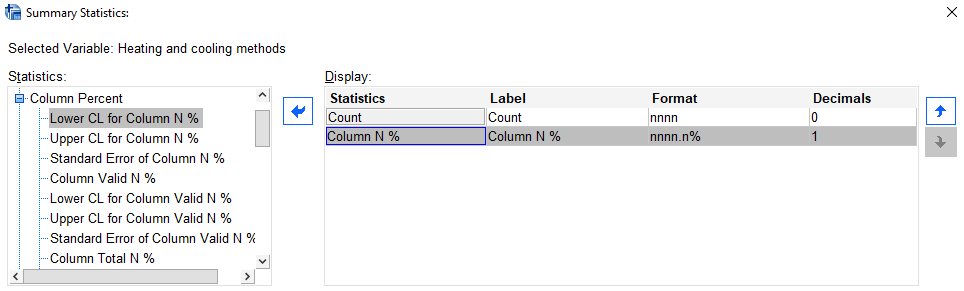
- click on Apply to selection
- click on Close
To include a total on the table:
- click on Category and Totals…
- select Total in the Show box on the right hand side
- click on Apply
The canvas will now show the table with percentages and a total included.
- click on OK
The resultant table should look like this:
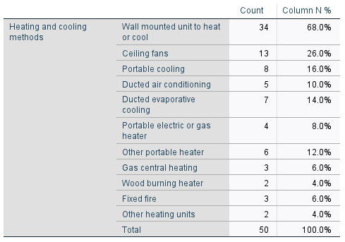
Note that the percentages are automatically based on the number of valid cases, i.e. those people who answered the question by listing at least one heating or cooling method.
The tables for dichotomous multiple response sets are created in exactly the same way.
To create a two-dimensional table, similar to a Crosstabs table, the second variable will need to be dragged and dropped into the Columns panel. Row or column percentages can then be chosen as required.
Graphing multiple response data
Once multiple response sets have been defined they can be used to create graphs in the Chart Builder, in the same way as for variables.
To create a Bar chart of the multiple response set ‘q15methods’, for example, from the menus choose:
- Graphs
- Chart Builder
- click on OK to say the all variables have been defined appropriately (if required)
- drag the simple bar chart image onto the canvas
- drag the ‘q15methods’ set and drop it on the X axis
By default, the Y axis will display the count for each category. To change this to response percentages (i.e. the percentage of respondents who selected each category) make the following change in the Element Properties dialogue box:
- choose Response Percentage from the drop down list in the Statistics area
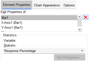
- click on OK
The resultant chart should look something like the following:
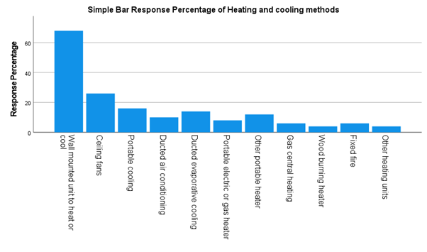
It can be edited using the Chart Editor, as detailed in the Charts page of this module.
Using SPSS syntax
SPSS syntax is a command language that is unique to SPSS. Rather than using the SPSS menus and dialogue boxes to perform procedures, as per the examples in this module, a syntax file can be used to write and then run commands. While this may seem a daunting prospect if you are not familiar with command languages, note that you do not have to write your own commands from scratch in order to create a syntax file unless you want to. In fact, you can create commands in a syntax file by doing any of the following:
- pasting commands that you have built up using the menus and dialogue boxes
- copying and pasting commands that are displayed in your output file
- creating your own commands from scratch by typing them directly into the syntax file
- editing commands that you have already pasted in order to create new commands
- a combination of any or all of the above.
There are many benefits to using a syntax file, some of which are that it:
- provides a record of all the procedures you have performed
- means you have a set of commands that can be repeated regularly, such as for monthly reports
- allows you to build a set of instructions that can be used to test different portions of data as it arrives
- is generally quicker, in particular when performing a large number of procedures.
This section details a few of the different ways you can create and run commands in a syntax file.
Rules for syntax
Before we look at some of the ways to create commands in a syntax file, note that there are a few basic rules and guidelines to follow when creating or editing syntax. These are as follows:
- Every new command should start on a new line.
- It is best to start the first word of a new command on the far left hand side of the line in order. If the command contains subsequent lines, these should be indented at least one space (tab can be used to make the first line of each command really stand out).
- The commands are not case sensitive, so you can use upper or lower case or a mixture of both.
- Generally the commands can be abbreviated to the first four letters as long as they are unique to that command. Variable names cannot be abbreviated though.
- Commas or spaces can generally be used to separate names of variables in a list, or the word ‘to’ can be used if the variables occur one after the other in the data file.
- The end of each command must be signalled by a full stop.
- You can leave blank lines between commands to aid readability, but must not embed a blank line within a command.
- You can include comments by starting a line with at least one asterisk (*) and finishing with a full stop.
Creating a syntax file
A few different ways to add commands to a syntax file are detailed below. Click on the relevant heading to learn more about it:
Pasting commands from a dialogue box
You can paste commands into a syntax file from an SPSS dialogue box rather than actually running the procedure. For example, to paste the command for creating a frequency table for the ‘q2’ variable into a syntax file, choose the following from the SPSS menu:
- Analyze
- Descriptive Statistics
- Frequencies…
- Click on the ‘q2’ variable
- Click on the arrow head to move it to the right hand box
- Click on Paste.
The procedure will not be executed, and instead a new syntax file will open which contains the relevant command. It should look like the following:
FREQUENCIES VARIABLES=q2
  /ORDER=ANALYSIS.
(Note that the syntax file may also start with a command stating which data set is being used. For example, ‘DATASET ACTIVATE DataSet1’. This is not required if you only have one data set open, but if you have more than one you will need to ensure that this command is included and that it refers to the correct data set.)
The first line of the ‘FREQUENCIES’ command tells SPSS that we want to obtain frequencies for the variable ‘q2’. The second line relates to a default setting of this command, and these are often included when you paste from a dialogue box (typically they relate to handling of missing data or the choices under the ‘options’ button). As a general rule of thumb, if you didn’t have to click on something to get it you don’t need to specify it in the syntax file because it is the default anyway, which is the case here. Hence we can remove this line from the command, as long as we put a full stop at the end of the first line instead. The command now becomes:
FREQUENCIES VARIABLES=q1.
Once this or any other command is in the syntax window it can be edited or copied, pasted and edited as required. For example, you could copy and paste the command then edit it to request frequency tables for variables ‘q14’ and ‘q15’ at the same time, as follows:
FREQUENCIES VARIABLES=q14 q15.
Copying and pasting commands from an output file
Syntax commands can be included as part of your output file when you perform procedures, in which case you can simply copy and paste them into a syntax file. If the commands are not included in your output file already, you can request this by selecting the following from the SPSS menu:
- Edit
- Options…
- click on the Viewer tab
- select Display commands in the log
- click on OK
All the commands that you run, either from the syntax or through dialogue boxes, will now be listed as part of your output file. This can be an easy way of learning what the syntax commands look like and it can be a great way of trying something, examining the output, and only creating the syntax when you have achieved exactly the desired result.
As an example, run an independent samples (t) test to see if there is a significant difference in the mean summer daily energy consumption between those who do and don’t own a swimming pool. You can do this by choosing the following from the SPSS menu (refer to the Inferential statistics page of this module for more information on this test):
- Analyze
- Compare means
- Independent-Samples T-Test
- make the Test variable q7
- move the continuous variable (‘q6’) into the Test Variable(s) box
- move the categorical variable (‘q16.4’) into the Grouping Variable box
- click on Define Groups…
- keep Group 1 as category 1 and Group 2 as category 2 and select Continue
- click on OK
The resultant syntax output in the output file (above the tables) should look something like:
T-TEST GROUPS=q16.4(1 2)
  /MISSING=ANALYSIS
  /VARIABLES=q6
  /ES DISPLAY(TRUE)
  /CRITERIA=CI(.95).
You can then copy and paste this command into an existing or new syntax file (to create a new one for this purpose if required, go to the File menu and choose New and then Syntax). Either way, once you have a syntax file open you can transfer the command to it as follows:
- double click on the piece of syntax to select it
- highlight and copy the command (CTRL+C or right click and select Copy)
- navigate to the relevant syntax file
- paste the command on a new line in the syntax file (CTRL+V or right click and select Paste)
The new command can then be copied and edited in the same way as any other command. In particular, note that the command may include default settings (typically relating to handling of missing data or the choices under the ‘options’ button). As a general rule of thumb, if you didn’t have to click on something to get it you don’t need to specify it in the syntax file because it is the default anyway, and these lines can be removed. For example, the following lines can be removed from this particular command:
  /MISSING=ANALYSIS
  /ES DISPLAY(TRUE)
  /CRITERIA=CI(.95).
Just make sure, as always, that you put a full stop at the end of the edited command. In this case the new command should be as follows:
T-TEST GROUPS=q16.4(1 2)
  /VARIABLES=q6.
Writing commands from scratch
You can create a new syntax file, choose the following from the SPSS menu:
- File
- New
- Syntax
You can now write your own commands in the syntax file according to the rules and suggestions detailed previously. Note that if you know what command to use but are not sure of the exact format required, you can type the command name then click on the Syntax Help icon at the top of the syntax window:

Information about that command will then be provided to you in the online documentation, which will hopefully allow you to proceed with creating the command.
As an example, you could write a syntax command to compute a new variable called ‘Overall_satisfaction’ by using the sum function on the four variables q9 to q12 (as in the More data transformations section of this page). This command would be as follows (note that the word ‘to’ can be used between the variables in this case as they occur one after the other in the data file; if this isn’t the case, you would need to list the variable names separated by commas instead):
compute Overall_satisfaction = sum(q9 to q12).
You could also add an additional command to create a label for this variable, as follows:
variable labels Overall_satisfaction Overall satisfaction with electricity provider.
You could then create a command to display the descriptive statistics for this variable, as follows:
descriptives variables = Overall_satisfaction.
Next, you could recode the ‘Overall_satisfaction’ variable into a new categorical variable called ‘Satisfaction_grouped’. This variable could have two categories based on the mean ‘Overall_satisfaction’ value of 15.04; one category could consist of people with ‘Overall_satisfaction’ values below the mean, and the other could consist of people with ‘Overall_satisfaction’ values above the mean. The required commands to do this, as well as to create labels for the variable and for the categories, are as follows (note the use of the syntax ‘lo’, ‘thru’ and ‘hi’ when creating the categories):
recode Overall_satisfaction (lo thru 15.04 = 1)(15.04 thru hi=2) into Satisfaction_grouped.

variable labels Satisfaction_grouped Overall satisfaction with electricity provider (grouped).

value labels Satisfaction_grouped 1 'Below the mean' 2 'Above the mean'.
Finally, you could create a crosstabulation for the ‘q3’ variable and the new ‘Satisfaction_grouped’ variable, with row and column percentages and the Chi-square statistic, in order to test whether there is any association between having children and the satisfaction grouping. The command to do this is as follows:
crosstabs tables= q3 by Satisfaction_grouped
  /cells = count row col
  /statistics=chisq.
Running syntax commands
Once you have added a command or commands to your syntax file you will need to run them in order to have the procedures performed. You can do this using the ‘Run’ menu in the syntax file, or by pressing the Run Selection icon (a green triangle). The options in the ‘Run’ menu are as follows:
- All - this runs all the commands that are in the current open syntax window.
- Selection - this runs only the command(s) that have been highlighted in the syntax window, or the command where the cursor currently is.
- To End - this runs the commands from where the cursor currently is to the end of the syntax file.
- Step Through - this runs the commands one at a time starting from the first command in the syntax window (Step Through From Start) or from where the cursor currently is (Step Through From Current). After a given command has run the cursor advances to the next command and you can continue the step through process by selecting Continue.
Note that pressing the Run Selection icon is equivalent to choosing Selection from the menu.
You might notice that if you only run a command to compute or recode a new variable, SPSS won’t actually produce the output in your data file until it is actually needed (e.g. until you use it in a statistical procedure). Until this time, the message ‘Transformations pending’ will appear along the bottom of the various SPSS windows.
To make the transformation actually happen, you can do any of the following:
- go to the Transform menu and click on Run pending transformation
- run a procedure that uses the new variable, such as the descriptives procedure
- include the command execute after the command for computing or recoding the variable, then run both.
Further Resources
Congratulations on making it to the end of the module! We hope you found it a useful introduction to SPSS. If you are interested in learning more about it, and in particular finding out how to conduct other statistical tests, you may like to make use of the following textbook:
Allen, P., Bennett, K., & Heritage, B. (2014). SPSS Statistics version 22: A practical guide. (3 ed.) Sydney: Cengage Learning Australia Pty Limited.Feedback
If you would like to provide feedback on this module please do so by answering some or all of the questions in the form below. Alternatively for any questions about the module please contact Library-UniSkills@curtin.edu.au
We review this feedback regularly, and take your suggestions on board to improve the module. Thank you for your feedback!
Explore more here About UniSkills
UniSkills was created and is maintained by Curtin University Library. To report issues with UniSkills contact Library Help.
Twemoji icons by Twitter, Inc and other contributors, licensed under a CC-BY 4.0 licence.
Except where otherwise noted, UniSkills content in all it’s forms (website, PDFs etc) are licensed under a Creative Commons Attribution ShareAlike 4.0 International Licence. We ask that you attribute any use of the content as created by Curtin University Library with a link to the Library website.
This license does not extend to other Curtin University and Curtin University Library webpages, or to Curtin branding and trademarks. Curtin University’s copyright information is available on the Curtin website.