
Data-literacy-with-R-printable-guide-UniSkills.pdf
Data literacy with R
Table of Contents
Introduction
This module is also presented in face to face and online workshops by Curtin Library. Discover upcoming workshops </div>
What you will learn
Presented here is an example of a typical data analysis and visualisation workflow using R. You will learn about R, along with
- Accessing and storing data
- ‘Cleaning’ data
- Analysing data
- Visualising data
- Workflow automation
- Interactive visualisations and beyond
This workflow example is intended to give a coding experience using R. It is not intended as a rigorous academic exercise in learning R. There are already many wonderful resources available for free on the internet which serve this purpose.
Our recommendation is to use the self-paced online courses available from the Carpentries for further learning. These include
This example does assume you have already R/RStudio installed.
Basics
So R is…?
Briefly, R is
- a programming language.
- borne out of statistics but thanks to many open-source extension packages is a very useful tool for working with data.
- named after S - another programming language which the creators of R were inspired by.
R is used by executing statements of the R programming language, or code, commonly at a command line or in a notebook in RStudio or a Jupyter Notebook. RStudio is a dedicated Integrated Development Environment (IDE) utilising a Graphical User Interface (GUI), and also provides package installation, document and website generation, file management and many other aspects of working with R.
Whilst R is an ‘interpreted language’, many of the extension packages are ‘compiled’, which makes them seriously fast and powerful for processing data.
Preflight
The next steps in this workflow need the following libraries/packages to extend the capabilities of base R. The code can be copy and pasted! R will return a number of messages related to loading these libraries, they can be helpful when developing workflows and can be suppressed when no longer required.
options(repr.plot.width=12, repr.plot.height=5, repr.plot.res=200) # increase ggplot sizes jupyter notebooks
if(!require(tidyverse)){
    install.packages("tidyverse")
    library(tidyverse)
}
if(!require(readxl)){
    install.packages("readxl")
    library(readxl)
}
if(!require(plotly)){
    install.packages("plotly")
    library(plotly)
}
if(!require(sf)){
    install.packages("sf")
    library(sf)
}
if(!require(rmapshaper)){
    install.packages("rmapshaper")
    library(rmapshaper)
}
if(!require(leaflet)){
    install.packages("leaflet")
    library(leaflet)
}
if(!require(htmltools)){
    install.packages("htmltools")
    library(htmltools)
}
if(!require(crosstalk)){
    install.packages("crosstalk")
    library(crosstalk)
}
if(!require(RSQLite)){
    install.packages("RSQLite")
    library(RSQLite)
}
if(!require(jsonlite)){
    install.packages("jsonlite")
    library(jsonlite)
}
Let’s begin
Simple mathematics is possible with R. Much like a calculator.
Let’s start with the following code. Execute the code by using the keyboard shortcut Ctrl+Enter (Command+Enter on a Mac).
The output response from R will appear below the executed code.
1 + 1
Hopefully the answer 2 appeared below the code. The code can be typed over and re-executed again. (Try changing the code above, perhaps to 2 + 3 for example, and re-execute to observe the changed output).
All sorts of maths is possible, including a variety of functions similar to those available on a calculator.
Try the following
( 5 * 6 ) + 12
try also
6^2 + 6
and finally also try
sqrt(49) * mean(1:11) * sin(pi/2)
Note. Trig functions are in radians. The colon : operator returns a number series between the two numbers.
Variables
Variables are at the heart of coding. Variables are placeholders for sets of data, and allow shorthand style code statements to powerfully manipulate data, repeatedly as required.
In R, the symbol ‘<-‘ is used to assign a variable a value rather than ‘=’. We’ll skip the discussion about why in this introduction. In R and RStudio the keyboard shortcut is Alt + -, or Option + - on a Mac. Not available in our Jupyter notebooks at this time.
To see the value of a variable, simply execute the variable name, or use print().
For example, lets assign the variable integer1 with the integer value 42 and then print it.
integer1 <- 42
integer1
Try the following to explore some common variable data types and structures.
- Strings
string1 <- "forty two"
string1
- Vectors
vector_string1 <- c("apples","oranges","lemons")
vector_string1
- 'apples'
- 'oranges'
- 'lemons'
- Lists
list_string1 <- list("apples","oranges","lemons")
list_string1
- 'apples'
- 'oranges'
- 'lemons'
- Named Lists
named_list_string1 <- list("fruit1"="apples","fruit2"="oranges","fruit3"="lemons")
named_list_string1
- $fruit1
- 'apples'
- $fruit2
- 'oranges'
- $fruit3
- 'lemons'
The data frame type/structure is very commonly used in data analysis.
Below is an example of creating a data frame manually, showing how it is a variable and how it is stored.
data_frame1 <- data.frame(fruit=c("apples","oranges","lemons"),
                                   quantity=c(7,14,21))
data_frame1
| fruit | quantity |
|---|---|
| <chr> | <dbl> |
| apples | 7 |
| oranges | 14 |
| lemons | 21 |
Sample Data in R
Data in tabular format, or tables, is a very common starting point when working with data.
R includes some sample data sets to work with whilst exploring R.
One such data set is called mtcars, which has various features for 32 now ancient cars from a 1974 survey for a US car magazine.
Running this head() command will give a stylised table consisting of all columns for the first five rows of data.
head(mtcars, 5)
| mpg | cyl | disp | hp | drat | wt | qsec | vs | am | gear | carb | |
|---|---|---|---|---|---|---|---|---|---|---|---|
| <dbl> | <dbl> | <dbl> | <dbl> | <dbl> | <dbl> | <dbl> | <dbl> | <dbl> | <dbl> | <dbl> | |
| Mazda RX4 | 21.0 | 6 | 160 | 110 | 3.90 | 2.620 | 16.46 | 0 | 1 | 4 | 4 |
| Mazda RX4 Wag | 21.0 | 6 | 160 | 110 | 3.90 | 2.875 | 17.02 | 0 | 1 | 4 | 4 |
| Datsun 710 | 22.8 | 4 | 108 | 93 | 3.85 | 2.320 | 18.61 | 1 | 1 | 4 | 1 |
| Hornet 4 Drive | 21.4 | 6 | 258 | 110 | 3.08 | 3.215 | 19.44 | 1 | 0 | 3 | 1 |
| Hornet Sportabout | 18.7 | 8 | 360 | 175 | 3.15 | 3.440 | 17.02 | 0 | 0 | 3 | 2 |
Data analysis and visualisation
Real World Datasets
There are many sources of data on the internet. Governments make public sector data available for activities such as Hackathons, allowing diverse groups of people to provide innovative solutions for communities.
For example, the West Australian State Government has the site Data WA, with over 2000 datasets.
The Australian Government has the site data.gov.au, with over 100,000 datasets.
Another good source is the Australian Bureau of Statistics (ABS)
Dataset 1 - Accessing and Cleaning
Our first dataset is Australian Taxation Statistics 2021-2022, in particular Table 6B which gives summary tax details for individual returns by postcode.
This dataset can be accessed directly from R, it is an Excel xlsx file. It is published under a Creative Commons Attribution 2.5 Australia licence so is suitable for use here.
Previewing this file, the data really starts in row 2 with the column names. Let’s say we are only interested in some data, somewhat arbitrarily Taxable Income and Private Health cover status related data across States and Postcodes. So we only need to import Columns 1, 3, 4, 6 and 155.
tax2022_url <- 'https://data.gov.au/data/dataset/4be150cc-8f84-46b8-8c61-55ff1d48a700/resource/43d41d1d-4e39-45df-b693-a06255779cff/download/ts22individual06taxablestatusstatesa4postcode.xlsx'

download.file(tax2022_url, 'tax2022.xlsx', mode = 'wb')

tax2022_raw <- read_excel('tax2022.xlsx', sheet = 'Table 6B', skip = 1, col_names = TRUE)[ ,c(1,3,4,6,155)]

tax2022_raw$Postcode <- str_pad(tax2022_raw$Postcode, 4, side="left", pad="0")

head(tax2022_raw, 5)
| State/ Territory1 | Postcode | Individuals no. | Taxable income or loss4 $ | People with private health insurance no. |
|---|---|---|---|---|
| <chr> | <chr> | <dbl> | <dbl> | <dbl> |
| ACT | 2600 | 5951 | 791214764 | 4841 |
| ACT | 2601 | 3614 | 265604097 | 1965 |
| ACT | 2602 | 23085 | 2026942835 | 15791 |
| ACT | 2603 | 7558 | 1055186744 | 5926 |
| ACT | 2604 | 9137 | 953261746 | 6649 |
R provides the functionality to change the column names to something easier to work with.
names(tax2022_raw) <- c('State', 'Postcode', 'Returns', 'TaxableIncome_dollars', 'PrivateHealth_returns')
head(tax2022_raw)
| State | Postcode | Returns | TaxableIncome_dollars | PrivateHealth_returns |
|---|---|---|---|---|
| <chr> | <chr> | <dbl> | <dbl> | <dbl> |
| ACT | 2600 | 5951 | 791214764 | 4841 |
| ACT | 2601 | 3614 | 265604097 | 1965 |
| ACT | 2602 | 23085 | 2026942835 | 15791 |
| ACT | 2603 | 7558 | 1055186744 | 5926 |
| ACT | 2604 | 9137 | 953261746 | 6649 |
| ACT | 2605 | 8111 | 863964219 | 6298 |
Using only code, R provides the ability to look at the structure (str()) and summary (sum()) of the data.
- Structure
str(tax2022_raw)
tibble [2,639 × 5] (S3: tbl_df/tbl/data.frame)
 $ State                : chr [1:2639] "ACT" "ACT" "ACT" "ACT" ...
 $ Postcode             : chr [1:2639] "2600" "2601" "2602" "2603" ...
 $ Returns              : num [1:2639] 5951 3614 23085 7558 9137 ...
 $ TaxableIncome_dollars: num [1:2639] 7.91e+08 2.66e+08 2.03e+09 1.06e+09 9.53e+08 ...
 $ PrivateHealth_returns: num [1:2639] 4841 1965 15791 5926 6649 ...
- Summary
summary(tax2022_raw)
    State             Postcode            Returns         TaxableIncome_dollars
 Length:2639        Length:2639        Min.   :    51.0   Min.   :1.368e+06
 Class :character   Class :character   1st Qu.:   412.5   1st Qu.:2.389e+07
 Mode  :character   Mode  :character   Median :  2103.0   Median :1.300e+08
                                       Mean   :  5886.9   Mean   :4.258e+08
                                       3rd Qu.:  8608.5   3rd Qu.:6.247e+08
                                       Max.   :123657.0   Max.   :5.074e+09
 PrivateHealth_returns
 Min.   :   12
 1st Qu.:  212
 Median : 1079
 Mean   : 3312
 3rd Qu.: 5010
 Max.   :36635
To filter rows, columns, or any combination of these, there are multiple ways of achieving this in R. R uses 1-based indexing, the first index of a list is 1.
Filter by
- Columns/Fields, either by column number
head(tax2022_raw[ , 2], 3) # 2nd column
| Postcode |
|---|
| <chr> |
| 2600 |
| 2601 |
| 2602 |
- or by Column ‘Name’,
head(tax2022_raw[ , "Postcode"], 4)
| Postcode |
|---|
| <chr> |
| 2600 |
| 2601 |
| 2602 |
| 2603 |
- or alternatively (with tail instead of head, to access the last rows of the data frame),
tail(tax2022_raw$Postcode, 4)
- '6951'
- '6959'
- '6985'
- 'WA other'
- to retrieve the unique values from a column,
unique(tax2022_raw$State)
- 'ACT'
- 'NSW'
- 'NT'
- 'Overseas'
- 'QLD'
- 'SA'
- 'TAS'
- 'VIC'
- 'WA'
- Rows/Records, either by row number,
tax2022_raw[2, ]
| State | Postcode | Returns | TaxableIncome_dollars | PrivateHealth_returns |
|---|---|---|---|---|
| <chr> | <chr> | <dbl> | <dbl> | <dbl> |
| ACT | 2601 | 3614 | 265604097 | 1965 |
- by rows which have particular values (or categories) in a column,
tax2022_raw[tax2022_raw$State %in% c("Unknown","Overseas"),]
| State | Postcode | Returns | TaxableIncome_dollars | PrivateHealth_returns |
|---|---|---|---|---|
| <chr> | <chr> | <dbl> | <dbl> | <dbl> |
| Overseas | Overseas | 123657 | 3888397917 | 17557 |
- by Rows and Columns, either by row and column number,
tax2022_raw[2,2]
| Postcode |
|---|
| <chr> |
| 2601 |
- or by the row with the maximum value of a column, and returning only three columns of the dataframe.
tax2022_raw[tax2022_raw$PrivateHealth_returns == max(tax2022_raw$PrivateHealth_returns), c(1,2,5)]
| State | Postcode | PrivateHealth_returns |
|---|---|---|
| <chr> | <chr> | <dbl> |
| QLD | 4350 | 36635 |
There are two interesting aspects of the data above which demonstrate the need to ‘clean’ data.
-
The tail command above reveals that the data is not exclusively ‘per postcode’; if the number of returns was small those postcodes are grouped into an ‘Other’ row. We will leave this for the moment and observe the impact later in this workflow.
-
There are some State values of ‘Overseas’ or ‘Unknown’ which are not of interest. In base R we would create a new dataframe without these. We can also check the new dataframe with the filter to check that it returns no matching rows.
# Create an new, intermediate table without these rows
tax2022_raw_aus <- tax2022_raw[!(tax2022_raw$State %in% c("Unknown","Overseas")),]

# Check the rows are now excluded
str(tax2022_raw_aus[tax2022_raw_aus$State %in% c("Unknown","Overseas"),])
tibble [0 × 5] (S3: tbl_df/tbl/data.frame)
 $ State                : chr(0)
 $ Postcode             : chr(0)
 $ Returns              : num(0)
 $ TaxableIncome_dollars: num(0)
 $ PrivateHealth_returns: num(0)
The Tidyverse!
In cleaning and subsetting the data above we now have two data frames, namely tax2022_raw and tax2022_raw_aus. In trying to keep the R commands relatively short and understandable we can end up with a lot of intermediate or temporary data frames, which can be difficult to keep track of. We could choose to not create the intermediate dataframes using a lot of ‘nesting’, though this leads to long complicated commands with lots of brackets! Another alternative is to use pipes, where the output of one command is ‘piped’ into the next command and so on. This strikes a great balance between command readability and minimising intermediate data frames.
There is an R package called Tidyverse, which includes a set of key R extension packages (including dplyr and tidyr) intended to make using (and learning) R easier for beginners. It includes the piping functionality, along with functions which filter, reshape and plot data. We will use the Tidyverse commands in the following analysis. In fact we already have, using read_excel above.
For example, to achieve removing the same rows in the previous step, we can ‘pipe’ the tax2022_raw data to the filter() command from the Tidyverse and compare the total rows with the previous str() command. The symbol for pipe is %>%, the keyboard shortcut for which is Ctrl+Shift+M, or Command+Shift+M on a Mac, when working in R or RStudio (once again not in our Jupyter Notebooks).
Note that the str() command, as do many commands, plays nicely with the piping too.
tax2022_raw %>%
  filter( State !="Unknown" & State!="Overseas" ) %>%
  str()
tibble [2,638 × 5] (S3: tbl_df/tbl/data.frame)
 $ State                : chr [1:2638] "ACT" "ACT" "ACT" "ACT" ...
 $ Postcode             : chr [1:2638] "2600" "2601" "2602" "2603" ...
 $ Returns              : num [1:2638] 5951 3614 23085 7558 9137 ...
 $ TaxableIncome_dollars: num [1:2638] 7.91e+08 2.66e+08 2.03e+09 1.06e+09 9.53e+08 ...
 $ PrivateHealth_returns: num [1:2638] 4841 1965 15791 5926 6649 ...
Key Learning
Key Learning #1 - Data is data, there is no need to constantly have a dedicated view for the raw, original data. These tools allow us to view it in any form needed so as to inform our analysis and visualisation.
Key Learning #2 - Cleaning the data involves investigating the original data, leaving it as it is and writing code to create a workable dataset, having removed unnecessary or incorrect data.
Key Learning #3 - Using pipes makes it simpler to prepare, read and modify code and eliminates the need for the clutter of many intermediate or temporary data frames.
Further Learning
Further Learning #1 - The datasets in this workshop are quite ‘clean’ and complete. Then there are datasets which are incomplete with data that is not available or NA - for another time.
Dataset 1 - Analysis
As an example, let’s perform some aggregate functions, such as sums or totals of dollars and returns for each State. Whereas filter() acts on rows, select() acts on columns. We will aggregate by State, so we remove the Postcode column using select(). We could select the rows we require as per above, however here it is more convenient to drop the few column(s) we don’t require. The !Postcode here is read as ‘select all columns that are not the Postcode column’.
To calculate the sums we can pipe the data to a group_by() command to group by State, and then pipe that result to a summarise_all() command to perform the aggregation on all columns. It’s also possible to use summarise() to sum individual columns.
# Totals by State
tax2022_raw %>%
  filter( State !="Unknown" & State!="Overseas" ) %>%
  select(!Postcode) %>%
  group_by(State) %>%
  summarise_all(sum)
| State | Returns | TaxableIncome_dollars | PrivateHealth_returns |
|---|---|---|---|
| <chr> | <dbl> | <dbl> | <dbl> |
| ACT | 301650 | 25305959656 | 199369 |
| NSW | 4788259 | 366314190746 | 2832812 |
| NT | 132529 | 9640785020 | 66821 |
| QLD | 3156186 | 216127627636 | 1607801 |
| SA | 1065717 | 68138353958 | 638572 |
| TAS | 329221 | 20005188929 | 171046 |
| VIC | 3958298 | 284549647726 | 2054944 |
| WA | 1679878 | 129655460938 | 1151554 |
To calculate the sums for the whole of Australia for 2019-2020, let’s filter the State column too.
# Totals for Australia
tax2022_raw %>%
  filter( State !="Unknown" & State!="Overseas" ) %>%
  select(!c('Postcode', 'State')) %>%
  summarise_all(sum)
| Returns | TaxableIncome_dollars | PrivateHealth_returns |
|---|---|---|
| <dbl> | <dbl> | <dbl> |
| 15411738 | 1.119737e+12 | 8722919 |
As a further example, let’s calculate the
- Taxable Income per return per State, and
- Percent of Private Health Insurance per State
Here we are creating two new calculated columns based on the data for each row, and so will use the mutate() command to create the new columns and mean for the summary.
# Means per State
tax2022_raw %>%
  filter( State !="Unknown" & State!="Overseas" ) %>%
  mutate(TaxableIncome_dollarspr = TaxableIncome_dollars/Returns) %>%
  mutate(PrivateHealth_percentpp = PrivateHealth_returns/Returns*100) %>%
  select(State, TaxableIncome_dollarspr, PrivateHealth_percentpp ) %>%
  group_by(State) %>%
  summarise_all(mean)
| State | TaxableIncome_dollarspr | PrivateHealth_percentpp |
|---|---|---|
| <chr> | <dbl> | <dbl> |
| ACT | 86592.31 | 64.49100 |
| NSW | 71809.85 | 60.11323 |
| NT | 72862.82 | 49.59776 |
| QLD | 63037.80 | 50.04635 |
| SA | 60967.22 | 58.45886 |
| TAS | 58154.11 | 50.85241 |
| VIC | 66824.78 | 49.70195 |
| WA | 73781.56 | 66.53637 |
Wide and Narrow Formats
The raw data is in summary form, or wide form. Easily read by people, not ideal for all the processing options available for machines eg AI.
Sometimes tasks in R are more easily achieved with the data in narrow or long format, where each row essentially only has one item of data.
Fortunately R and the tidyverse have tools which allow for easily swapping between formats, namely pivot_wider and pivot_longer.
What is important is knowing which columns are to be kept, often called identifier variables ( Postcode and State ), and which columns are to be pivoted, often called measured variables ( Returns, Taxable Income and Private Health status ).
Let’s create a temporary dataframe tax2022_raw_long here just to show the effect of moving from wide to narrow/long formats and back again.
From Wide to Narrow/Long
tax2022_raw_long <- tax2022_raw %>%
  filter( State !="Unknown" & State!="Overseas" ) %>%
  pivot_longer( cols = -c(Postcode, State),
                names_to = "item",
                values_to = "value",
                values_drop_na = TRUE)
head(tax2022_raw_long)
| State | Postcode | item | value |
|---|---|---|---|
| <chr> | <chr> | <chr> | <dbl> |
| ACT | 2600 | Returns | 5951 |
| ACT | 2600 | TaxableIncome_dollars | 791214764 |
| ACT | 2600 | PrivateHealth_returns | 4841 |
| ACT | 2601 | Returns | 3614 |
| ACT | 2601 | TaxableIncome_dollars | 265604097 |
| ACT | 2601 | PrivateHealth_returns | 1965 |
and then back from Narrow/Long to Wide
tax2022_raw_long %>%
  pivot_wider( names_from = "item",
               values_from = "value") %>%
  head()
| State | Postcode | Returns | TaxableIncome_dollars | PrivateHealth_returns |
|---|---|---|---|---|
| <chr> | <chr> | <dbl> | <dbl> | <dbl> |
| ACT | 2600 | 5951 | 791214764 | 4841 |
| ACT | 2601 | 3614 | 265604097 | 1965 |
| ACT | 2602 | 23085 | 2026942835 | 15791 |
| ACT | 2603 | 7558 | 1055186744 | 5926 |
| ACT | 2604 | 9137 | 953261746 | 6649 |
| ACT | 2605 | 8111 | 863964219 | 6298 |
Visualisation and ggplot
R also has functions to visualise data. One common library used for visualisations is ggplot2, which is included in the tidyverse.
The code defines the data to be used, and then we use code to generate the graphs and assign values to the different aspects of the graphs. Code generated visualisation can be very efficient compared to GUI based platforms.
For example, to quickly visualise (without much styling!) the summed totals of the raw data per State
- we take the code from earlier (#Totals by State),
- use pivot_longer() to transform from wide to narrow/long format ready for ggplot, keeping the State as the identifier column,
- use ggplot(), adding geom_bar() for the bargraph and a facet_wrap() to show the different items in separate facets, each with independent y axis ranges (thanks to ‘free_y’ scaling)
Note that here we need to assign the output of ggplot to a variable plot_states using <- and then display the contents of that variable, which is the plot.
plot2022_states_totals <- tax2022_raw %>%
  filter( State !="Unknown" & State!="Overseas" ) %>%
  select(!Postcode) %>%
  group_by(State) %>%
  summarise_all(sum) %>%
  pivot_longer( cols = -c(State),
                names_to = "item",
                values_to = "value",
                values_drop_na = TRUE) %>%
  ggplot(aes(x=State, y=value, fill=State)) +
  geom_bar(stat = "identity") + facet_wrap( vars(item), scales="free_y") +
  theme(text = element_text(size = 15))

plot2022_states_totals
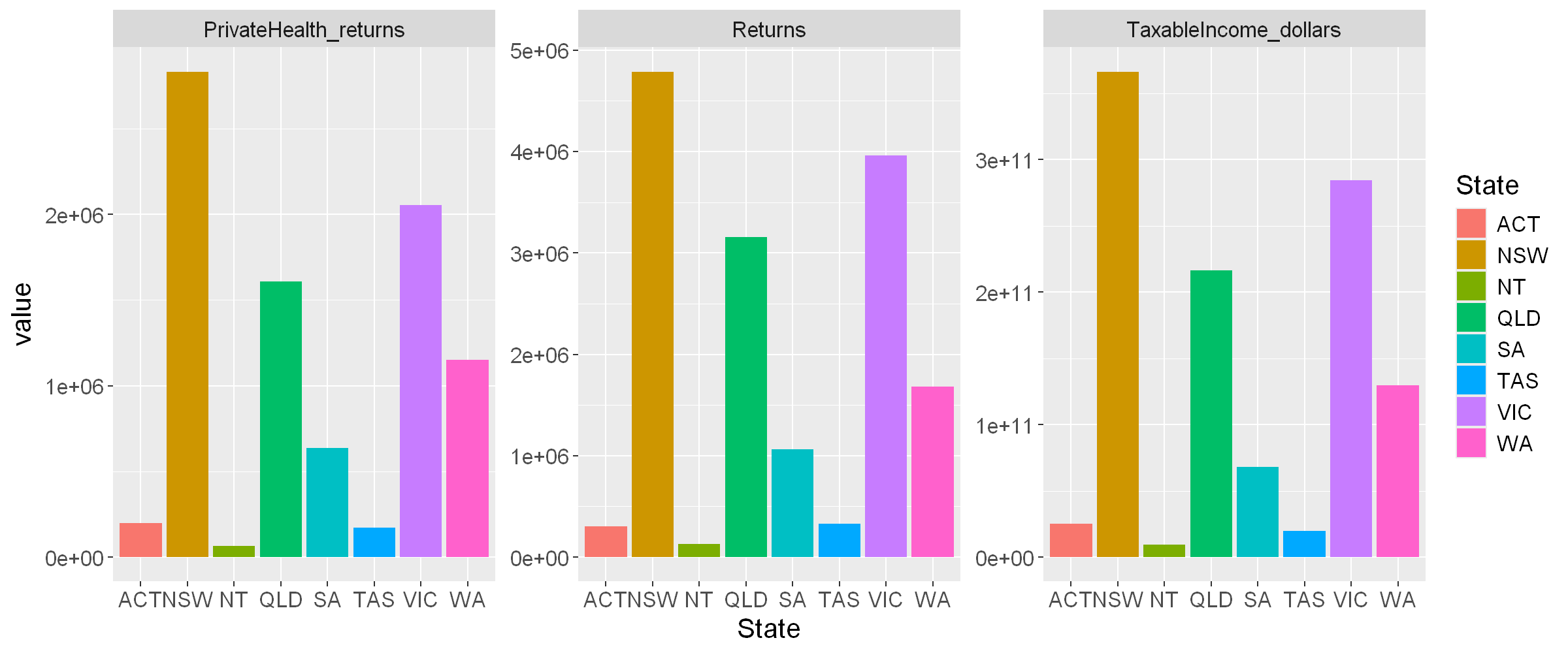
To quickly visualise the mean values per state
- we take the code from earlier (#Means per State),
- use pivot_longer() and ggplot() as before to produce the graph.
plot2022_state_means <- tax2022_raw %>%
  filter( State !="Unknown" & State!="Overseas" ) %>%
  mutate(TaxableIncome_dollarspr = TaxableIncome_dollars/Returns) %>%
  mutate(PrivateHealth_percentpp = PrivateHealth_returns/Returns*100) %>%
  select(State, TaxableIncome_dollarspr, PrivateHealth_percentpp ) %>%
  group_by(State) %>%
  summarise_all(mean) %>%
  pivot_longer( cols = -c(State),
                names_to = "item",
                values_to = "value",
                values_drop_na = TRUE) %>%
  ggplot(aes(x=State, y=value, fill=State)) +
  geom_bar(stat = "identity") + facet_wrap( vars(item), scales="free_y") +
  theme(text = element_text(size = 15))

plot2022_state_means
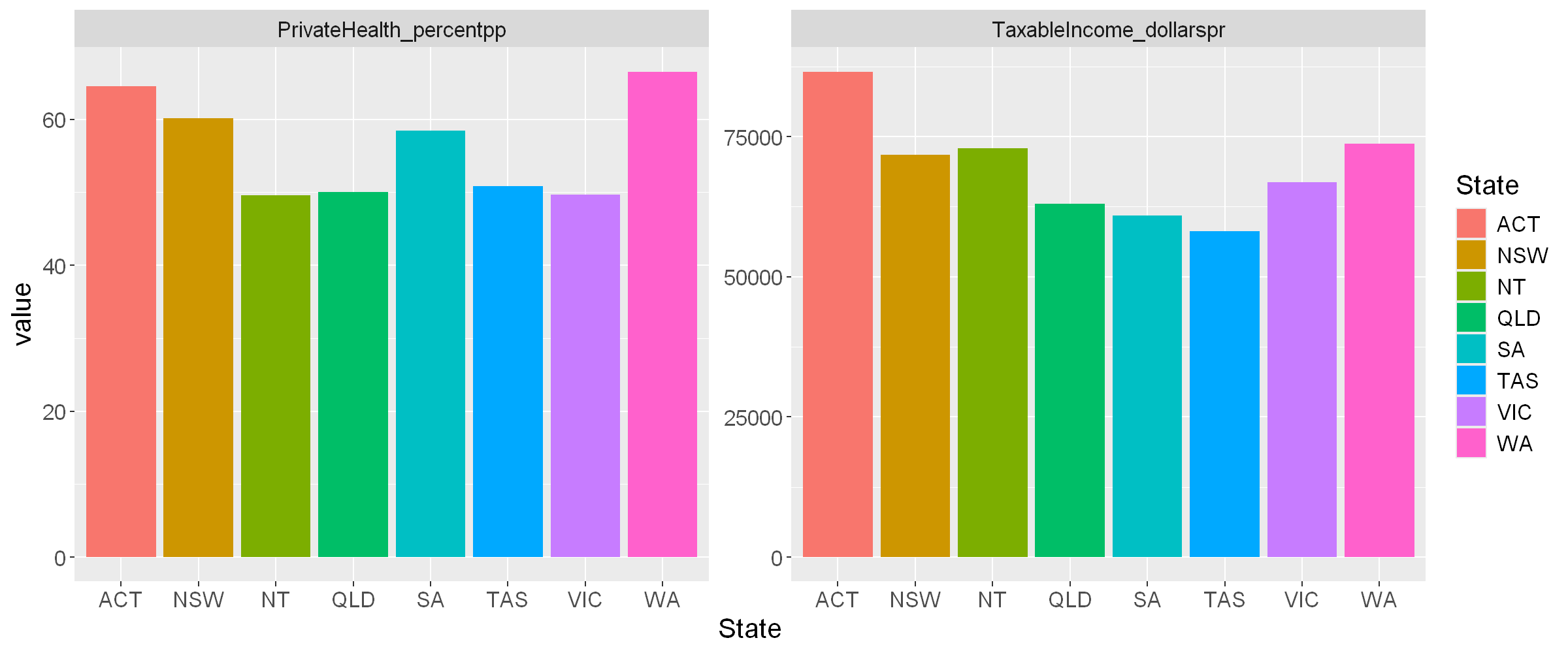
Note: These plots are images; they can become blurry when enlarged and are not responsive on different devices such as mobiles or tablets. Other visualisation tools, such as Leaflet and Plotly (presented later) are more versatile as they effectively recreate the plot to suit each device.
Automation
When the source data changes, for example more data samples are collected or updated, using code to manipulate the data brings a massive advantage - automation. The same code can be re-executed on the new data for updated analysis and visualisations.
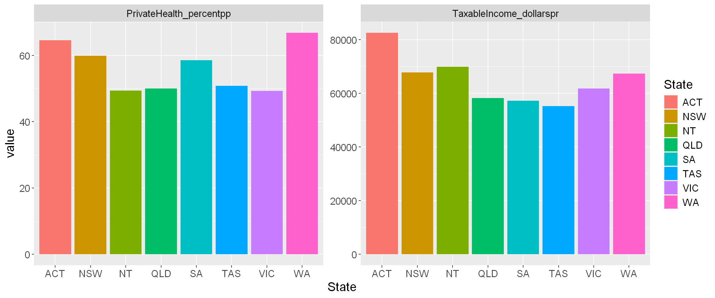
As an example, here is the code used to sum the three Taxation parameters for Australia for 2021-2022, re-executed for the 2020-2021 dataset, also published under Creative Commons Attribution 2.5 Australia. The code required a small tweak, the columns are in a different order compared to 2021-2022.
Compare the results for 2020/21 and 2021/22.
- 2020/2021
tax2021_url <- 'https://data.gov.au/data/dataset/07b51b39-254a-4177-8b4c-497f17eddb80/resource/fa05bac8-079d-4eba-bd4d-779466e45f02/download/ts21individual06taxablestatusstateterritorypostcode.xlsx'

download.file(tax2021_url, 'tax2021.xlsx', mode = 'wb')

tax2021_raw <- read_excel('tax2021.xlsx', sheet = 'Table 6B', skip = 1, col_names = TRUE)[ ,c(1,2,3,5,154)]

names(tax2021_raw) <- c('State', 'Postcode', 'Returns', 'TaxableIncome_dollars', 'PrivateHealth_returns')

tax2021_raw %>%
  filter( State !="Unknown" & State!="Overseas" ) %>%
  mutate(TaxableIncome_dollarspr = TaxableIncome_dollars/Returns) %>%
  mutate(PrivateHealth_percentpp = PrivateHealth_returns/Returns*100) %>%
  select(TaxableIncome_dollarspr, PrivateHealth_percentpp ) %>%
  summarise_all(mean)
| TaxableIncome_dollarspr | PrivateHealth_percentpp |
|---|---|
| <dbl> | <dbl> |
| 62881.6 | 55.71372 |
- 2021/22
tax2022_raw %>%
  filter( State !="Unknown" & State!="Overseas" ) %>%
  mutate(TaxableIncome_dollarspr = TaxableIncome_dollars/Returns) %>%
  mutate(PrivateHealth_percentpp = PrivateHealth_returns/Returns*100) %>%
  select(TaxableIncome_dollarspr, PrivateHealth_percentpp ) %>%
  summarise_all(mean)
| TaxableIncome_dollarspr | PrivateHealth_percentpp |
|---|---|
| <dbl> | <dbl> |
| 67519.74 | 55.81243 |
Also compare the plot of mean values for 2020/21.
plot2021_state_means <- tax2021_raw %>%
  filter( State !="Unknown" & State!="Overseas" ) %>%
  mutate(TaxableIncome_dollarspr = TaxableIncome_dollars/Returns) %>%
  mutate(PrivateHealth_percentpp = PrivateHealth_returns/Returns*100) %>%
  select(State, TaxableIncome_dollarspr, PrivateHealth_percentpp ) %>%
  group_by(State) %>%
  summarise_all(mean) %>%
  pivot_longer( cols = -c(State),
                names_to = "item",
                values_to = "value",
                values_drop_na = TRUE) %>%
  ggplot(aes(x=State, y=value, fill=State)) +
  geom_bar(stat = "identity") + facet_wrap( vars(item), scales="free_y") +
  theme(text = element_text(size = 15))

plot2021_state_means
Key Learning
Key Learning #4 - Data frame structures are easily transformed in R, transforming to whatever form is convenient for a particular purpose.
Key Learning #5 - Using code to perform analysis and generate graphs and visualisations saves a lot of time and finessing, particularly when tasks need to be repeated regularly and often.
Further Learning
Further Learning #2 - The above visualisations were generated quickly, without too much concern for formatting. Every aspect of the graphs above can be controlled to give beautiful and purposeful visualisations.
Combining two datasets
Dataset 2 - Accessing and Cleaning
The ABS produces The Socio-Economic Indexes for Areas (SEIFA) based on the Census of Population and Housing. These indexes provide a measure of relative socio-economic advantage and disadvantage across different areas of Australia. It includes this dataset, which includes from Table 5 an Index of Education and Occupation, which reflects the education and occupational level per postcode. The dataset is also published under a suitable Creative Commons Licence.
Looking at the spreadsheet, the data we are interested in are the Postcode and Percentile/Ranking within Australia columns of the Table 5 sheet. The data starts on row 7. We can import this data directly and then discard all but columns 1 and 7 (Postcode and Percentile/Rank).
seifa2021_url <- 'https://www.abs.gov.au/statistics/people/people-and-communities/socio-economic-indexes-areas-seifa-australia/2021/Postal%20Area%2C%20Indexes%2C%20SEIFA%202021.xlsx'

download.file(seifa2021_url, 'poa_indexes.xlsx', mode = 'wb')

seifa2021_raw <- read_excel('poa_indexes.xlsx', sheet='Table 5', skip=6, n_max=2627, col_names=FALSE, .name_repair = 'minimal')[,c(1,7)]

names(seifa2021_raw) <- c('Postcode','ieo_percentile')

str(seifa2021_raw)
tibble [2,627 × 2] (S3: tbl_df/tbl/data.frame)
 $ Postcode      : chr [1:2627] "0800" "0810" "0812" "0820" ...
 $ ieo_percentile: num [1:2627] 88 79 54 85 10 57 2 40 61 57 ...
Combining datasets
Combining datasets offers great opportunities for data analysis and insights.
Our datasets both have postcode columns, so can be combined to compare education levels with income and private health status data.
R and the Tidyverse offer simple merge functions which can combine two datasets, based on common column(s) in both datasets.
We will use the inner_join() function. We only have one column in common; if there are more than one columns in common, they would simply need adding to the by parameter as a vector using the combine c() function.
Finally a note about cleaning - there may be differences in the postcode allocations between the SEIFA and Taxation data, we will leave this discrepancy for now and see the impact later in this workflow.
tax2022_raw %>%
  filter( State !="Unknown" & State!="Overseas" ) %>%
  mutate(TaxableIncome_dollarspr = TaxableIncome_dollars/Returns) %>%
  mutate(PrivateHealth_percentpp = PrivateHealth_returns/Returns*100) %>%
  inner_join( x= ., y = seifa2021_raw, by = "Postcode") %>%
  select(State, Postcode, ieo_percentile, TaxableIncome_dollarspr, PrivateHealth_percentpp ) %>%
  filter(Postcode == '6102')
| State | Postcode | ieo_percentile | TaxableIncome_dollarspr | PrivateHealth_percentpp |
|---|---|---|---|---|
| <chr> | <chr> | <dbl> | <dbl> | <dbl> |
| WA | 6102 | 69 | 56469.43 | 48.54591 |
A note about SQL
For those with a background in SQL, R interfaces with many different databases and queries can be executed as if using the native SQL interface.
In the example below, the library RSQLite is used to
- create a SQLite database,
tax_seifa_db <- dbConnect(RSQLite::SQLite(), "")
- refresh our memories of the tax2022_raw data
head(tax2022_raw)
| State | Postcode | Returns | TaxableIncome_dollars | PrivateHealth_returns |
|---|---|---|---|---|
| <chr> | <chr> | <dbl> | <dbl> | <dbl> |
| ACT | 2600 | 5951 | 791214764 | 4841 |
| ACT | 2601 | 3614 | 265604097 | 1965 |
| ACT | 2602 | 23085 | 2026942835 | 15791 |
| ACT | 2603 | 7558 | 1055186744 | 5926 |
| ACT | 2604 | 9137 | 953261746 | 6649 |
| ACT | 2605 | 8111 | 863964219 | 6298 |
- refresh our memories of the seifa2021_raw data
head(seifa2021_raw)
| Postcode | ieo_percentile |
|---|---|
| <chr> | <dbl> |
| 0800 | 88 |
| 0810 | 79 |
| 0812 | 54 |
| 0820 | 85 |
| 0822 | 10 |
| 0828 | 57 |
- write the tax data from the above inner_join command to a table,
- write the seifa data from the above inner_join command to a table,
dbWriteTable(tax_seifa_db,"seifa2021_tbl",seifa2021_raw)
dbWriteTable(tax_seifa_db,"tax2022_tbl",tax2022_raw)
dbListTables(tax_seifa_db)
- 'seifa2021_tbl'
- 'tax2022_tbl'
- execute a query using SELECT on the two tables to achieve the same output as the above inner_join() command,
dbGetQuery(tax_seifa_db, 'SELECT seifa2021_tbl.ieo_percentile, tax2022_tbl.* FROM seifa2021_tbl JOIN tax2022_tbl ON seifa2021_tbl."Postcode" = tax2022_tbl."Postcode" WHERE seifa2021_tbl."Postcode" = 6102')
| ieo_percentile | State | Postcode | Returns | TaxableIncome_dollars | PrivateHealth_returns |
|---|---|---|---|---|---|
| <dbl> | <chr> | <chr> | <dbl> | <dbl> | <dbl> |
| 69 | WA | 6102 | 9181 | 518445793 | 4457 |
- and finally close the connection to the database.
dbDisconnect(tax_seifa_db)
Map visualisations
Leaflet and Map Shapefiles
R has some powerful libraries to make use of map data. Map data can be imported for example as a shapefile and visualised along with data using the interactive library Leaflet.
These shapefiles are not images based on pixels, but use vectors to effectively redraw the postcode boundaries (polygons) in whatever environment it is used. They provide much more definition than is needed to display on a screen on a web page, so R provides tools which resample the vectors to suit a webpage, greatly simplifying the file and making it smaller and quicker to render.
Once again, the map/shapefile data for Postcodes in Australia is readily available from the ABS website, with a suitable Creative Commons Licence.
To reduce time and resources needed for this workflow - we have created a preprocessed shapefile named pc_sf_raw.shz, which is already a simplified version of the map file and can be loaded with the code below.
pc_sf_raw <- read_sf("pc_sf_raw.shz")
head(pc_sf_raw)
| POA_CODE21 | AUS_CODE21 | POA_NAME21 | AUS_NAME21 | AREASQKM21 | LOCI_URI21 | SHAPE_Leng | SHAPE_Area | geometry |
|---|---|---|---|---|---|---|---|---|
| <chr> | <chr> | <chr> | <chr> | <dbl> | <chr> | <dbl> | <dbl> | <MULTIPOLYGON [°]> |
| 0800 | AUS | 0800 | Australia | 3.1731 | http://linked.data.gov.au/dataset/asgsed3/POA/0800 | 0.08189288 | 2.638987e-04 | MULTIPOLYGON (((130.8502 -1... |
| 0810 | AUS | 0810 | Australia | 24.4283 | http://linked.data.gov.au/dataset/asgsed3/POA/0810 | 0.24185920 | 2.030520e-03 | MULTIPOLYGON (((130.8715 -1... |
| 0812 | AUS | 0812 | Australia | 35.8899 | http://linked.data.gov.au/dataset/asgsed3/POA/0812 | 0.27878850 | 2.983265e-03 | MULTIPOLYGON (((130.9084 -1... |
| 0820 | AUS | 0820 | Australia | 39.0642 | http://linked.data.gov.au/dataset/asgsed3/POA/0820 | 0.40913401 | 3.247671e-03 | MULTIPOLYGON (((130.8502 -1... |
| 0822 | AUS | 0822 | Australia | 150775.8030 | http://linked.data.gov.au/dataset/asgsed3/POA/0822 | 90.60183104 | 1.256424e+01 | MULTIPOLYGON (((136.7502 -1... |
| 0828 | AUS | 0828 | Australia | 28.6532 | http://linked.data.gov.au/dataset/asgsed3/POA/0828 | 0.24629886 | 2.382171e-03 | MULTIPOLYGON (((130.9382 -1... |
See also the list of points to draw the postcode boundary/polygon for Bentley, Perth (6102).
st_coordinates(pc_sf_raw[pc_sf_raw$POA_CODE21 == '6102', ])
| X | Y | L1 | L2 | L3 |
|---|---|---|---|---|
| 115.8991 | -32.01344 | 1 | 1 | 1 |
| 115.8867 | -32.01239 | 1 | 1 | 1 |
| 115.8866 | -31.99810 | 1 | 1 | 1 |
| 115.8889 | -31.99136 | 1 | 1 | 1 |
| 115.9025 | -32.00329 | 1 | 1 | 1 |
| 115.9150 | -31.99387 | 1 | 1 | 1 |
| 115.9328 | -32.00241 | 1 | 1 | 1 |
| 115.9215 | -32.01273 | 1 | 1 | 1 |
| 115.8991 | -32.01344 | 1 | 1 | 1 |
Full citation for source of modified map/shapefile:
Australian Bureau of Statistics (2021) 'Non ABS Structures: Postal Areas - 2021 [https://www.abs.gov.au/statistics/standards/australian-statistical-geography-standard-asgs-edition-3/jul2021-jun2026/access-and-downloads/digital-boundary-files]' [Shapefile], Digital boundary files: Australian Statistical Geography Standard (ASGS) Edition 3, accessed 27th February 2024.
How was this file created?
The file was created using the code below, there is no need to execute the code in this workflow.
if(!require(zip)){
    install.packages("zip")
    library(zip)
}
pc_sf_url = 'https://www.abs.gov.au/statistics/standards/australian-statistical-geography-standard-asgs-edition-3/jul2021-jun2026/access-and-downloads/digital-boundary-files/POA_2021_AUST_GDA2020_SHP.zip'
download.file(pc_sf_url, 'POA_2021_AUST_GDA2020_SHP.zip', mode = 'wb')
unzip("POA_2021_AUST_GDA2020_SHP.zip")
pc_sf_raw <- read_sf("POA_2021_AUST_GDA2020.shp") %>%
  ms_simplify()
st_write(pc_sf_raw,"pc_sf_raw.shp", delete_dsn = TRUE)
shz_files <- c('pc_sf_raw.dbf','pc_sf_raw.prj','pc_sf_raw.shp','pc_sf_raw.shx')
zip("pc_sf_raw.shz",shz_files)
Demonstration 1 - Leaflet Visualisation
Here we create a visualisation demonstration including a map of Australia with postcodes shown in colours reflecting the Index of Education and Occupation, and hovering over each postcode will display a label detailing the combined tax/seifa data from earlier in abbreviated form.
Though explaining the code for the visualisation is beyond the scope of this workflow, a powerful visualisation has been created with relatively little code. We can also see the effects of not ‘cleaning’ the data earlier. We can see areas missing data, where tax data was summarised into ‘Other’ categories, or there was a change in postcodes between the two data sources. The join commands from earlier couldn’t find a match between the two datasets for these Postcodes and thus there is no corresponding data.
# Create a dataframe from earlier # Tax data combined workflow
tax_seifa <- tax2022_raw %>%
  filter( State !="Unknown" & State!="Overseas" ) %>%
  mutate(TaxableIncome_dollarspr = round(TaxableIncome_dollars/Returns/1000,0)) %>%
  mutate(PrivateHealth_percentpp = round(PrivateHealth_returns/Returns*100,0)) %>%
  inner_join( x= ., y = seifa2021_raw, by = "Postcode")

# Data cleaning - add leading zero to three digit postcodes from tax data
tax_seifa$Postcode <- sprintf("%04d",as.numeric(tax_seifa$Postcode))

# Combine map shapefile and tax data into a new R object
pc_sf <- pc_sf_raw %>%
  inner_join(x=.,y=tax_seifa,by = c('POA_CODE21'='Postcode'))

# Add a label to data which combines all of the tax data into a single abbreviated field
pc_sf$data_label <- paste0("PCode:",pc_sf$POA_CODE21," Income:$",pc_sf$TaxableIncome_dollarspr,"K PrivHlth:",pc_sf$PrivateHealth_percentpp,"% IEO:",pc_sf$ieo_percentile)

# Create a colour palette based on index of educational opportunity percentile
pc_v1_palette <- colorQuantile("YlOrRd", pc_sf$ieo_percentile, n = 5, reverse = TRUE)

# Leaflet Visualisation 1
pc_v1 <- leaflet(pc_sf) %>%
  addPolygons(color="black", weight=0.5, smoothFactor=0.2, fillOpacity=0.5, fillColor = ~pc_v1_palette(pc_sf$ieo_percentile), label = ~pc_sf$data_label, highlightOptions = highlightOptions(color="white",weight=1,bringToFront = TRUE)) %>%
  addProviderTiles(providers$CartoDB.Voyager) %>%
  addLegend(pal=pc_v1_palette, values=~pc_sf$ieo_percentile, title="SEIFA<br> Index of<br>Education/<br>Occupation<br>percentile", position="bottomleft" )

pc_v1
REPLACEMEHERE
Interactive visualisations
Interactive Visualisations
In the previous visualisations the user can’t change the core information which is shown, in effect the visualisations are ‘static’.
The most useful visualisations don’t limit the user to a static analysis, they incorporate interactivity, where the visualisation can be changed by the user varying relevant parameters.
The user is not dictated to, instead they are guided and can choose their own analysis journey. Incorporating intuitive elements can allow even more insights.
There is always one key issue which needs to be addressed with data analysis and interactive visualisations - how to share them with those who will use them?
Essentially the humble web browser is the one application we know will most likely be on any device capable of using the visualisations.
RShiny is a very powerful interactive visualisation tool for R used in a web browser, however it requires a separate RShiny data server to be running, which not everyone may have the access needed to implement.
Assuming we have a method of sharing a webpage (eg GitPages, static website instance), let’s explore some visualisations which function completely within a web browser without the need for a separate data server.
Crosstalk Filters
Crosstalk is an extension package designed to work with htmlwidgets package, both of which allow interactive visualisations in a Notebook environment in a web browser.
Crosstalk is not infinitely configurable, but will provide slider, checkbox and dropdown filters which will work with several of the htmlwidgets visualisation tools, including Plotly/ggplotly, DataTables and Leaflet.
Demonstration 2 - Plotly/ggplotly Visualisation with Crosstalk filters
Plotly for R is an advanced and diverse open source visualisation library, which also includes a function ggplotly() which wraps around a ggplot generated plot and immediately adds useful interactivity and features.
To enable the Crosstalk filters to work with the visualisation, we created a shared data resource, which is the used by the visualisation tools.
Let’s create a visualisation which explores correlations between the two data sources earlier. We will plot SEIFA percentile/rank versus Private Health participation for each Postcode for a user chosen range of Taxable Income.
This is achieved by
- Creating a shared resource tax_seifa_shared, which is a narrow/long format of the combined tax and seifa data created previously.
- use bscols() to format a visualisation with two rows, one for the filter_slider() and one for the plot.
Can you draw any interesting conclusions from the visualisations?
tax_seifa_bc = tax2022_raw %>%
  filter( State !="Unknown" & State!="Overseas" ) %>%
  mutate(TaxableIncome_dollarspr = round(TaxableIncome_dollars/Returns/1000,0)) %>%
  mutate(PrivateHealth_percentpp = round(PrivateHealth_returns/Returns*100,0)) %>%
  inner_join( x= ., y = seifa2021_raw, by = "Postcode") %>%
  select(State, Returns, Postcode, ieo_percentile, TaxableIncome_dollarspr, PrivateHealth_percentpp )

tax_seifa_bc_shared <- SharedData$new(tax_seifa_bc)

plot_bc <-  tax_seifa_bc_shared %>%
            ggplot(aes(x=ieo_percentile, y=PrivateHealth_percentpp, )) +
            geom_point(aes(fill=State, size=Returns, text=paste0("Postcode: ", Postcode)), alpha=0.5, stroke=0.1) +
            scale_fill_brewer(palette="Paired") +
            scale_size(range = c(1, 8), name="Returns")
bscols(
  widths=c(12,12),
  filter_slider("TaxableIncome_dollarspr", "Mean Taxable Income per return ($K)", tax_seifa_bc_shared, column=~TaxableIncome_dollarspr, step=1, width = "100%"),
  ggplotly(plot_bc))
REPLACEMEHERE
Interactive map visualisations
Demonstration 3 - Leaflet Visualisation with Crosstalk filters
Interactive Crosstalk elements can be added to Leaflet visualisations too, though not with the Postcode shapes from earlier but with the labels of each Postcode.
In this visualisation, once again achieved with a relatively small amount of code, two sliders are used to select Postcodes based on SEIFA Index of Education and Occupation and also Private Health Cover Percentage.
What interesting correlations can you find?
pc_sf$long <- st_coordinates(st_centroid(pc_sf$geometry))[,"X"]
pc_sf$lat <- st_coordinates(st_centroid(pc_sf$geometry))[,"Y"]

pc_v2_shared <- SharedData$new(pc_sf)

bscols(
  widths=c(6,6,12),
  filter_slider("ieo_percentile", "SEIFA Index of Education and Occupation", pc_v2_shared, column=~ieo_percentile, step=1, width = "100%"),
  filter_slider("PrivateHealth_percentpp", "Private Health Cover Percentage per Postcode", pc_v2_shared, column=~PrivateHealth_percentpp, step=1, width = "100%"),
  leaflet(pc_v2_shared) %>%
    addPolygons(color="black",weight=0.3, smoothFactor=0.2, fillOpacity=0.5, fillColor="lightgrey", highlightOptions = highlightOptions(color="royalblue",weight=1)) %>%
    addProviderTiles(providers$CartoDB.Voyager) %>%
    addCircleMarkers(~long,~lat, label=~data_label, radius=1)
)
REPLACEMEHERE
Key Learning
Key Learning #6 - Datasets with common ‘keys’ can be combined to allow for more powerful analysis.
Key Learning #7 - R can perform SQL style queries with external SQL databases.
Key Learning #8 - Interactive visualisations are best; the user is not dictated to, instead they are guided and can choose their own analysis journey. Incorporating intuitive elements can allow even more insights.
Key Learning #9 - Web browsers are the ideal vehicle to use for sharing visualisations. R has many tools which can present visualisations using only the web browser, no need for other software or databases/data servers.
Further Learning
Further Learning #3 RShiny is a well documented and widely used library to achieve interactivity in visualisations.
Next steps
Looking beyond this introduction
R Markdown/Notebooks
Similar to Jupyter Notebooks, R Notebooks interweave Markdown text and R code to create updateable data documents to serve many purposes. These documents can be published in a wide variety of formats.
Blogdown
Create entire automatically generated data based websites with
- Blogdown which uses Hugo static websites.
- the Blogdown developers have also created a workflow for Jekyll static websites too.
GitHub and GitPages
Jupyter notebooks stored in GitHub will be shown formatted (but unrendered) in the code view, but with GitPages it is possible to display the complete rendered version of the notebook on your own site…for free!
JSON Data
JSON (JavaScript Object Notation) is a serial data format which is widely used, particularly on the internet when obtaining data from API’s (Application Programming Interface).
It allows nested storage of data not possible with a two-dimensional table alone.
{
    "title": "Fruits",
    "details": "JSON example for R workshop",
    "fruits": [
    {
        "fruit": "Apples",
        "quantity": 7,
        "varieties": [
		{
            "variety": "Royal Gala",
			"supplier": "Apples'R'Us"
		},
		{
            "variety": "Fuji",
			"supplier": "The Orchard down the road"
		}]
    },
    {
        "fruit": "Oranges",
        "quantity": 14,
        "varieties": [
		{
            "variety": "Navel",
			"supplier": "The other Orchard"
		}]
    },
    {
        "fruit": "Lemons",
        "quantity": 21
    }]
}
Licensing and copyright
Unless otherwise stated all content in this workflow is COPYRIGHT © Curtin University 2024. Curtin branding and trademarks are COPYRIGHT © Curtin University.
The text, images, data, documentation and general web content presented in this Jupyter notebook, unless stated otherwise, is licensed Creative Commons Attribution-ShareAlike 4.0 International. The R code presented in this Jupyter notebook is licensed BSD-3-clause. The leaflet demonstration image is produced using the R Leaflet library, which in turn uses the Leaflet.js library and includes content from OpenStreetMap and CartoDB.
As mentioned in the text, the data used here is licenced as follow.
- The dataset for Australian Taxation Statistics 2021-2022, which is an Excel formatted xlsx file, is published under a Creative Commons Attribution 2.5 Australia licence.
- The dataset for Australian Taxation Statistics 2020-2021, which is an Excel formatted xlsx file, is published under a Creative Commons Attribution 2.5 Australia licence.
- The specific dataset from the Socio-Economic Indexes for Areas (SEIFA), which is an Excel formatted xls file, is published under a Creative Commons Licence.
- The map data for Postcodes, which is an Shapefile, is published under a Creative Commons Licence.
The various software tools used here are licenced as follows.
- Jupyter Notebook is provided under the BSD-3-Clause license
- R is provided under the GNU General Public License v2.
- RStudio is provided under the GNU Affero General Public License v3
- R libraries
The RStudio GUI
The RStudio integrated development environment (IDE) is free and open-source, and helps make programming in R easier by providing a range of functionality accessed through a graphical user interface (GUI). The GUI is divided into four different panes, some or all of which will be visible when you first open the environment.
This page provides a summary of each of these four panes, followed by information about creating projects in RStudio. In order to work through it you will first need to install both R and RStudio, if you haven’t already. Once you have them installed, open RStudio to get started.
Console pane
The Console pane is visible on the left of the GUI when you first open RStudio. In this pane you can write code and observe output. For example, to write a command to calculate 1 plus 2 type the following command after the ‘>’:
1+2## [1] 3Press ‘enter’, and the console should display the result of this calculation on the next line.
As another example, create a new variable x and assign
it the value of 100 by typing the following and pressing ‘enter’:
x <- 100This time no output is displayed in the console, but the variable has been created and is visible in the Environment tab in the top right pane. For more information on this, see the Environment tab section of this page.
Note that a line at the top of the console displays the version of R
being used, together with the address of the current working directory.
This is the default location for any files you read into or save in
RStudio. You can also check the current working directory by typing the
getwd() function in the console. For more information on
the working directory, and how to set it, see the Files tab and RStudio
projects sections of this page.
Note also that you can toggle through the commands you have previously written in the console using the up arrow (and later also the down arrow as required), which can make it quicker and easier to run the same or similar commands.
Environment/History pane
The pane at the top right of the RStudio GUI consists of multiple tabs, two of which are the Environment and History tabs. These are detailed below.
Environment tab
The Environment tab lists the variables and data sets in the Global
Environment, otherwise known as the workspace. This will include the
variables and data sets created and imported in the current session and
possibly any saved in previous sessions as well, depending on your
settings (for more information on this, see the RStudio projects section of this page). For
example, you should be able to see that the variable x has
a value of 100 if you created this in the Console pane section.
You can save the objects in your workspace as an RData file by clicking the ‘Save workspace as’ icon at the top of the tab, and open any such saved files by clicking the ‘Load workspace’ icon (hover over the icons to view the name of each). You can also import data sets into the workspace using ‘Import Dataset’ and, if necessary, delete all objects from the workspace with the ‘Clear objects from the workspace’ icon.
Finally, you can display the contents of any packages loaded in the System Library by changing the selection from ‘Global Environment’ to the appropriate package (e.g. ‘package:stats’, ‘package:graphics’, etc.). For more information on the System Library and packages, see the Packages tab section of this page.
History tab
The History tab lists your previously executed code. You can save this history as an RHistory file by using the ‘Save history into a file’ icon, and can load a previous history using the ‘Load history from an existing file’ icon. Note, however, that the default setting is for the history to be saved and the previous history restored automatically when you start a new session. For more details on this, and how to change these default settings if required, see the RStudio projects section of this page.
You can also double click on any entry to paste it into the Console pane, or use ‘To Console’ (or ‘To Source’ to paste to the Source pane instead). Finally, you can delete selected entries from the history using the ‘Remove the selected history entries’ icon, or delete the whole thing (with caution) using the ‘Clear all history entries’ icon.
Files/Plots/Packages/Help pane
The pane at the bottom right of the RStudio GUI consists of multiple tabs, four of which are the Files, Plots, Packages and Help tabs. These are detailed below.
Files tab
The Files tab displays the files in the current working directory. You can use the icons in this tab to create a new folder in the working directory, or to delete or rename folders as appropriate. You can also navigate to other folders (either by clicking on the appropriate folder name in the address bar, by browsing using the ellipsis next to the address bar, or by clicking next to the ‘up’ icon), and can create, delete or rename folders in these other locations as well.
Once you have opened a new or existing folder, you can choose to set it as the working directory using the ‘More file commands’ icon and the ‘Set as Working Directory’ option. Alternatively, you can choose to go back to the current working directory by selecting ‘Go to Working Directory’.
For example, create a new folder called ‘Introductory-R’ in an
appropriate location and set it as your working directory. Notice that
when you do this, the command setwd with the location
displays in the Console pane, and the
current working directory updates at the top of the console. Note that
you can also create a new working directory and set the working
directory by creating and opening an RStudio project respectively, and
in fact this is recommended once you start using RStudio more. For more
information on this, see the RStudio
projects section of this page.
Plots tab
This tab enables you to view plots of your data. For example, you
could view a very basic plot of the single variable x by
typing the following command in the Console
pane:
plot(x)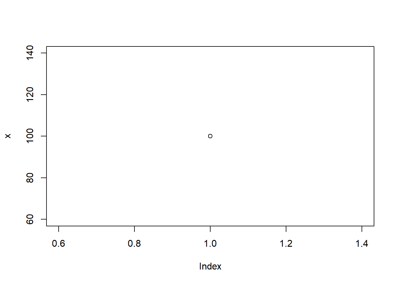
Once you have created a plot you can zoom in on it using the ‘Zoom’ icon, save the plot as an image or PDF using the ‘Export’ icon, and delete a plot or all plots using the ‘Remove the current plots’ or ‘Clear all plots’ icons respectively. If you have multiple plots you can move between them using the ‘Previous’ and ‘Next’ icons.
Packages tab
Packages are collections of data and functions that add functionality to R. There are a number of packages that are already included with RStudio, and you can view these in the System Library in the Packages tab. Some of these are automatically loaded (these are referred to as the base packages), while others are included but not loaded. To load one of these packages, just check the appropriate box.
Alternatively, to load a package that isn’t available in the System Library you will need to install it first using the ‘Install’ icon. Search for the name of the package you want to install then select the ‘Install’ button, before loading it in the same way as for existing packages. When you do this the new package will be stored in your User Library as opposed to in the System Library. While packages in the System Library are automatically updated, you need to ensure you update any User Library packages yourself.
Note that you can also install a package using the
install.packages command, and you can load an installed
package using the library command. For example, you could
install and load a package called ‘openxlsx’ by typing the following
commands in the Console pane:
install.packages("openxlsx")## --- Please select a CRAN mirror for use in this session ---
## package 'openxlsx' successfully unpacked and MD5 sums checked
##
## The downloaded binary packages are in
## C:\Users\241961d\AppData\Local\Temp\RtmpY7FMk8\downloaded_packageslibrary(openxlsx)Either way, packages only need to be installed once but any non-base packages need to be loaded each time you start a new RStudio session (you will get an error message telling you that the function you are trying to use can’t be found if it is in a package that needs to be loaded and you forget to do this!). Also, note that you generally don’t need to worry too much about any red text that appears in the Console pane when you install a package - as long as the black text at the end says it has been unpacked and saved then it is good to go.
Help tab
In this tab you can view help on functions and packages by searching for the name of the function or package you would like using the search feature. You can move between different help pages you have open using the ‘Previous’ and ‘Next’ icons, or go to the R Help page using the ‘Show R Help’ icon. Note that you can also view help on functions and packages by clicking on the package you would like help on in the Packages tab, or by typing a ‘?’ followed by the function name in the Console pane and pressing enter.
Source pane
There is one more, very important, pane that is not automatically open when you start RStudio, which is the Source pane. It can be opened by going to:
File -> New File -> R Script
This pane is used to write code in what are called scripts, in the same way as you wrote code in the Console pane. However unlike the Console pane, any commands written in the Source pane can be saved using the ‘Save’ icon (as an R file). For this reason, if you are doing anything more than just playing around it is better to type your code in the Source pane instead.
Once you have written code in the Source pane you can run it by highlighting it (or by putting the cursor on a single line of code) and selecting the ‘Run’ icon, or by pressing Ctrl+Enter (or Cmd+Enter on a Mac). The code along with any output will then be displayed in the Console pane.
Previously saved R script files can be opened in the Source pane by selecting them from the Files tab, or by going to File -> Open File… and locating the file.
RStudio projects
So far we have just been doing a bit of experimentation in RStudio, but once you start using it for more it is important to consider how you will organise your files. In particular, it is best practice to keep all related files (e.g. data, scripts, history, plots, etc.) together in one directory. An easy way to do this is by making use of an RStudio project, which you can create by going to:
File -> New Project…
You can then select to create the project in a new directory or in an existing directory, or to clone a version control repository (not covered here). For example, if you previously created an ‘Introductory-R’ folder in the Files tab section of this page you should choose ‘Existing Directory’ and select this directory. Alternatively, choose ‘New Directory’, select ‘New Project’ and then specify the name of the folder and where you would like it saved.
When you do this an Rproj project file is created in the specified directory (along with a hidden Rproj.user folder, where any temporary project files are stored), and the project opens in RStudio with the working directory set as the project directory. You should see the name of the project in the top right hand corner of RStudio (above the Environment/History pane) indicating this. You can use the drop down menu next to the project name to close the project or to open a different project as required, or you can make use of the ‘File’ menu to do the same. You can also close a project by simply closing RStudio, and can open one by double clicking on the Rproj file in the relevant save location.
Regardless of how you close a project, note that the default global settings are such that the most recently opened project is restored when you open RStudio (if one exists, and assuming you haven’t selected a specific project to open). These global settings also dictate what exactly will be loaded in the project itself. For example, the default is that your previous scripts (even unsaved ones, if they were open when you closed it) together with your history will automatically be restored. In addition, any variables and data you had saved in your workspace (i.e. those in the Global Environment in the Environment tab) will automatically be restored. While all of this can be very helpful, as you start working with RStudio more you may find that you want to make changes to these global settings. To do so, go to:
Tools -> Global options…
For example, you may prefer to start with a blank workspace
(i.e. Global Environment) each time you open RStudio, so that you get
into the habit of always saving your procedures in your scripts rather
than relying on having the results in the environment. To do this,
deselect ‘Restore .RData into workspace at start up’ in the pop-up
window that opens and set ‘Save workspace to .RData on exit’ to ‘Never’
(note that you can still save this and load it any time manually, it
just won’t save and load automatically with these settings).
Alternatively, you can run the command
usethis::use_blank_slate() to do the same, although you
will likely need to install and load the ‘usethis’ package first (either
in the Packages tab or using the commands
install.packages("usethis") and
library(usethis) respectively).
Lastly, note that each project also has its own project options which override the global options. You can view these for a specific project, and make any changes from the global options as required, by using the drop down menu next to the project name in the top right hand corner and selecting ‘Project Options…’.
About UniSkills
UniSkills was created and is maintained by Curtin University Library. To report issues with UniSkills contact Library Help.
Twemoji icons by Twitter, Inc and other contributors, licensed under a CC-BY 4.0 licence.
Except where otherwise noted, UniSkills content in all it’s forms (website, PDFs etc) are licensed under a Creative Commons Attribution ShareAlike 4.0 International Licence. We ask that you attribute any use of the content as created by Curtin University Library with a link to the Library website.
This license does not extend to other Curtin University and Curtin University Library webpages, or to Curtin branding and trademarks. Curtin University’s copyright information is available on the Curtin website.